Katherine Fernandez

Hi, I'm Kat.

I am a Product Designer and Educator in New York City.

With 8+ years in product design, I create digital experiences across e-commerce, AI-powered career tools, workforce technology, and learning platforms used by more than a million people each year. I work end to end, from research and interaction design to design systems and, often, the build itself, bringing the perspective of five years in the classroom to make complex experiences feel clear, intuitive, and human.

See my work
Illustrated portrait of Katherine Fernandez

UX Case Studies

Some client work is passcode protected. Ask me for access.
The Princeton Review SAT Essentials study plan, showing the ten week schedule, the daily task list and a progress panel with target score

The Princeton Review LMS

Role: UX/UI Designer
{{ platformNote }}
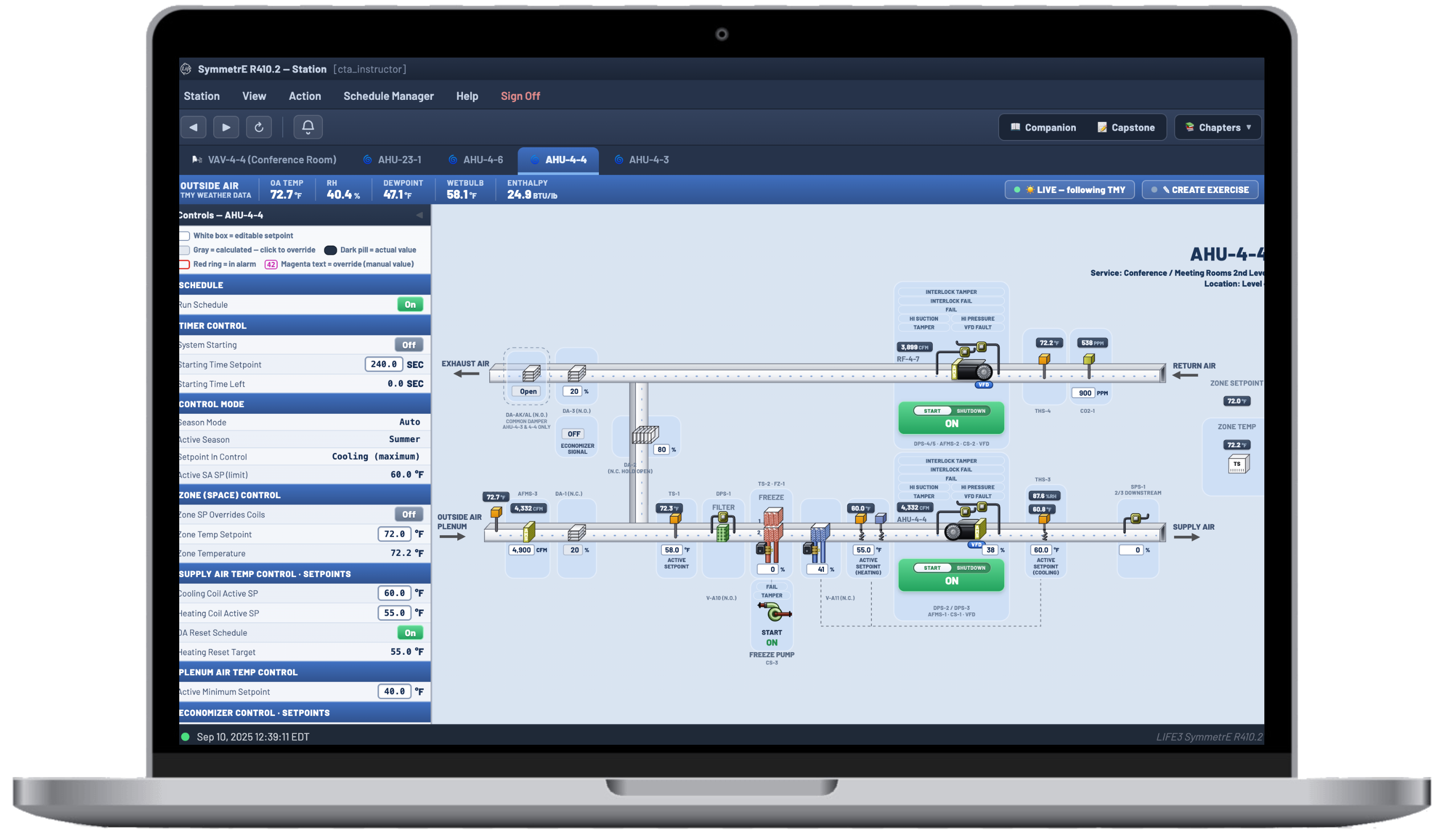
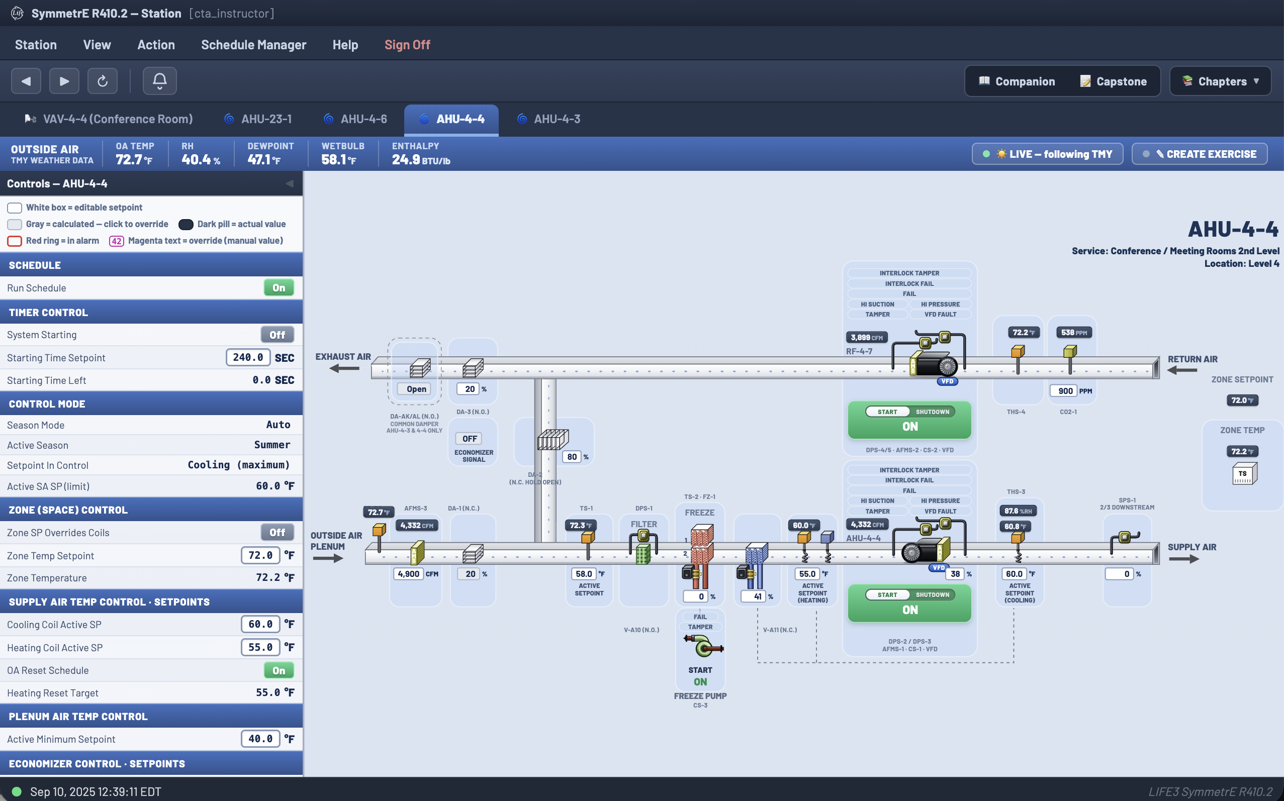
The BMS simulator showing an air handler graphic

BMS Simulator

Role: Product Designer, UX/UI
{{ bmsNote }}
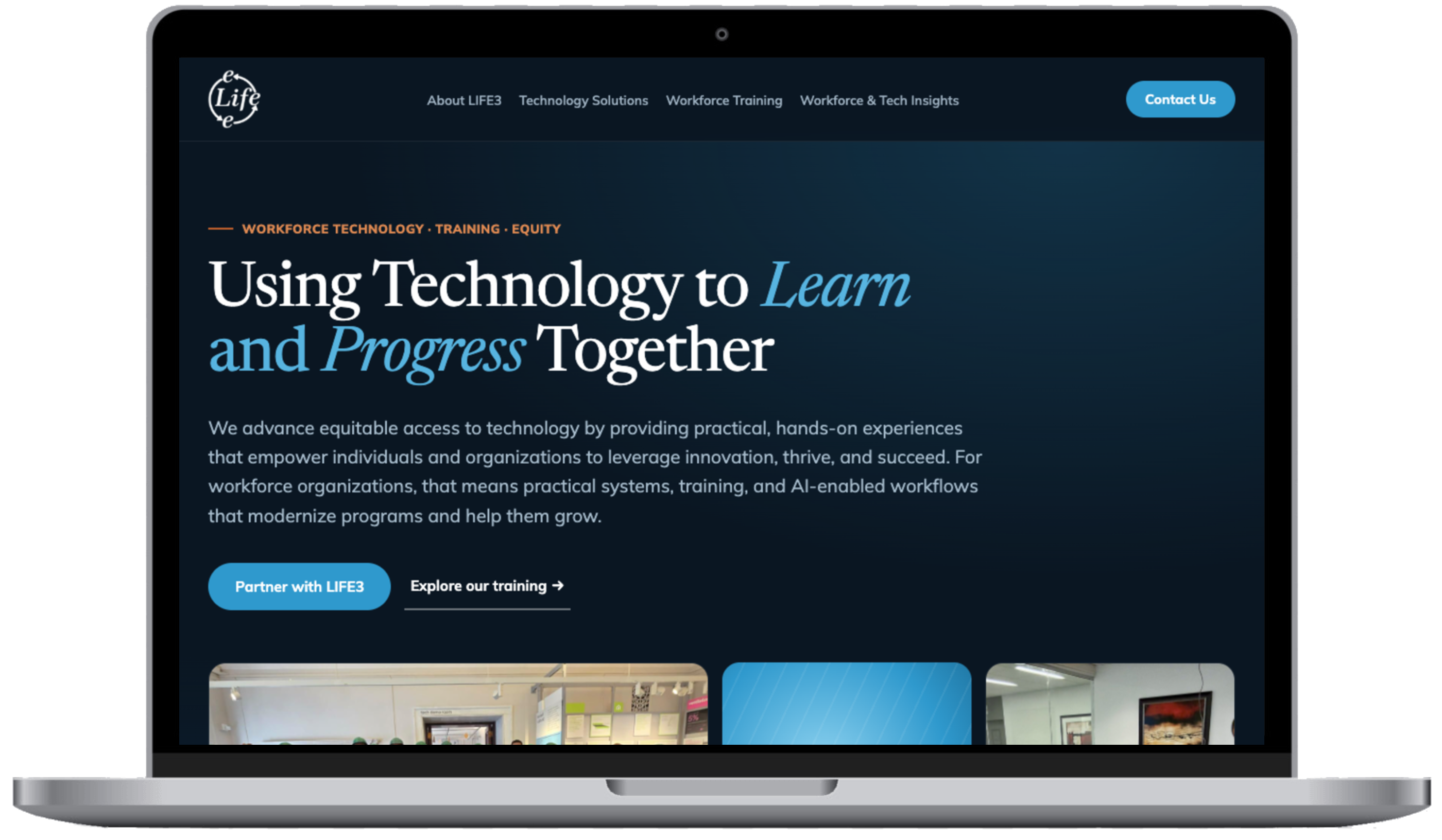
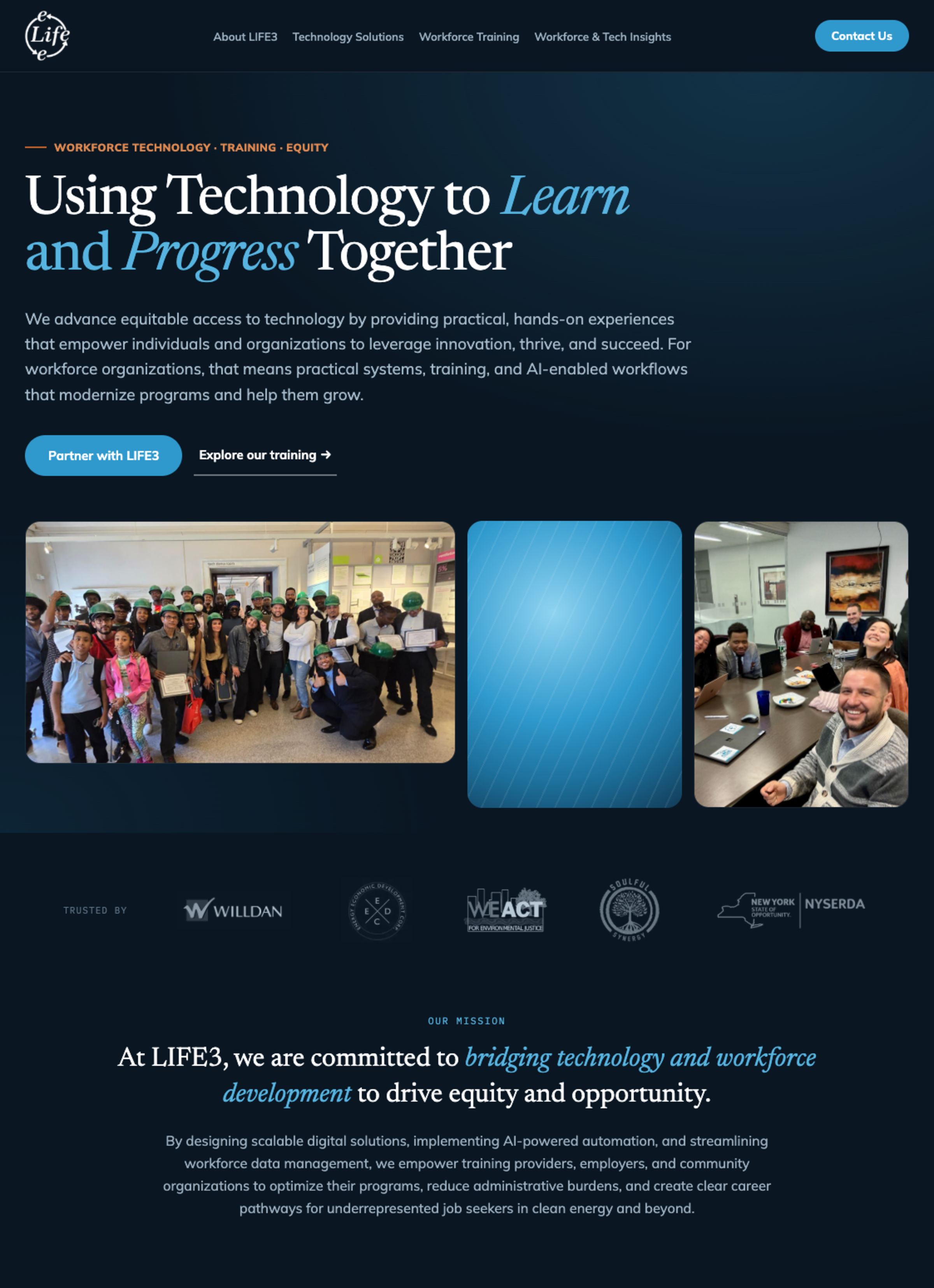
The LIFE3 homepage

LIFE3 Website Redesign

Role: Lead Product Designer and Advisor
Eight pages, design system, accessibility
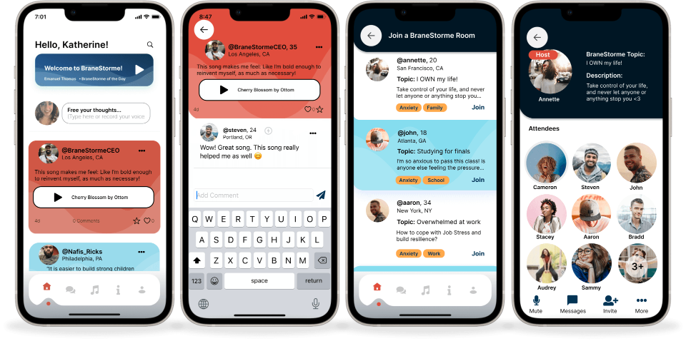
BraneStorme app screens

BraneStorme

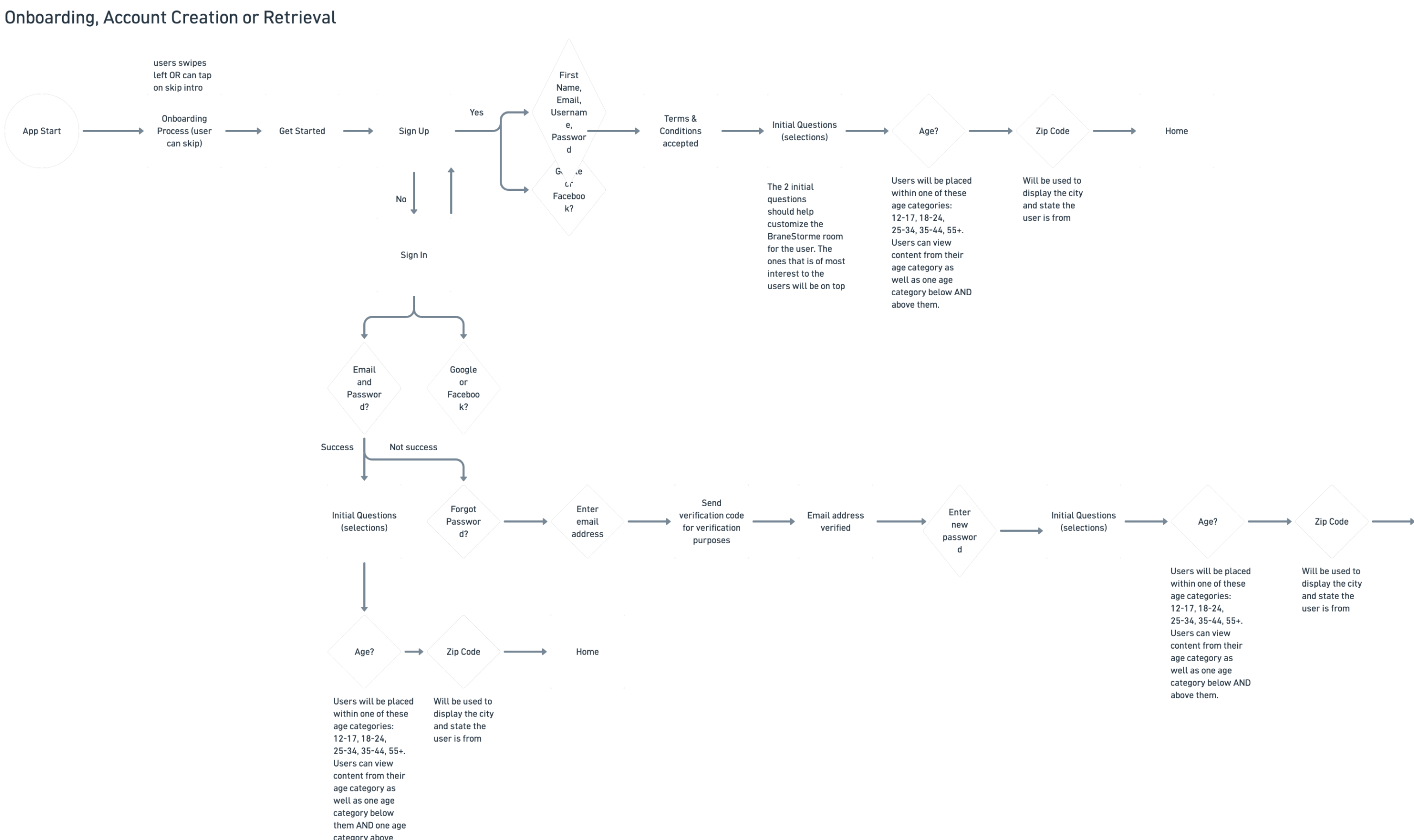
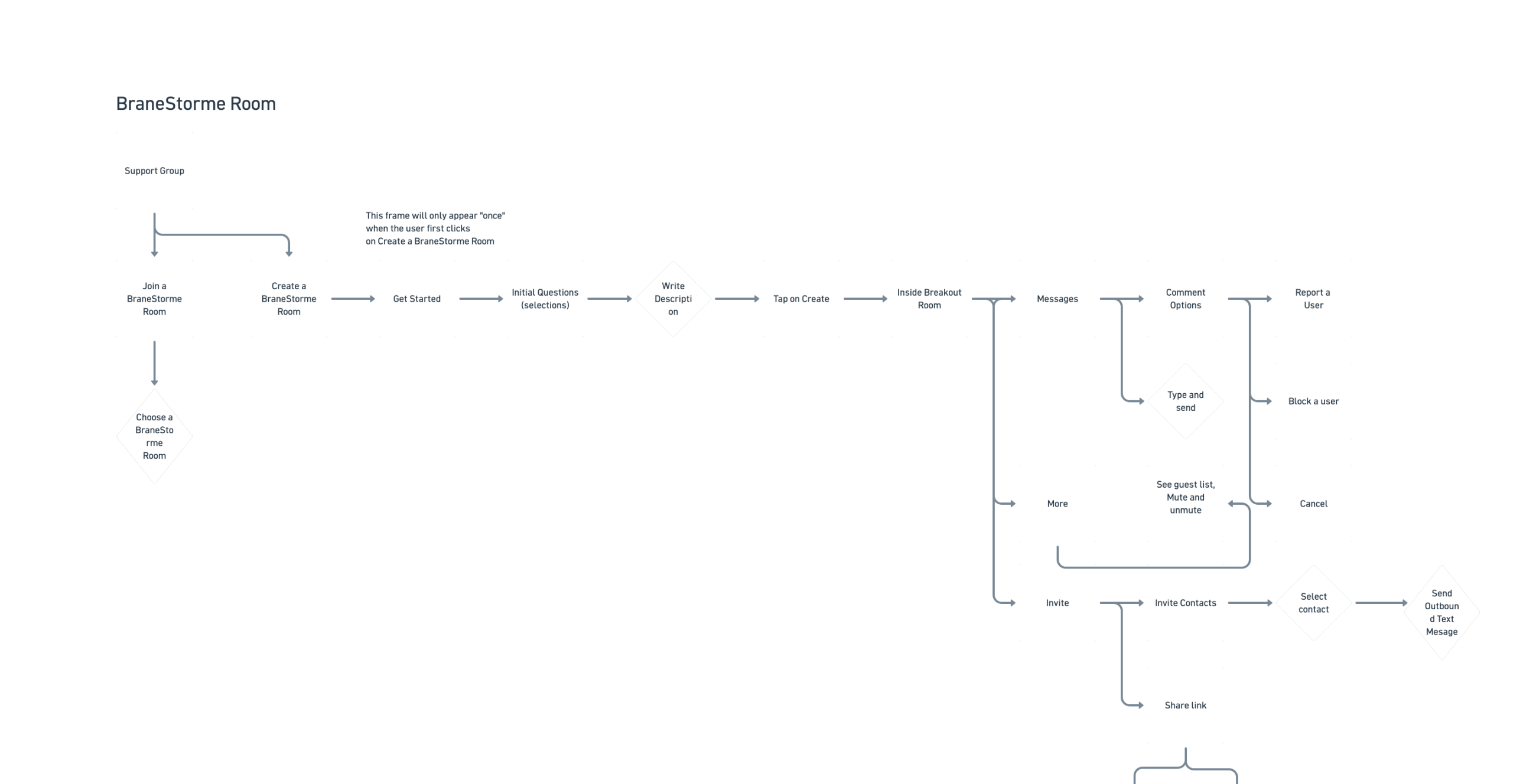
Role: Product Manager + UX/UI Designer · 0→1
Research, brand, seven flows, shipped
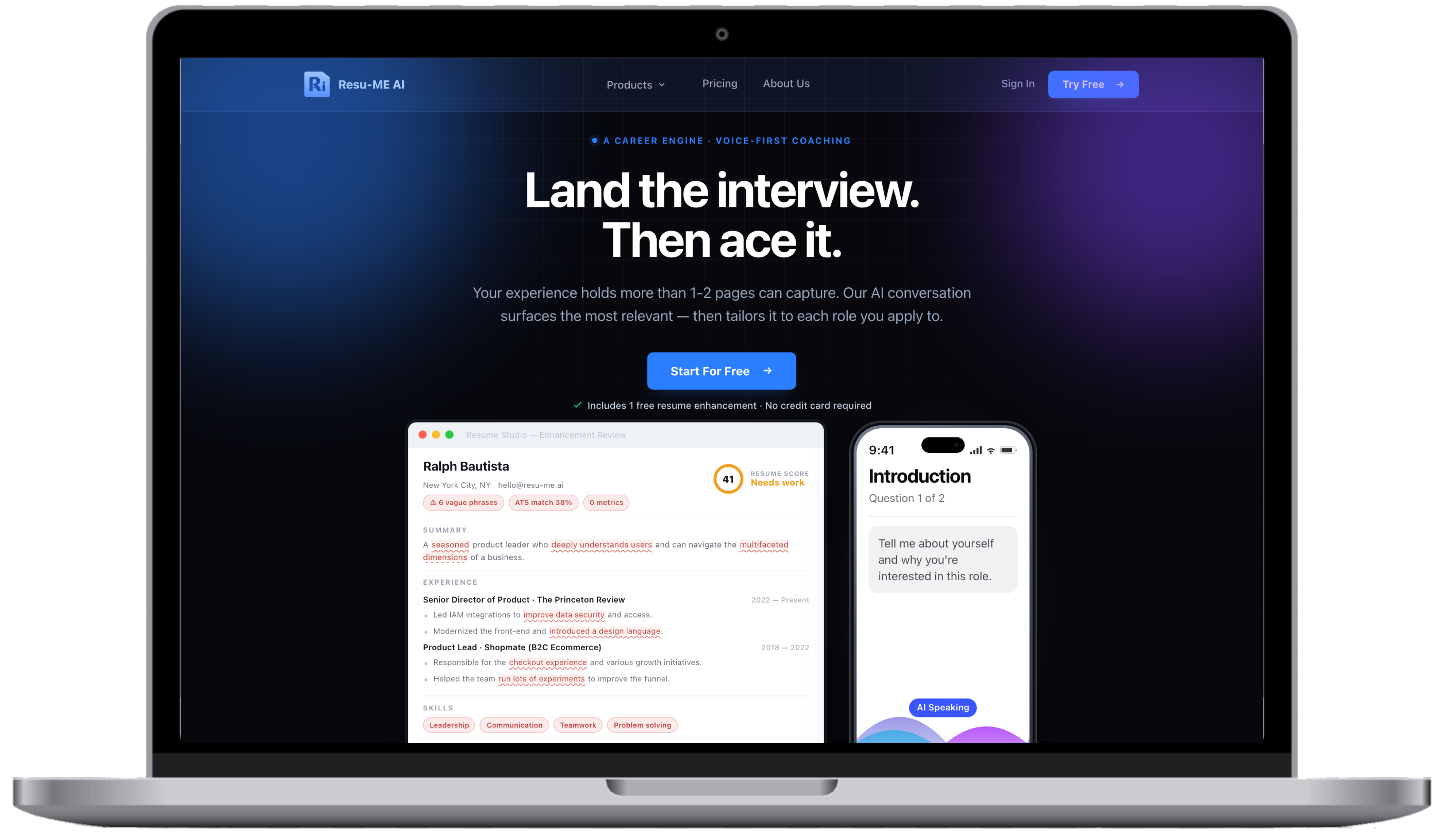
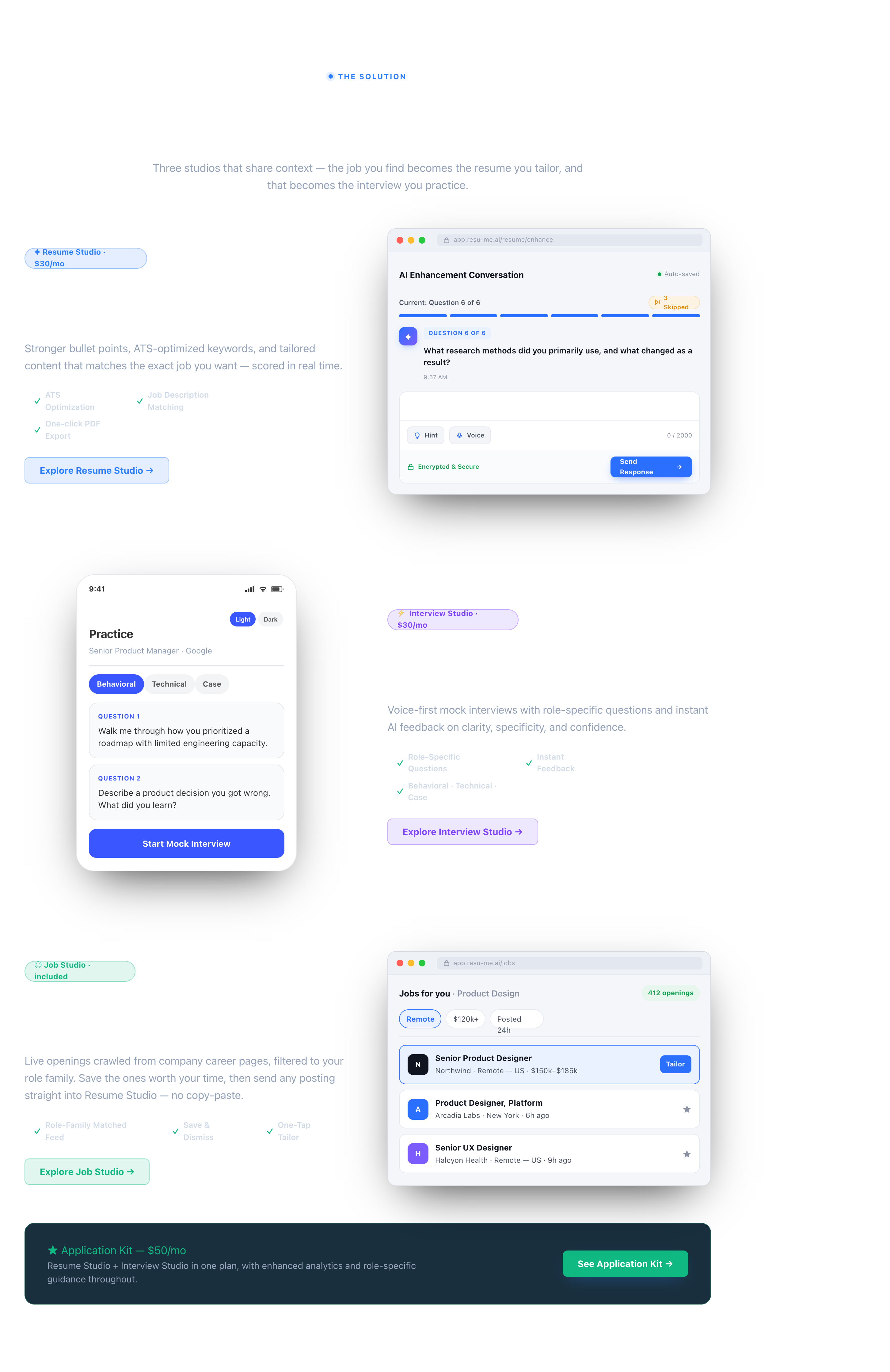
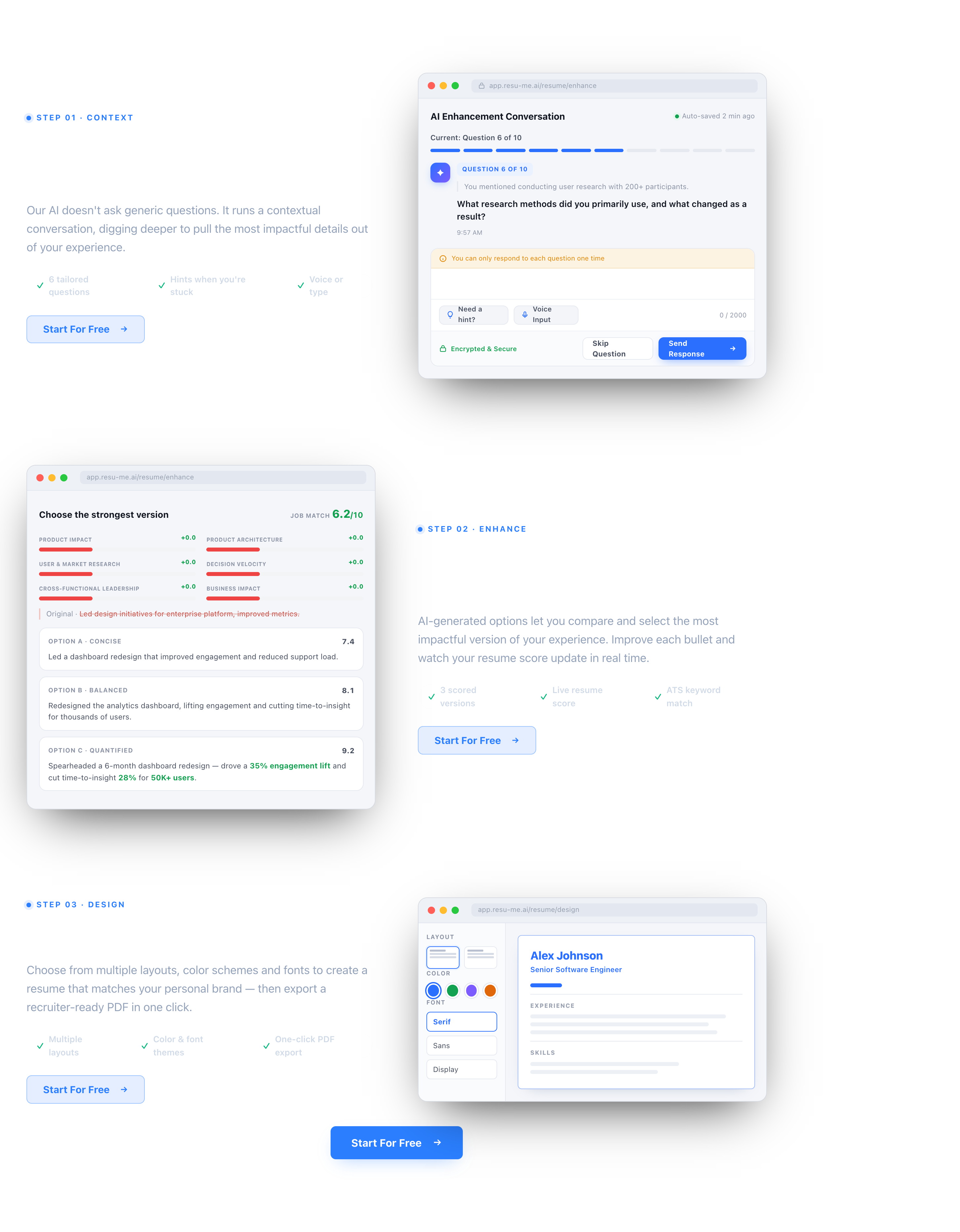
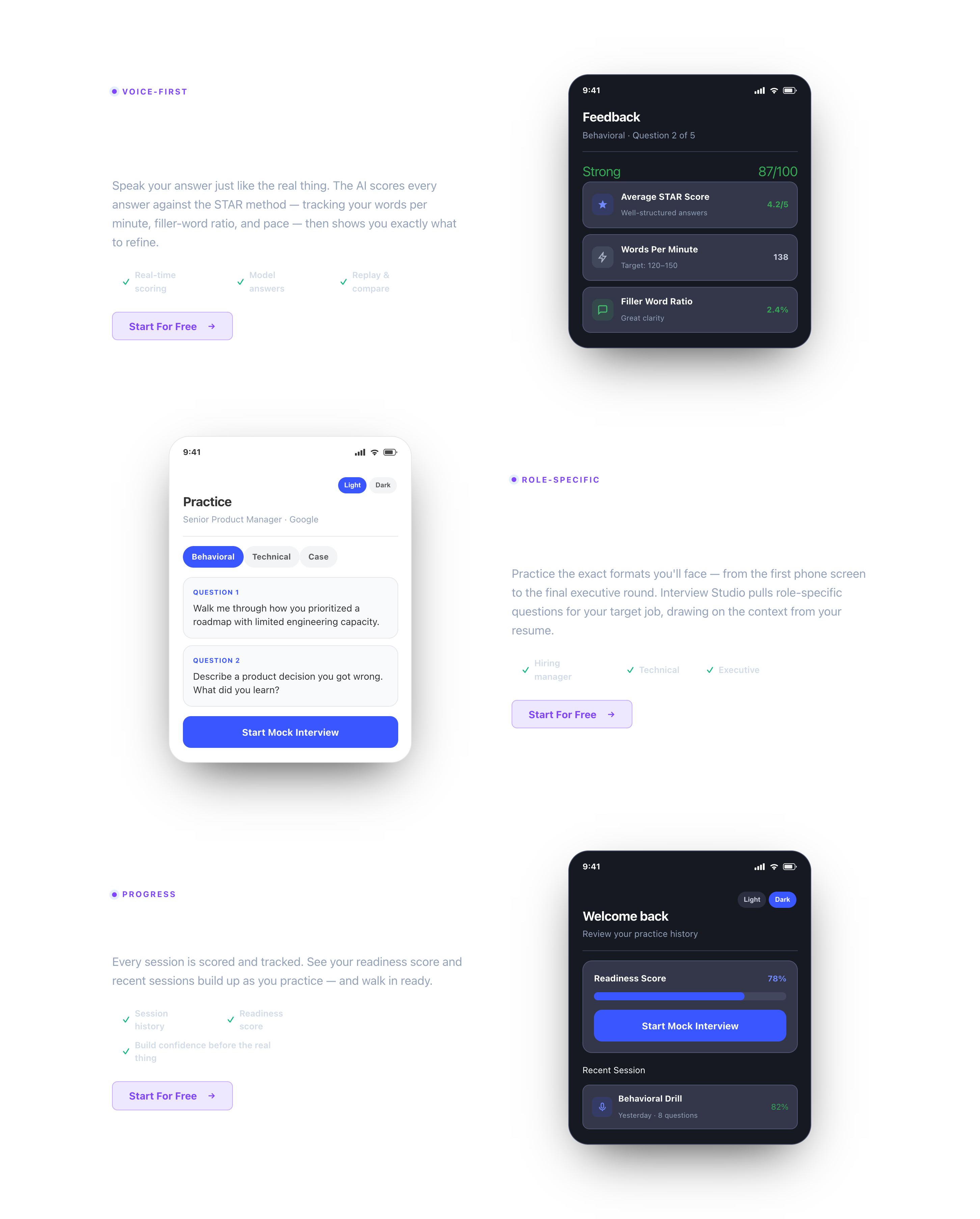
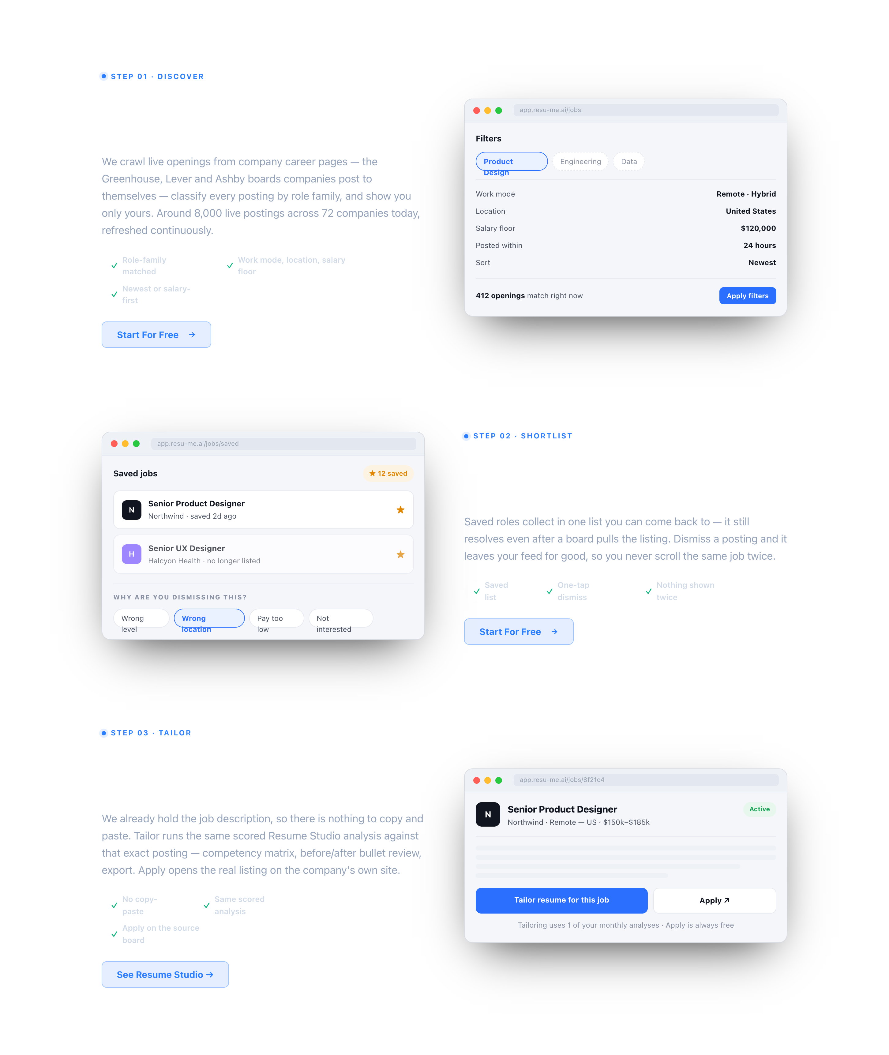
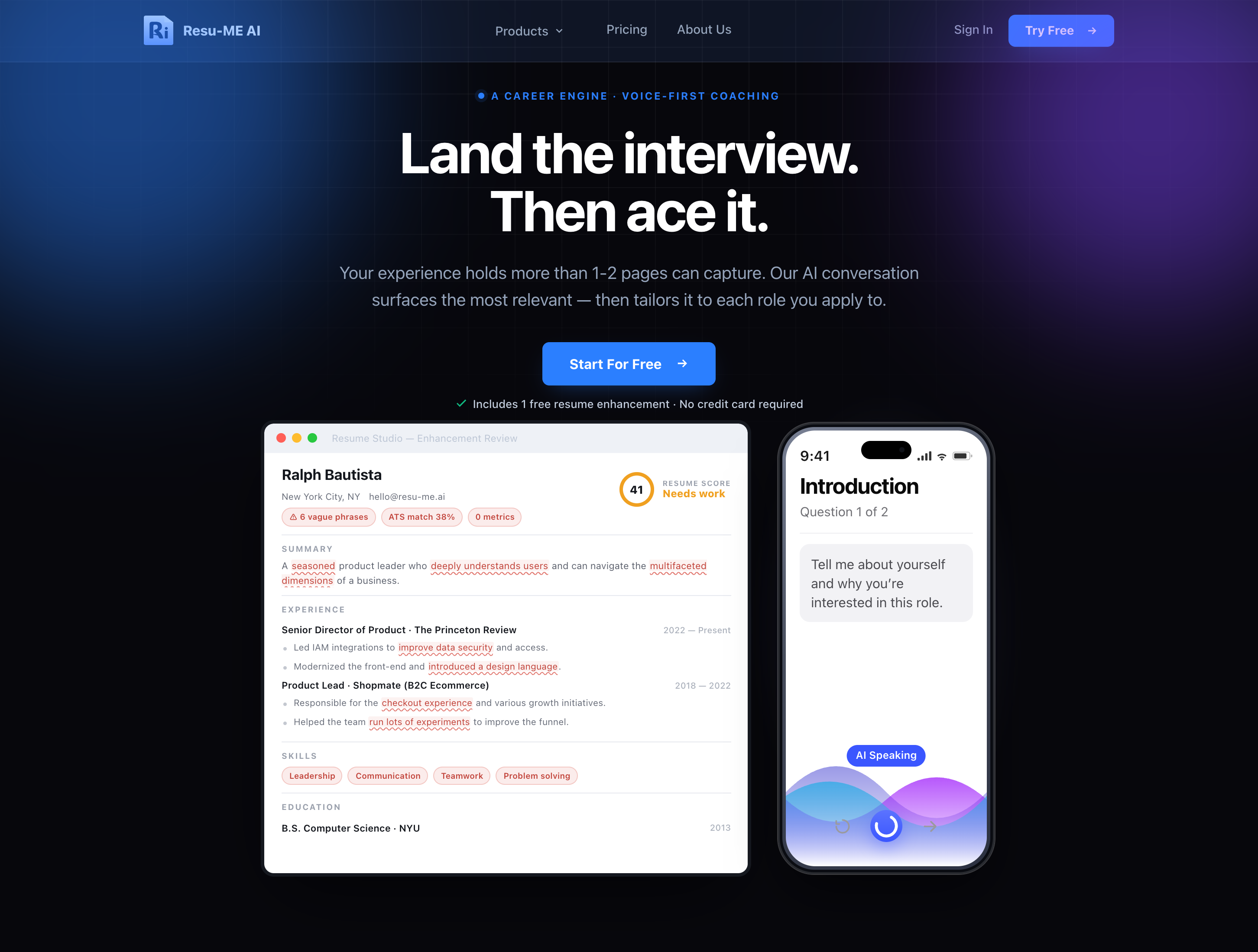
The Resu-ME AI marketing homepage on a laptop: Land the interview. Then ace it., with Start For Free and the Resume Studio and Interview Studio product shots below it

Resu-ME AI

Role: Cofounder and Head of Design · 0→1
Acquisition, conversion, onboarding
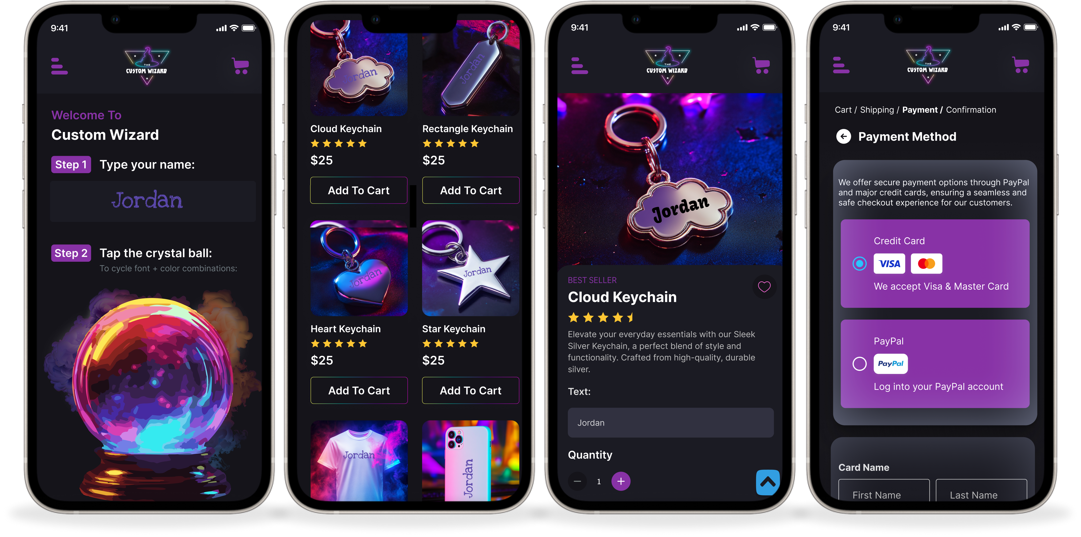
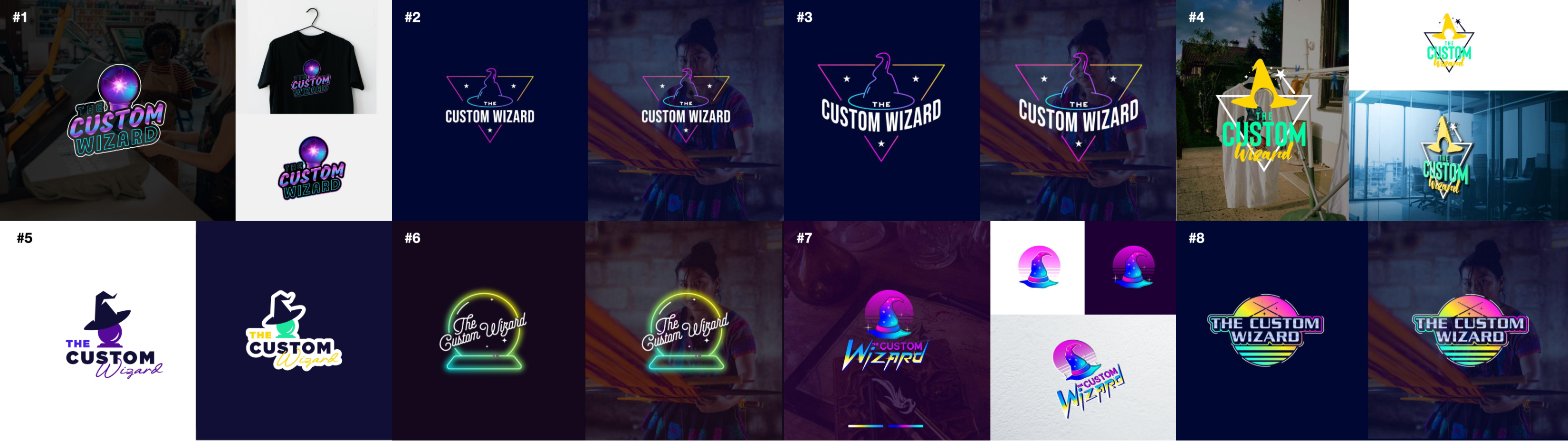
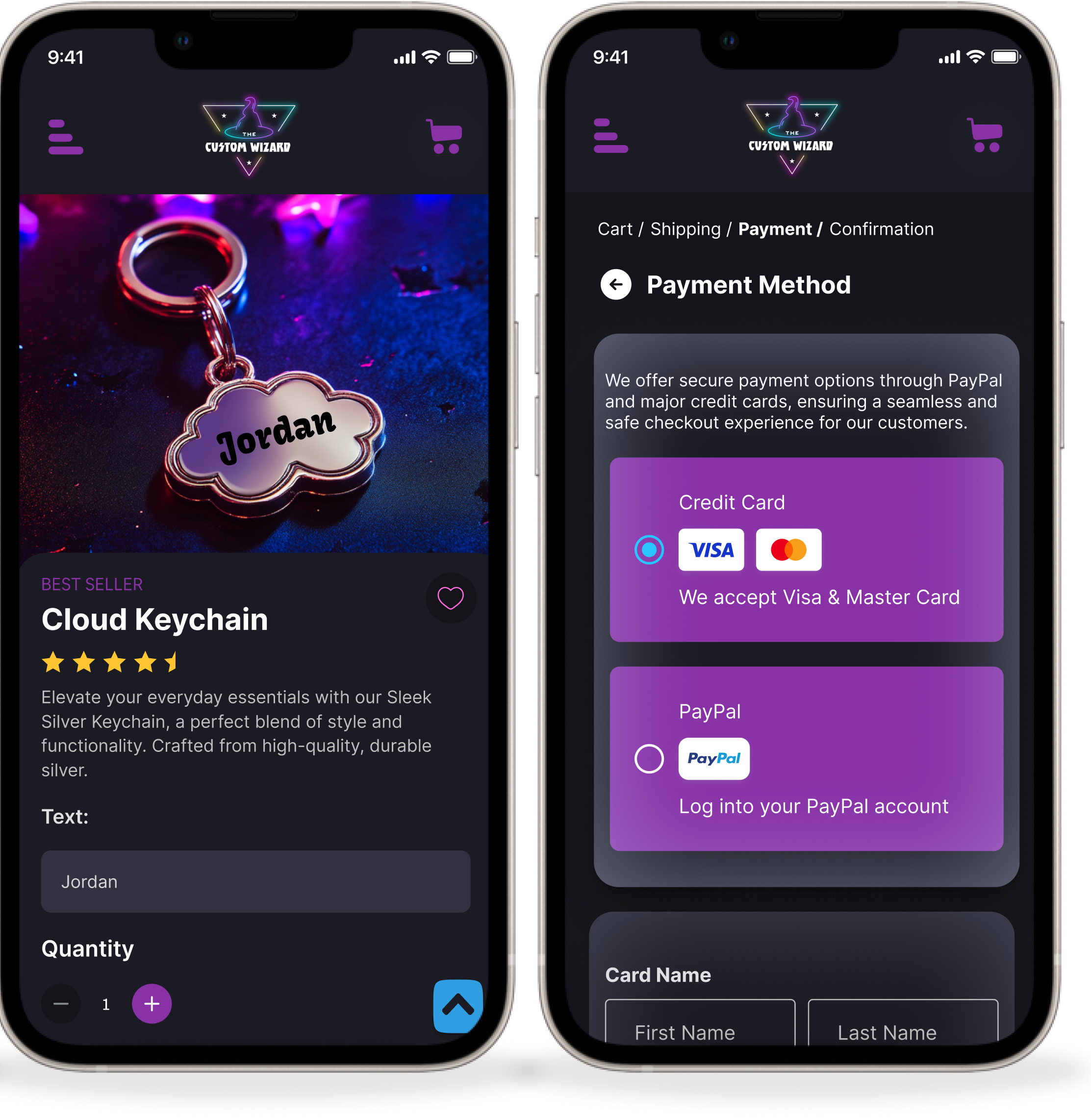
The Custom Wizard tool: type a name, tap the crystal ball, pick a product

The Custom Wizard

Role: Lead Designer, Brand + UX/UI · 0→1
{{ wizardNote }}
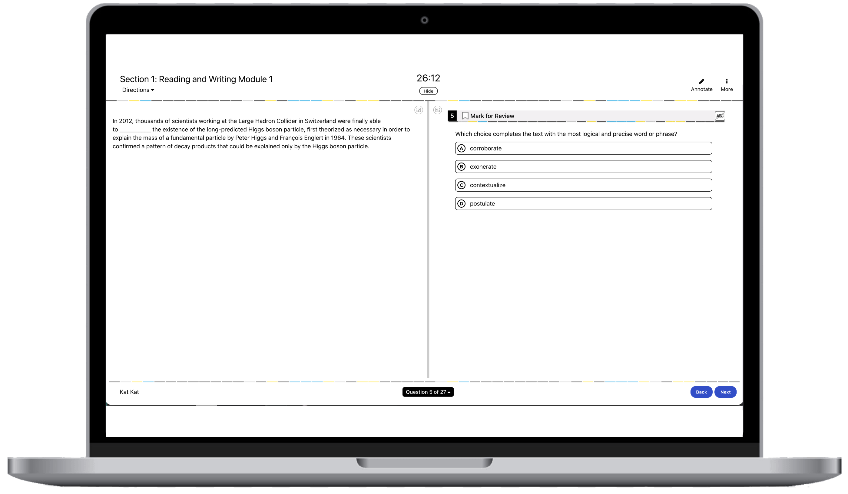
Digital SAT practice question interface

Productive Struggle

Role: UX/UI Designer
{{ struggleNote }}
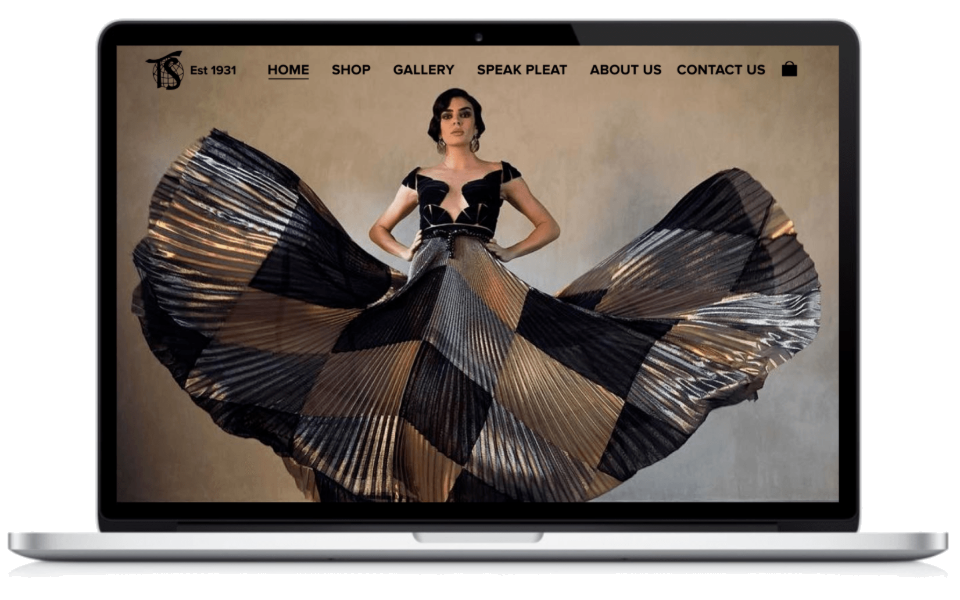
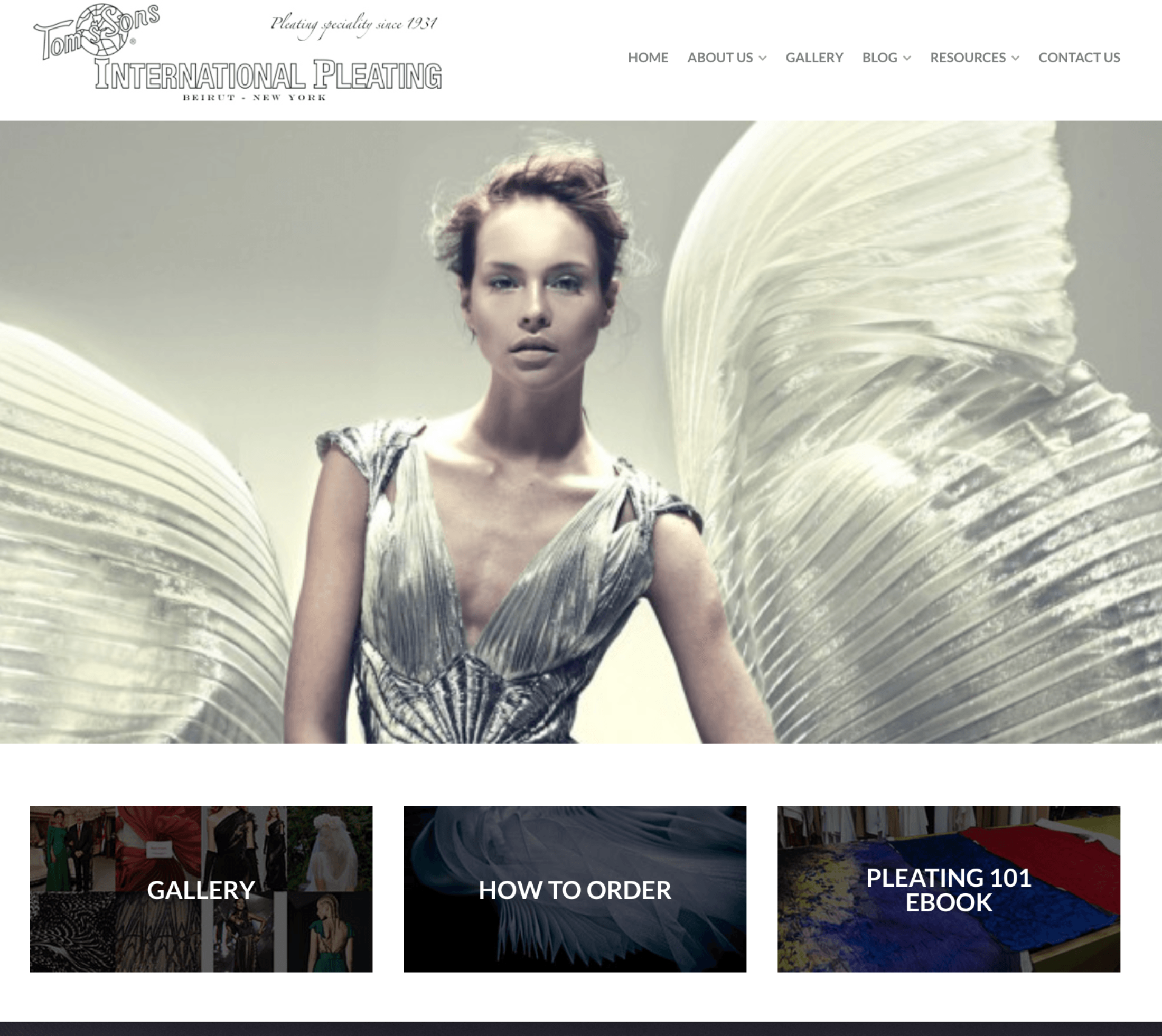
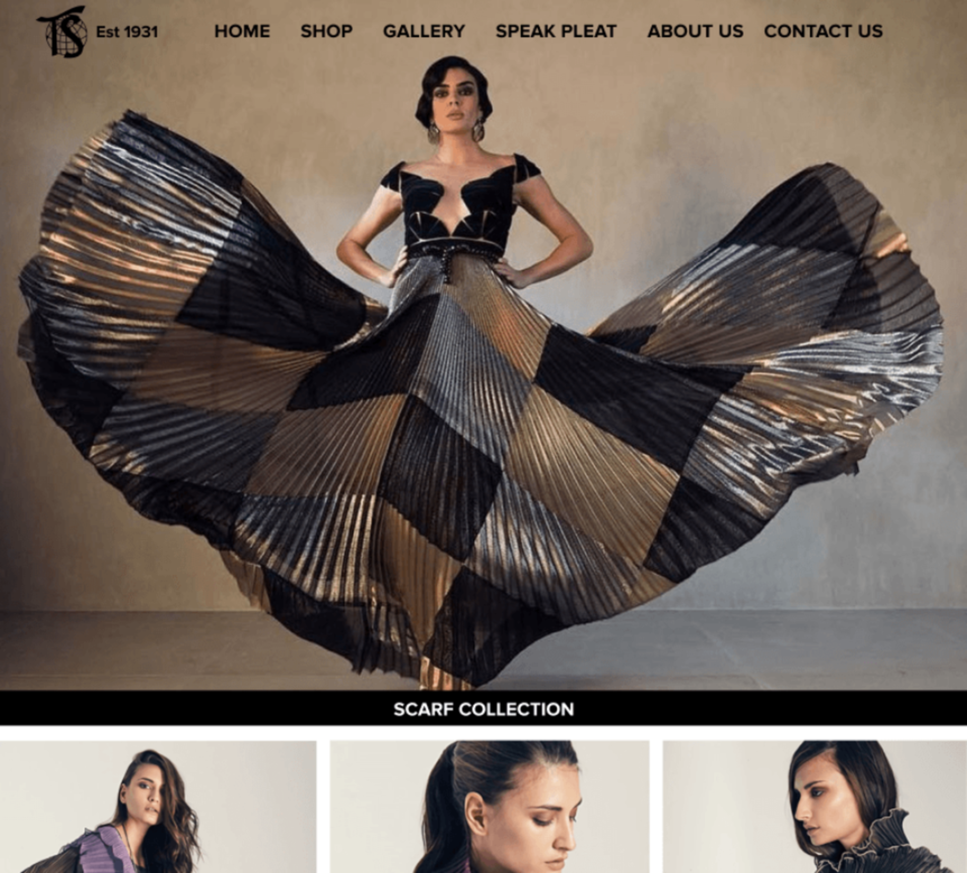
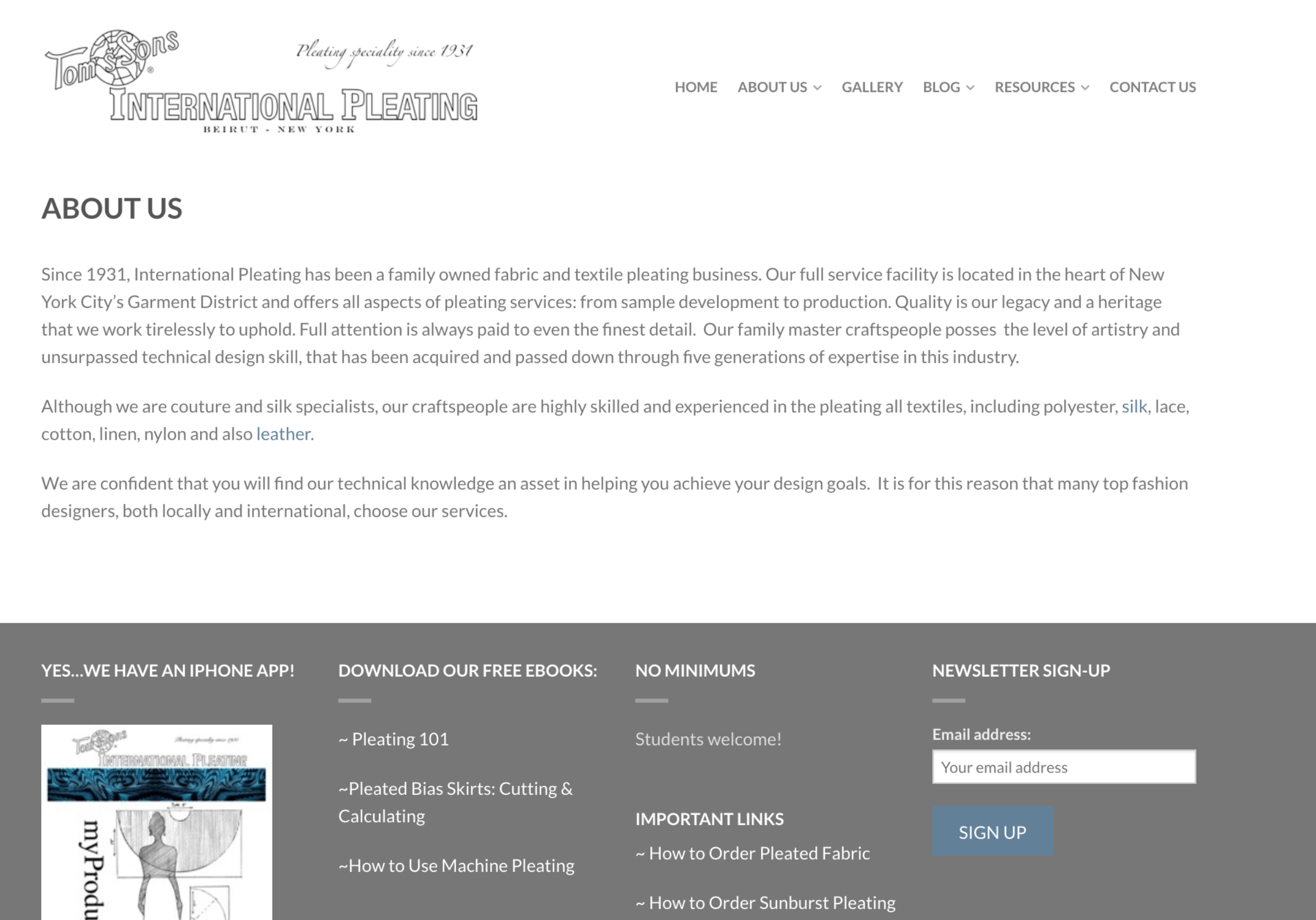
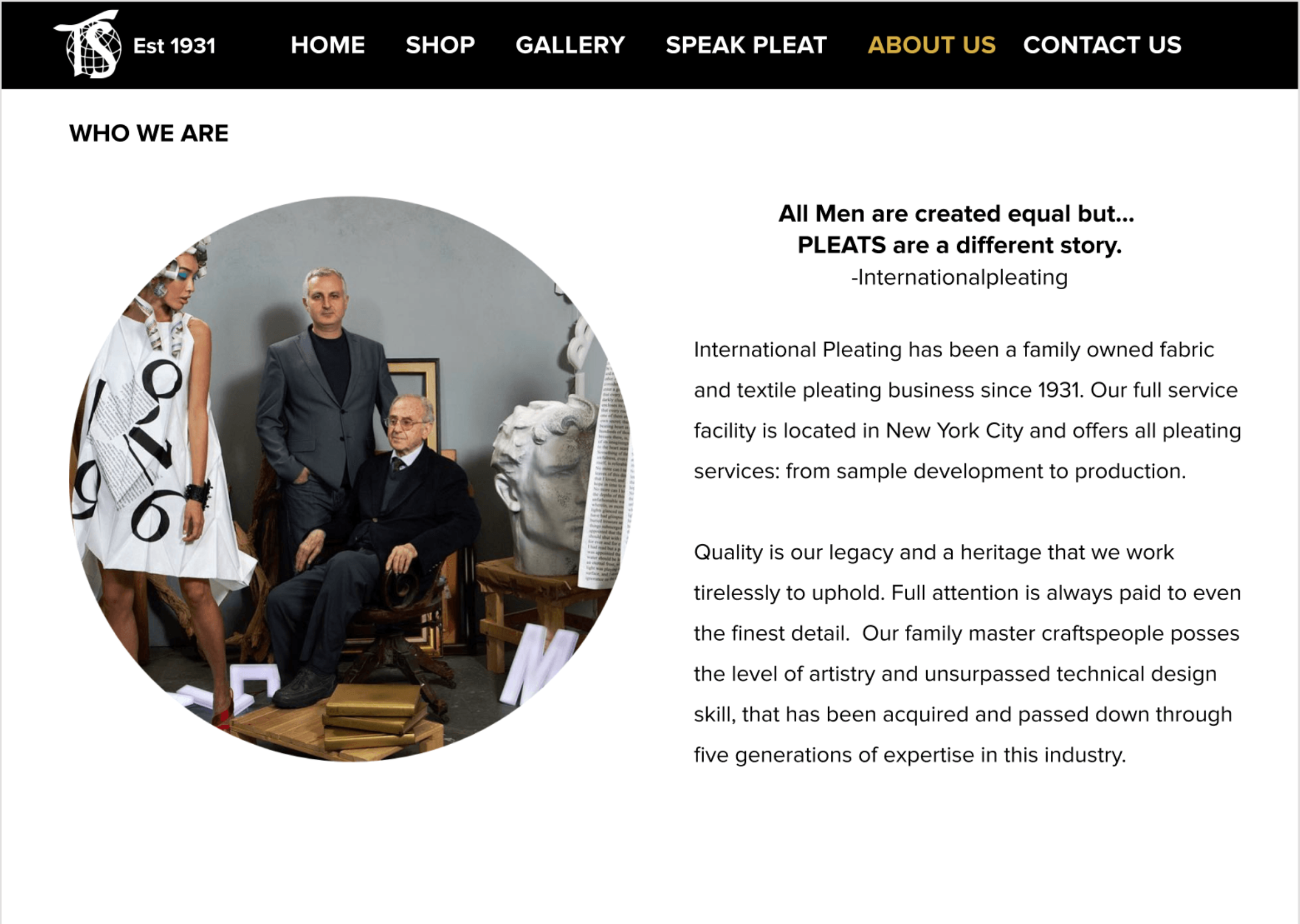
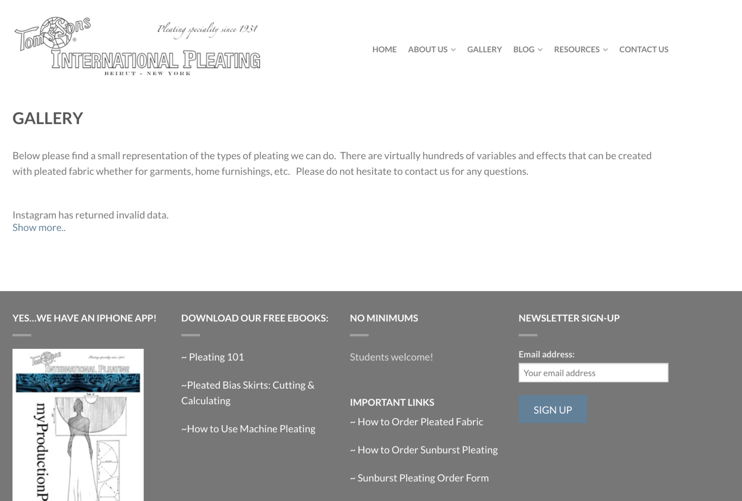
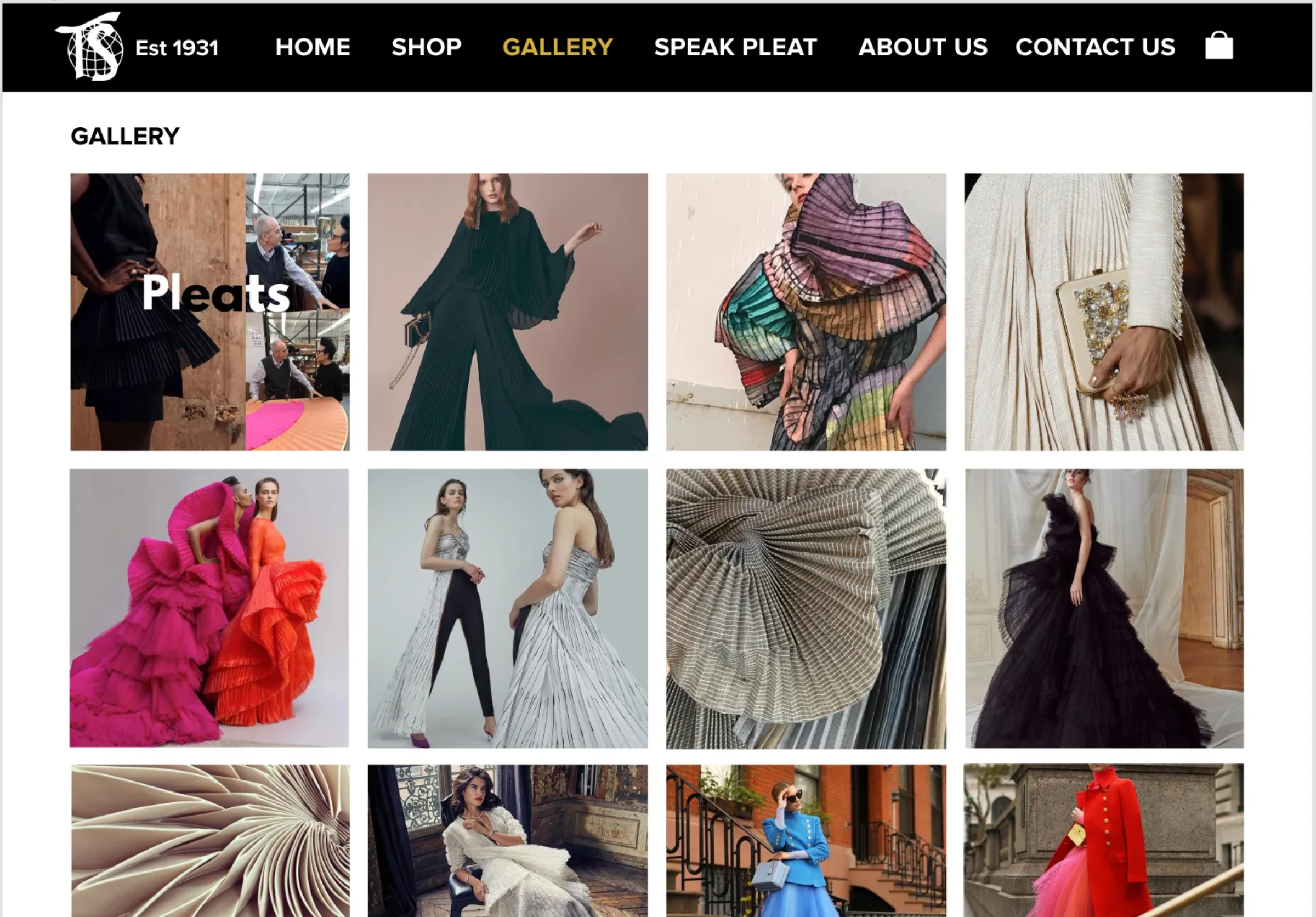
Tom's Sons International Pleating website

Tom's Sons International Pleating

Role: Researcher + Designer
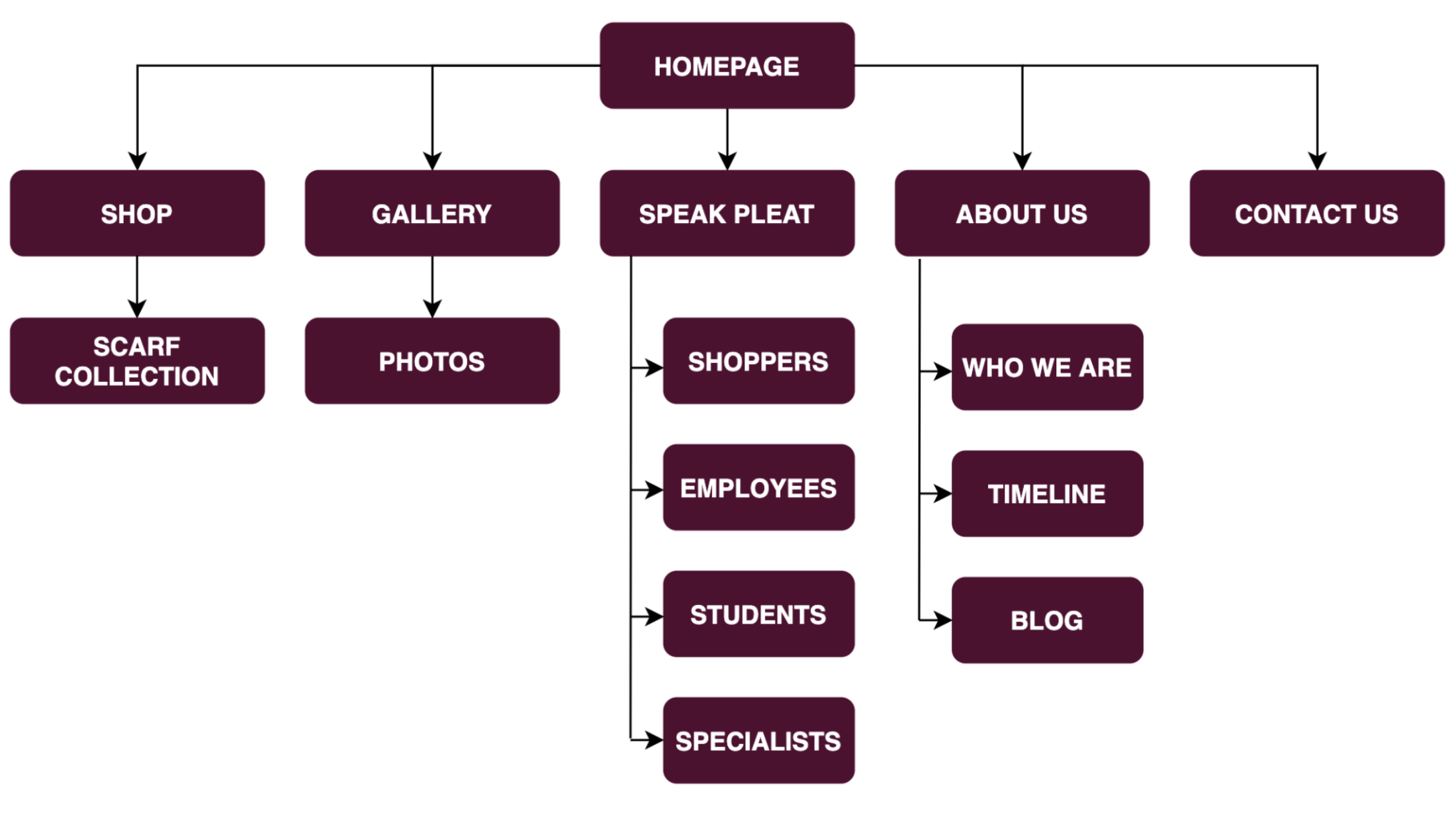
Research, IA, brand, usability testing
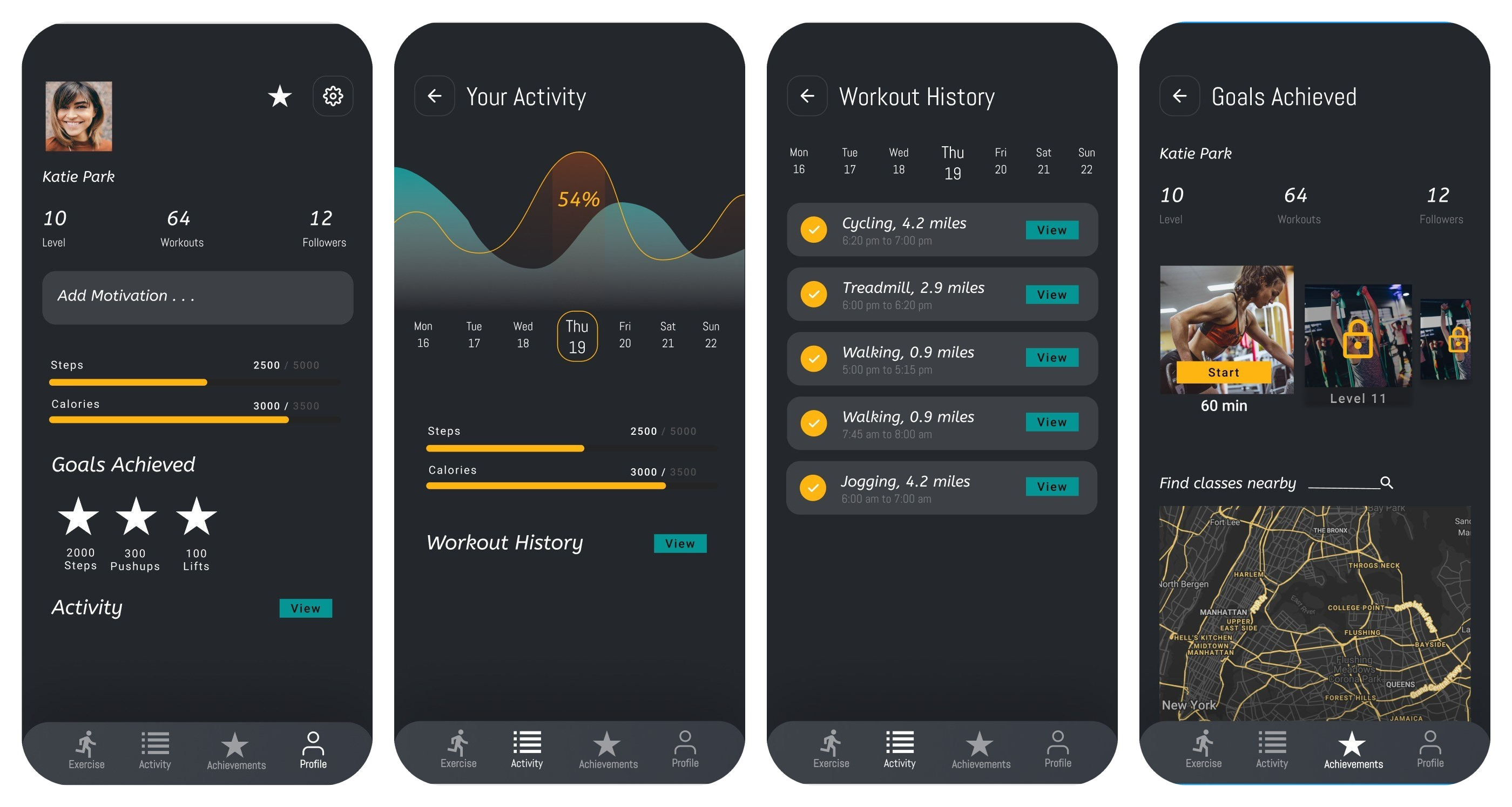
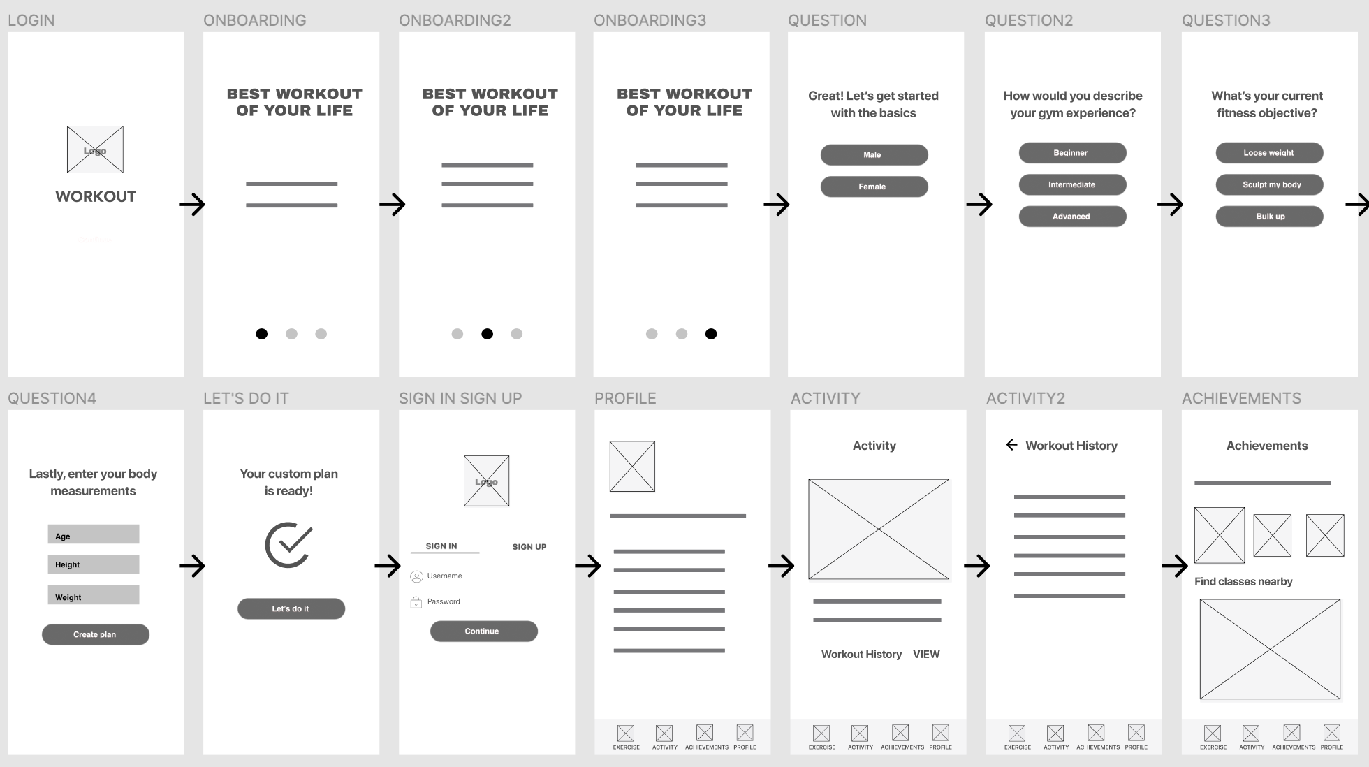
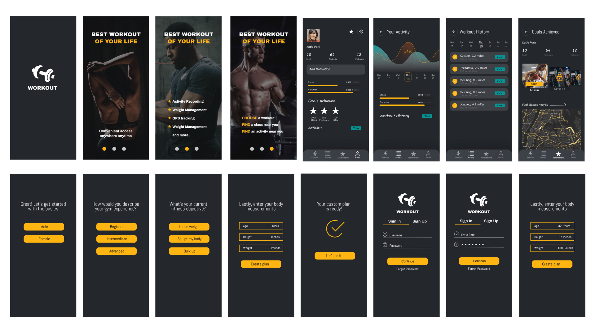
Four screens from the workout app: profile, your activity, workout history, and goals achieved

Workout App Design Challenge

Role: Research + Design + Prototype · 0→1
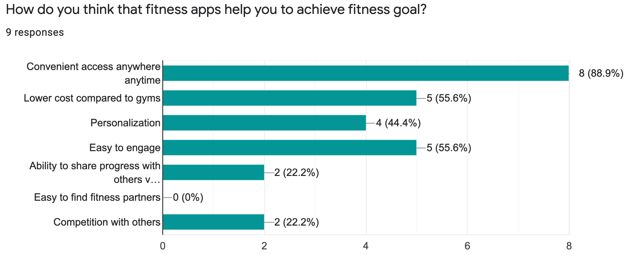
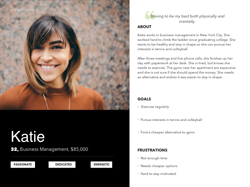
Survey research, persona, flow, screens
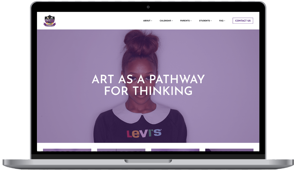
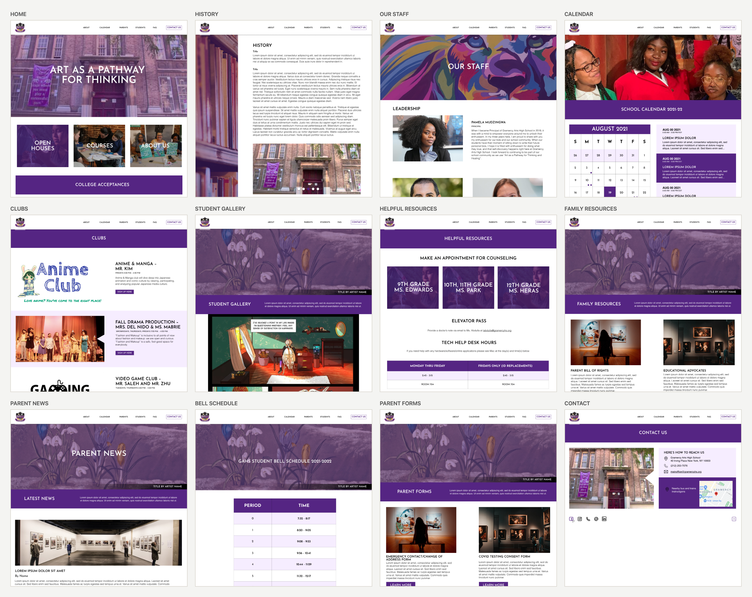
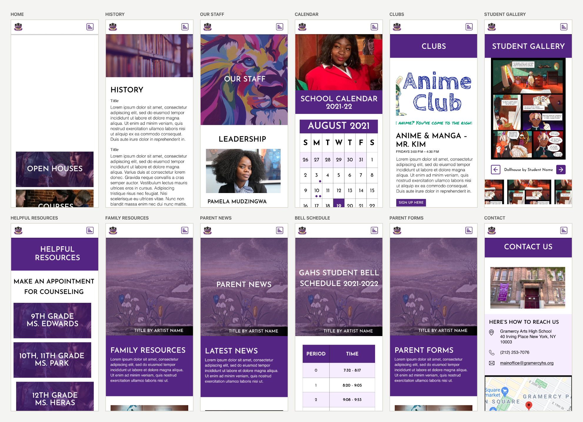
Gramercy Arts High School website

Gramercy Arts High School

Role: Researcher + Designer + Wordpress Developer
Research, IA, design, WordPress build
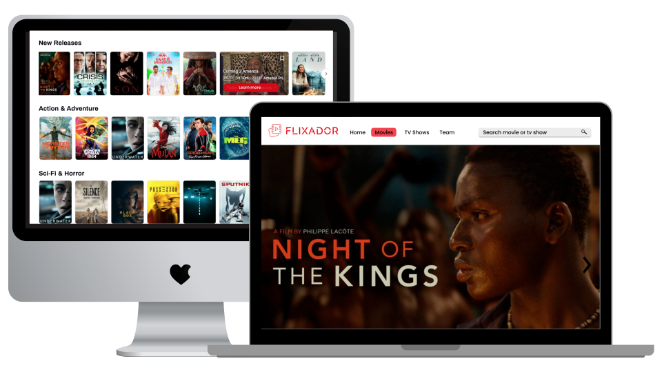
Flixador film discovery app

Flixador

Role: Designer + Developer · 0→1
flixador.netlify.app ↗

How I operate as a senior designer

Six habits, each one tied to the project where it actually mattered.

01
I own the whole problem, not the screens

On the test prep platform I ran the audit, the interviews, the design system, the copy, and defined the metrics we reported monthly. On the BMS Simulator I led the product design and implemented much of the product, including the front-end interactions, the control logic and the fault behavior underneath them. I take accountability for a problem from discovery through to what ships.

02
I check the data before I draw

Twice, checking the underlying data before designing changed what got built. On Productive Struggle I counted the questions available per topic and found the planned intervention could never have triggered for most students. On the BMS Simulator I audited a prototype and found the simulation clock was never connected to the data, so the building students were meant to diagnose had never moved.

03
I make the case, document the tradeoffs, and move forward

I wrote the case for cutting the most-requested feature on a roadmap, a progress widget that implied a promise the business could not keep, and worked the implications through with legal and operations. On another project I was overruled twice on the same decision. Rather than keep debating it, I built all three options as real pages, and carried forward the parts I had opposed.

04
I make sure what we ship can stand up to scrutiny

I removed three invented metrics from a page that was about to publish, flagged a contradiction in a client's own figures and raised it rather than quietly choosing the more flattering one, and redesigned a cost section so it stopped implying a guarantee the business could not make for every future cohort. A claim that cannot withstand scrutiny from the audience evaluating it costs more in credibility than it returns in conversion.

05
I design with engineering constraints in the room

I write implementation-ready tickets with breakpoints, states, edge cases and copy in them, and I stay in sprint planning through build so I hear what is expensive before I over-spec it. My experience working in React, Redux, HTML, CSS and WordPress gives me that judgment: where a detail is worth the cost, where it is not, and when the honest answer is to cut scope rather than negotiate it.

06
I grow the designers around me

On The Custom Wizard I mentored a recent graduate of The Knowledge House UX/UI program and gave him the checkout flow, the highest-stakes surface in the product, across three breakpoints. I set up the system first so his decisions were about the work, then critiqued against that system rather than my taste. Five years teaching design to high schoolers is where I learned the difference.

In practice

Currently looking for a senior product design role.

Education, health, or anything where someone is trying to get better at something hard. New York or remote. I'm glad to walk through the passcode protected work on a call.

This one is under wraps.

It covers unreleased product work and internal research, so it sits behind a passcode instead of out in the open. If you're a recruiter or hiring manager, I've probably already sent it to you. Check the email or the top of my resume.

No passcode? Ask me. I answer fast.

{{ err }}
Back to work
← All work
The Princeton Review logo
The Princeton Review · Confidential, please don't redistribute · 12 min read

The Princeton Review LMS

Three years on one product: six exams, five course formats, and a million students a year. The whole arc, from the first audit to the numbers we reported to the board.

My role
UX/UI designer. Research through measurement.
Team
2 PMs, 6 engineers, curriculum, data, a second designer
Dates
Jan 2023 to May 2026
Scale
1M+ learners a year, 20+ programs
Contribution
User research Moderated usability testing Information architecture Interaction design Design system Content design Product metrics definition Engineering handoff Design QA
Tools used
Figma FigJam Jira Confluence Adobe Illustrator Snowflake reports Microsoft Teams Lottie
Abstract

Between 2023 and 2026 I was the designer on a test prep platform used by more than a million students a year. Six exams and five course formats had drifted into thirty near-duplicate dashboards, and every student in a course received the same homework regardless of what their baseline test said they needed. I audited all thirty combinations, interviewed nineteen students across six exams, and rebuilt the platform on one shell and one design system. The finding that mattered most was not about layout. It was that our own vocabulary was telling students they were failing.

In short
Problem
Six exams and five course formats had drifted into thirty near-duplicate dashboards, each shipping its own vocabulary.
Users
Students studying alone between classes, and the instructors and advisors supporting them.
Discovery
An audit of all thirty configurations, separating real product gaps from years of drift.
Research
Nineteen moderated sessions across six exams against a written task rubric, plus two prototype directions.
Design
One shell, one progress model, one score-history model, and a design system behind 20+ programs.
Shipped
Ease of use held at 4.36/5 through a full navigation replacement; conversion 1.22% to 1.83% year over year.
Decision record
Goals
User: know what to study today and whether it is working. Business: lift free-to-paid conversion and keep students engaged past the midpoint of a course.
Constraints
One legacy platform shared by six exams and five course formats, release freezes during testing season, and 20+ live programs that could not break.
Iterations
Dashboard 2.0 to 3.0. Two prototype directions went to students; they preferred one's next-step hierarchy and the other's left navigation, so the shipped shell combines both.
Rejected
Keeping per-exam dashboards (it preserved the drift), and the most requested widget on the roadmap, a score prediction, because it implied a promise the business could not keep.
Edge cases
No baseline test yet, no test date picked, a test in progress versus taken versus not started, rest days in the plan, and Essentials students without live sessions.
Status
Live. The redesign is published on the Princeton Review platform.
What's on this page
1. The problem
2. How we worked
3. Discovery
4. Research
5. Synthesis
6. Wireframes
7. Design system
8. Validation
9. Build and handoff
10. Measurement
11. What came next
12. What I'd change
01

Problem

It is eleven at night and a student has an hour before they give up for the day. They open the platform, see a list of everything they have not done, and close it again. Our instructors were rated between 4.8 and 5.0 out of 5. The software was the weakest thing we sold, and it was the only part students used alone.

There were two structural reasons. First, six exams times five course formats had drifted into near duplicate dashboards with different navigation, different vocabulary and different features. We tracked parity in a spreadsheet. Nobody could answer "what does a student see" without asking which student.

Second, every student in a course got identical homework. It did not matter what their baseline test said they needed. Test prep revenue had been declining for several years and the platform experience was pulling satisfaction down with it.

02

Team and process

I sat in a squad with two product managers, six engineers, and partners in curriculum and data. My week had a rhythm: sprint planning on Thursday, a standing one to one with my PM, a working group called Dramatically Improve Test Prep, and Feature Review, where designs got argued over before they became tickets.

I was the only designer on test prep for most of it. That meant I ran my own research, wrote my own copy, specced my own breakpoints, and filed my own Jira tickets. It also meant I had to be honest about sequencing, because there was no one to hand the second priority to.

03

Discovery: product audit

Before designing anything I mapped every feature across every exam and every course format. Six exams, five formats, thirty combinations. I needed to know which differences were real product decisions and which were just drift.

Two things came out of it. Essentials courses were genuinely missing Advantage Sessions and flexible attendance, which is a roadmap problem, not a design one, so it went to the roadmap. Everything else was drift, and drift was mine to fix.

Live Online
In Person
Self-Paced
Essentials
Guaranteed
SAT
ACT
GRE
GMAT
LSAT
MCAT
Full feature set
Drifted: same capability, different nav or naming
Real gap
Not offered
Fig. 1. Feature audit across six exams and five course formats.
04

User research

We built two prototypes and put them in front of nineteen students. One was the study experience: adaptive plan, skill mastery map, content library, drills, analytics. The other was the score report: post-test analytics, question level review, an AI tutor, and practice recommendations.

Sessions were moderated against a written rubric so I could compare across exams. I ran the SAT and ACT sessions myself, in person for the SAT class, and synthesized all nineteen.

Exam Students Format What they wanted most
MCAT4Live OnlineSkill mastery map, accuracy analytics, time analysis
LSAT6Live OnlineExplanation quality, question type mastery, elimination logic
SAT6In-person classCustomizable plan, test countdown, readable explanations
GMAT1Live OnlineOne dashboard instead of four places
GRE1Self-pacedPacing: where did my time go
ACT1Live OnlineRealistic practice, clear daily structure
Fig. 2. Participant distribution, Q1 2026 study.

Three students, in their own terms

David, targeting 1500

Thirty minutes on weekdays, up to two hours at weekends. Full practice tests felt too long. He wanted one question per format instead of five repetitive ones, the real Desmos calculator built in, and equations shown under the prompt. He liked streaks because they felt like Duolingo. He said using a hint should not count as fully correct, and suggested partial credit based on how many hints you used.

Pedro, targeting 1400

Around twelve hours a week. He could not annotate or take notes on our content, and could not flag a lesson to come back to. He did not want the answer inside a hint. He wanted to finish the whole drill first, then see the correct answers and explanations together.

Eva, targeting 1250, hoping for 1400

Thirty minutes to an hour a day, chosen by energy level. Maths when tired, never reading. Highlighting and note taking kept her focused. She wanted to block out days she could not study and set her own study times. She tried to click into section progress on the study plan to reach the lesson behind it, and it was not clickable: a false affordance in the most-trafficked component on the page.

05

Synthesis and insights

1
Tell me what to study next

Not more content. Direction. Reducing the decision a tired student has to make at eleven at night was the highest value thing we could do.

2
Practice has to come from my weak areas

Students wanted a button on a weak topic that produced a drill. Analytics that did not lead anywhere read as decoration.

3
Our vocabulary was failing

"Not Ready" read as a verdict on the student. Nobody could tell mastery from completion, or baseline from projected score. Students could not explain how a mastery percentage was calculated, so they did not trust it.

4
Explanations were the product

Students wanted to know why the wrong answers were wrong, not just why the right one was right. LSAT and MCAT students were already pasting our questions into outside AI tools to get that. We owned the moment of confusion and were handing it away.

5
Study time is not evenly available

Every student asked for some version of the same thing: let me block out the days I cannot study, and let me set my own hours.

I turned those into the definition work: a single navigation model, one progress model, one score history model, and a terminology system with a rule behind it. Describe the work, not the person, and show the evidence behind any claim. Where we could not show evidence, we removed the claim.

Renaming, after research
Not Ready
→
Haven't started
Mastered
→
Strong, 8 of 9 right
Projected score
→
Your last test: 1390
Low yield
→
Rarely on the test

LSAT students specifically told us they did not know what "low yield" meant.

Copy test, five students
"To begin, take Test 1 (Baseline Test)…"
0%
"To get started, take Test 1 (Baseline Test)…"
100%

A small thing, but it is the first sentence a student reads in the product. I polled the team and shipped the second one.

06

Wireframes and prototypes

I built a sitemap, then onboarding and study settings wireframes, then two full prototype directions. Prototype 1 put next steps front and center. Prototype 2 was denser and used a left hand navigation.

Students split. They preferred Prototype 1's hierarchy and said Prototype 2 felt cluttered, but they preferred Prototype 2's left hand navigation. So we shipped the combination rather than picking a winner. The prototypes were a way to ask a question, not two proposals to choose between.

Below is where the 3.0 shell landed. One left navigation that stays the same whether you are studying for the MCAT or the SAT, one progress model, one score history, and a Today block that says what to do and why.

Two screens carry the decision the whole redesign turns on. The same student, the same week of work, in the two modes the shell supports.

Planner off is a sequence: the next class at the top, then lessons, then required homework, then extra practice. It answers what do I do next. Planner on is a calendar: the same items distributed across named days, with rest days the student chose and personalized drills that unlock after the next practice test. It answers when am I doing it. Interviews split cleanly on which of those two questions a student was asking, so rather than pick a winner I made it a toggle, and wrote the toggle copy to promise that switching loses nothing.

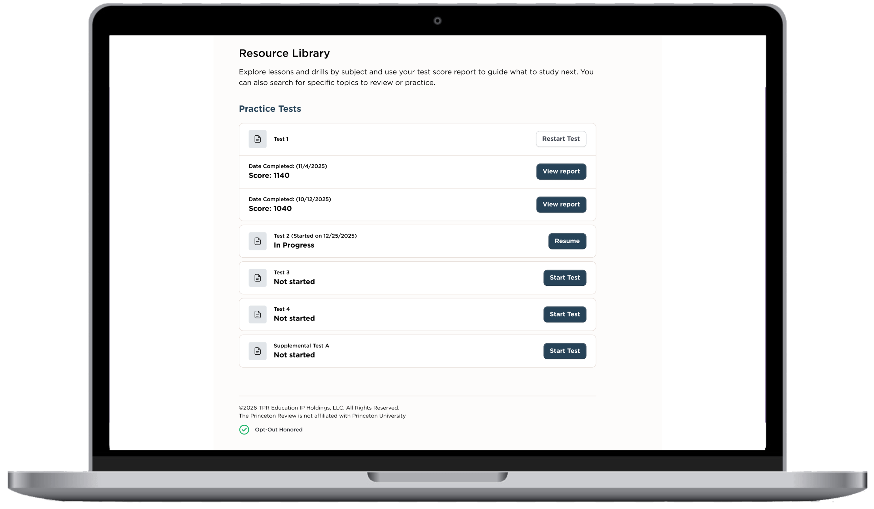
Resource Library: practice tests with completion dates, scores, and view report actions
Fig. 3. Resource Library: practice tests with completion dates, scores, and view report actions.
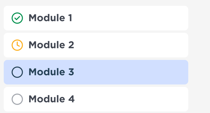
Module list showing complete, in progress, current and not started states
Fig. 4. Module states. Four states, each carrying an icon and a label rather than color alone: done, in progress, where you are now, and not started.
Digital SAT test interface: split passage and question, timer, annotate, mark for review, and question navigator
Fig. 5. The practice test environment. It has to mirror the real exam exactly: the timer, the hide control, annotate, mark for review, and the question navigator at the bottom. Students told us a practice environment that differs from the real one is worse than no practice at all.
07

Design system

Twenty-plus programs ran on one component library: navigation, progress, cards, drill states, score reports, empty states, light and dark mode. Dark mode mattered more than it sounds. A significant share of this studying happens at night.

The library is what turned feature parity across six exams and five course formats into a maintenance job rather than a rebuild. When a component changed it changed everywhere, and the parity spreadsheet stopped being the only answer to what a student actually sees.

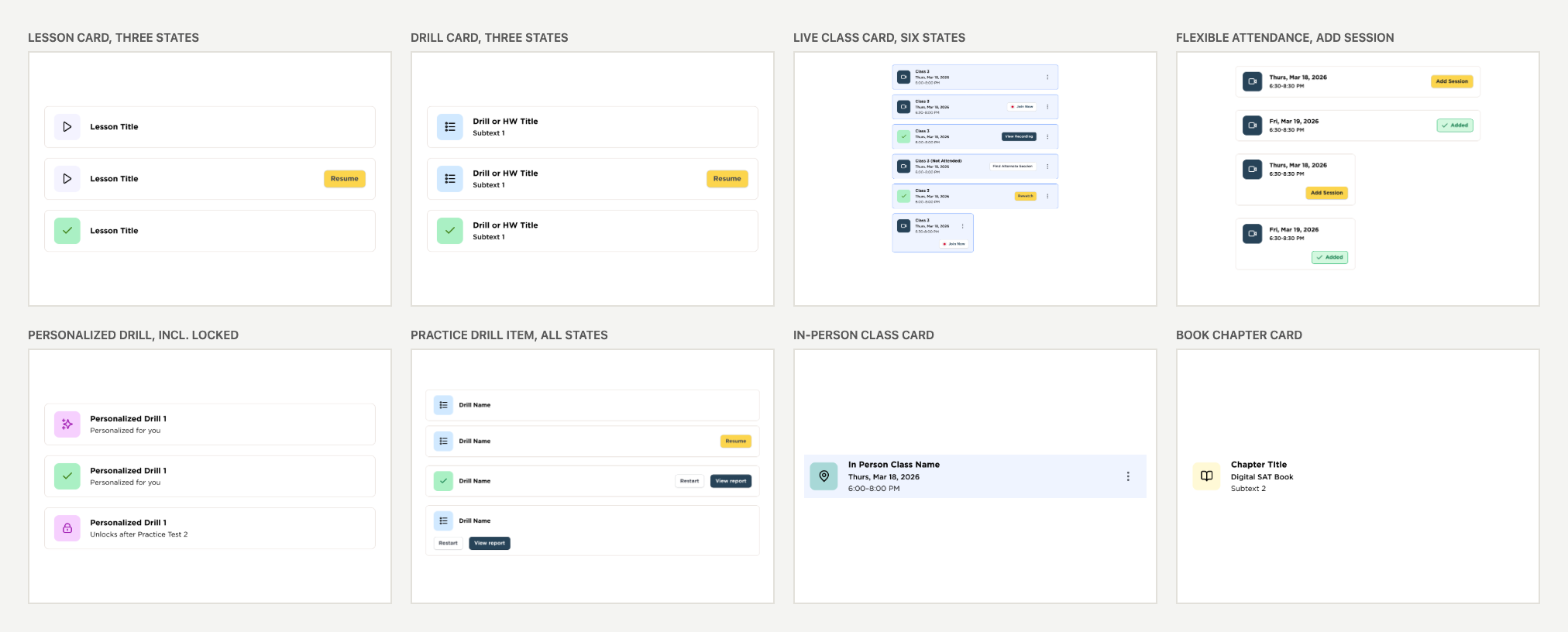
The library is not a swatch page. Every component below is specified with all of its states, because the states are where a learning platform actually lives: a class that is upcoming, live, attended, missed or rewatchable is five different pieces of copy and five different actions on the same card.

Three rules held it together. Status is never carried by color alone, so every state pairs a hue with an icon and a label. Activity type is carried by a single icon container whose fill identifies the kind of work, which is what let one card component serve lessons, drills, classes, books and personalized work. And every empty state is written, not defaulted, because a student who has taken no practice tests yet is the most fragile user on the platform.

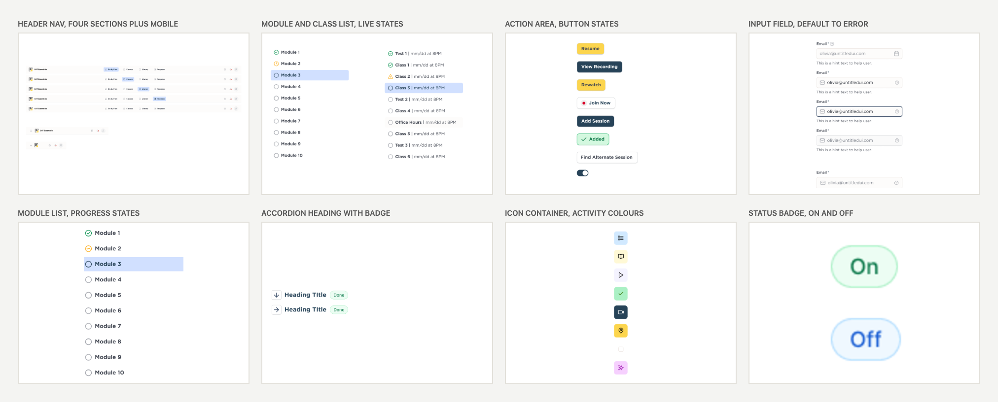
Design system foundations: header nav with four sections plus mobile, module and class list, action area button states, input field states, module list, accordion heading with badge, icon container colours, status badge
Fig. 6. Foundations. Navigation, controls and form states, specified once and reused across six exams and five course formats.
Activity card components: lesson, drill, live class with six states, flexible attendance session picker, personalized drill including a locked state, practice drill item, in-person class and book chapter cards
Fig. 7. One card component, every activity type. Lesson, drill, live class, in-person class, book chapter and personalized work, each with the states the product actually produces.
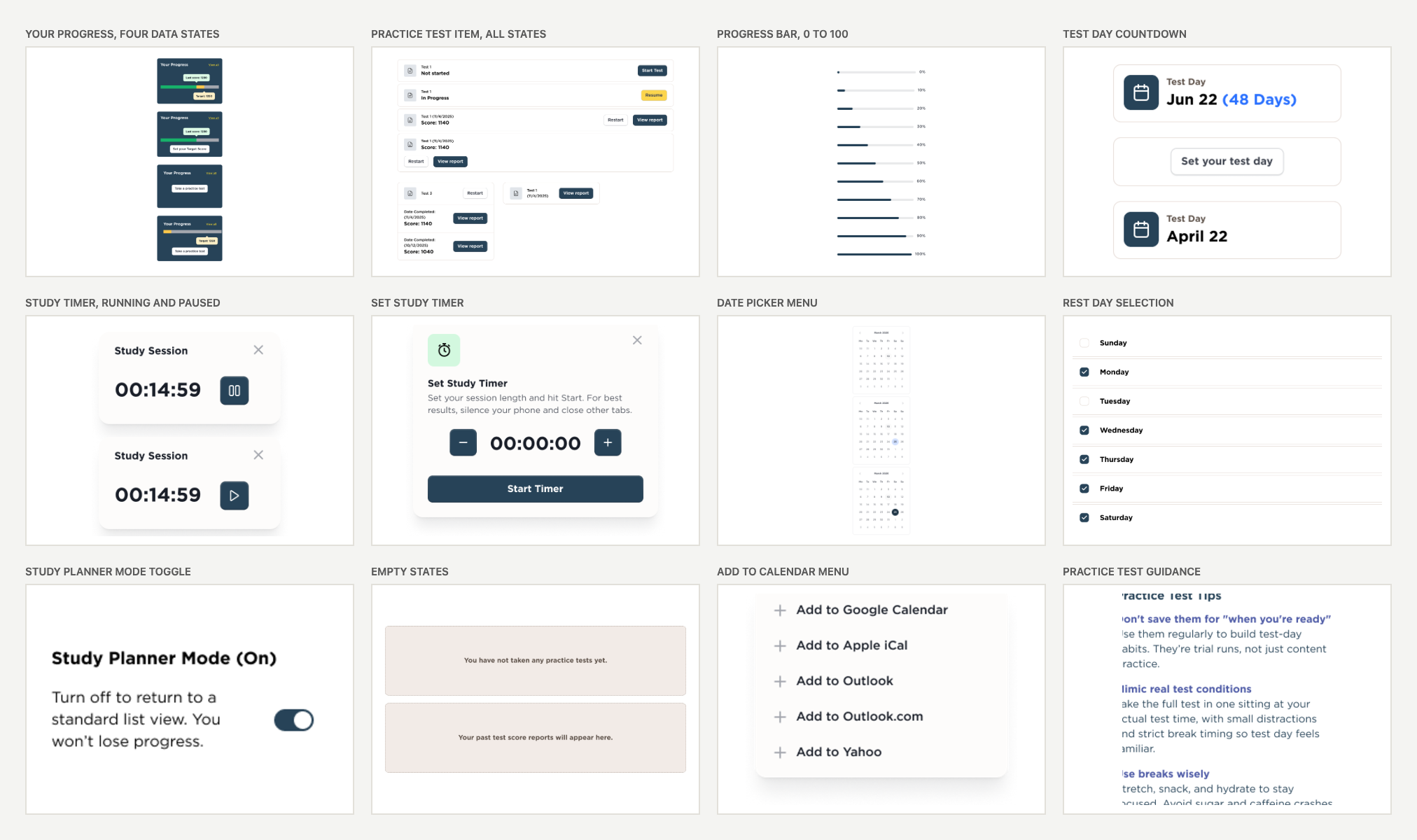
Progress and feedback components: your progress card in four data states, practice test item, progress bar from zero to one hundred, test day countdown, study timer, date picker, rest day selection, study planner toggle, empty states and the add to calendar menu
Fig. 8. Progress and feedback. The four data states on the progress card matter most: no test taken, no target set, one of each, and both.

The component nobody asks you to spec

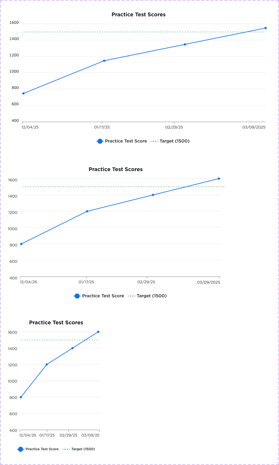
A student's practice test history is the only place they find out whether any of this is working. Ours was a table. I specced it as a chart with the target score drawn as a line, at three widths down to 375px, including what happens to the axis labels and the legend when there is no room for either.

The target line matters more than the trend. Score progression is not linear and a flat month is normal. Without the goal drawn on the same chart, a flat month looks like failure.

Score history chart specified at desktop, tablet and mobile widths against a target line
Fig. 9. Score history chart at three breakpoints.
08

Validation and scope cuts

Usability sessions ran against a written rubric, one document per participant, so findings could be compared rather than remembered. Feedback overall was that students liked the adaptiveness and wanted more control over it: more blocked out days, more study hours, clearer copy.

The decision I am proudest of is a subtraction. The guarantee progress widget showed whether a student was on track to qualify for our score guarantee. It was the loudest request on the roadmap. It also implied a promise the business could not make at the level of an individual student, and it sat on eligibility rules that legal was rewriting.

A progress ring that implies "you're covered" is not a feature. It is a promise the business has to keep.

I wrote the case, took it through product, legal and operations, and it was cut from the new dashboard. What went in instead was a plain statement of what the student had completed and what was outstanding, with a link to the actual terms.

09

Engineering handoff

Designs went into Jira as tickets I wrote, with breakpoints, states, empty states and copy in the ticket rather than in a comment thread. I sat in sprint planning so I could hear what was expensive before I specced more of it.

Smaller pieces shipped alongside the big ones. A Desmos calculator header, because students told us the practice environment had to match the real exam. Flexible attendance, which started as a baseline analysis of who was actually attending. Account settings behavior, which reads as trivial until you have to decide whether it opens in a new tab or replaces the dashboard context.

10

Success metrics

I worked with data to define the product metrics we reported monthly, framed on HEART and chosen for signal clarity rather than completeness. Four metrics, each with a written definition, a data source, and its caveats, because a number without caveats gets misread in a board deck.

Figures below are April 2026, the last full month before I left.

Signal Metric Apr 2026 What it tells us
HappinessPlatform ease of use, 1 to 54.36Held flat through a full navigation replacement. 439 respondents.
EngagementCompleted 80%+ of content83.0%Separates logging in from doing the work. 2,825 students.
AdoptionFree to paid conversion1.49%Year on year the rate went 1.22% to 1.83%, up 0.61pp.
RetentionMid program drop-off35.6%New definition: 2 of 3 signals down more than 25% between halves.
Fig. 10. The four metrics, as reported monthly.

The retention metric is the one I would point at. Before it existed, the team found out a student had disengaged when the course ended. Defining disengagement as a combination of three signals, declining test scores, low attendance and low content use, meant we could see it happening at the halfway point and still do something.

11

Business impact

Four metrics, three commercial levers. Worth stating explicitly, because two of them read as satisfaction numbers and are really revenue and cost.

Revenue

Free to paid conversion is the only metric here that is directly money, and it moved from 1.22% to 1.83% year over year. On a base of more than a million annual learners, 0.61pp is a material lift, and the trial and practice-test journeys I designed sit directly in that funnel. I would not claim sole causation: pricing, marketing and curriculum all moved in the same period, so the honest framing is that design was one contributor to a measurable commercial result.

Retention

The disengagement definition changed when intervention was possible, from after a course ended to the halfway point. Every student caught at the midpoint is a completion the business keeps and a refund conversation it avoids. 35.6% of students were hitting that threshold, which is the size of the addressable problem, not a vanity figure.

Cost to deliver

One design system behind 20+ programs, replacing a parity spreadsheet and thirty near-duplicate dashboards. Six product teams stopped re-solving the same components, which is engineering time returned to roadmap work. It also meant a sitewide change, like the score-history chart, shipped once instead of thirty times.

Risk

Ease of use held at 4.36/5 through a complete navigation replacement. The commercial read on a flat satisfaction number is that a large redesign shipped without a support-cost spike or a churn event, which is the outcome a business actually buys when it funds a rebuild.

12

Iterations and other work

The dashboard was the spine, but it was never the only thing on my plate. This is the full list, roughly in order.

Workstream When Where it got to
Cross-product design system, 20+ programs2023 to 2026Shipped, maintained
Dashboard 2.0, consolidation2024 to 2025Shipped
Dashboard 3.0 and SAT Self-Paced personalization2025 to 2026In build at handover
Score report redesign and focus areas
9 SAT students: 7 in person at the NYC center, 2 self-paced. 1:1 interviews plus prototype testing. Rebuilt around four mistake patterns: misreading, concept gaps, strategy errors, pacing.
Feb to Apr 2026Presented at Feature Review, 13 Apr
Free trial experience, aimed at conversionMar to Apr 2026Concept delivered in two weeks, presented 15 Apr
Productive struggle discoveryMar to May 2026Concept accepted, own case study
Flexible attendanceFeb to Apr 2026Baseline analysis, then shipped
Post free-practice-test experienceFeb 2026Designs per test type, partner led
Desmos calculator headerFeb 2026Shipped
Product metrics definitions and monthly report2026Live, feeding the monthly business review
Light and dark mode, feature parity across course types2025 to 2026Shipped
Fig. 11. Every workstream I owned, and where each one shipped.
13

Retrospective

Ship the words before the features. The terminology fixes cost nothing to build and unblocked comprehension of everything downstream. We sequenced them late because they looked like polish. Two quarters of research kept rediscovering the same confusion we could have removed in a sprint.

I should have pulled the item bank counts at the start of 3.0 instead of partway through. It would have changed the shape of the personalization work from the first week. That is exactly what happened on the next project.

And I was the only designer on test prep for too long without saying so clearly enough. I learned to document the tradeoff in writing, with dates, rather than absorb it silently.

Next case studyBMS Simulator →
← All work
The Princeton Review logo
The Princeton Review · Confidential, unreleased · 9 min read

Productive Struggle

What should the product do the moment a student gets stuck? And the data problem I found that would have stopped it from ever happening.

My role
UX/UI designer. Discovery lead.
Partners
Learning design and psychometrics consultants, PM, curriculum
Dates
Mar to May 2026
Inputs
13-instructor survey, 19 student interviews, item bank audit
Contribution
Instructor survey Student interviews Content and item-bank audit Concept design Interaction design Stakeholder validation
Tools used
Figma FigJam Jira
Abstract

An adaptive engine can decide what a student should study next. It cannot decide what to do in the seconds after they get something wrong four times in a row. I led discovery on that gap, working from an instructor survey and nineteen student interviews. Before designing anything I counted the questions available per topic, and found that the intervention the team had planned could never have fired for most students. The design that shipped triggers on patterns across a whole domain instead, and asks the student to name their own mistake before the platform explains it.

In short
Problem
The adaptive engine could choose what to study next, but not what to do the moment a student kept getting it wrong.
Users
Students stuck mid-drill, and the instructors who normally catch that in a classroom.
Discovery
Counting the item bank per topic showed the planned trigger could never have fired for most students.
Research
An instructor survey and nineteen student interviews, synthesized before any screen was drawn.
Design
Triggers on mistake patterns across a domain, and the student names their own error before the platform explains it.
Status
Approved design, in development at handover. Discovery only, so no post-launch metrics.
Decision record
Goals
User: recover after repeated mistakes instead of quitting the session. Business: stop adaptive sessions from ending in abandonment.
Constraints
A thin item bank per topic, and a hard rule that the intervention could never give the answer away.
Iterations
The planned trigger fired per topic. Counting the item bank showed it could never fire for most students, so the trigger moved to mistake patterns across a domain.
Rejected
Per-topic triggering, and explaining the error before the student names it, because it removed the reflection that makes the struggle productive.
Edge cases
A topic with a single question, a student who skips the reflection prompt, and prompts firing often enough to become noise.
Status
Not shipped. Approved design, in development at handover. No post-launch metrics.
01

Problem framing

A student misses the same kind of question four times in a row, and the platform serves them a fifth. That was the moment I was asked to design for. The company was moving from one-size-fits-all homework to a milestone driven adaptive pathway. A student takes a full length baseline test. The system puts them in a score quartile per section. The lower two quartiles get a plan weighted towards remedial content, the upper two get harder practice. Every later full length test recalibrates. Inside a plan, routing uses a priority score that weighs how hard a question is against how many points that topic is worth on the real exam.

It is a good model. It also answers a question no student asks. A student does not want to know their quartile. They want to know what to do about the fact that they just missed the same kind of question four times in a row.

My scope was the layer the algorithm could not specify: the seconds after we detect that someone is stuck. Instructors called it productive struggle. I had to turn it into a trigger, a screen, and a piece of data the router could use.

The routing model, and where my layer sits
Step 1
Baseline full length
Mirrors the real exam. Produces a score report and an item level record.
Step 2
Quartile, per section
Q1 and Q2 weighted to remediation, Q3 and Q4 to hard practice. Never shown to the student.
Step 3
Hybrid plan
A short universal post-class drill, then adaptive routing by priority score.
My layer
Pattern, reflect, route
Detect a failure cycle, hold the explanation behind self-diagnosis, feed the diagnosis back into routing.
Step 4
Recalibrate
The next full length regroups the student and rewrites the plan.
Fig. 1. The adaptive model, with my intervention inserted between routing and content.
02

Key design decisions

Decision 1

Match between system and the real world

Performance tiers are a good routing input and a bad interface. Telling a sixteen year old they are in the bottom quartile does the opposite of what the system exists to do. Our own research had already shown this in miniature. A topic labeled "Not Ready" was read as a statement about the student.

So the student never sees the tier. They see the plan and the reason for it, in the smallest true unit. Linear equations, twenty minutes, because you missed four of six on Test 2. Same information, addressed to the work rather than the person.

Decision 2

The obvious trigger could never have fired

The plan of record was to trigger the intervention on repeated mistakes inside a single assessment objective, the sub-sub-topic level. Before designing the screen I pulled the item counts per objective.

Assessment objective Items Can a repeated-mistake pattern form?
Unit conversions1No. The bank is exhausted after one question.
Nouns3No. Not enough to form a pattern and then practice against it.
Standard English Conventions whole domain400+Yes. Aggregate up to domain level.
"Plugging In" strategy tag, cross-domain99Yes, and it targets behavior, which improves faster than knowledge.
Fig. 2. Item counts per objective. Illustrative rows from the audit.

A student cannot repeat a mistake in a bank of one question. The feature would have shipped, passed QA, and fired for almost nobody. That is the worst kind of failure, because in the metrics it just looks like low engagement.

So I moved the trigger up a level and out sideways. Aggregate to content domain. Fire at natural breakpoints, like finishing a passage or a drill, which is what instructors had independently suggested. And fire on cross-domain strategy tags, which turned out to be the most useful of the three. A student failing repeatedly at Plugging In has a fixable behavior rather than a knowledge gap, and behavior responds to practice faster.

Decision 3

Designing against habituation

Instructors were blunt about the risk. Any interruption that fires predictably gets tuned out, the same way operators stop seeing a nuisance alarm. Prompt on every question and students learn to click straight through inside one session, at which point the prompt costs attention and buys nothing.

Two rules came out of that. Reflection is triggered by a pattern, never per question, so it fires when a student is inside a failure cycle and stays silent through a good run. And it holds back the explanation, not the question. You name your own error before the platform shows you the answer.

Students had already told us the same thing from the other direction. Hints that hand over the answer make the hint useless, and using a hint should not mark a question fully correct. David suggested partial credit based on how many hints you used.

The loop
Detect
A cluster of misses across a domain, a passage, or a strategy tag.
Pause
Stop the drill. Do not serve another hard question. Do not reveal the answer.
Diagnose
The student names the error: concept gap, slip, wrong strategy, or pacing.
Correct
The explanation matched to the error they named, not the generic one.
Retest
A same-but-different drill straight away, to check the correction took.
Fig. 3. The reflection loop, triggered by pattern rather than per question.
The Digital SAT practice environment: split passage and question, timer, annotate, mark for review, and the question navigator
Fig. 4. The environment the intervention has to live inside. This is the shipped drill screen, and it is deliberately austere because it mirrors the real exam. Anything I added had to earn its place against a student who is being timed.
Decision 4

Reflection has to pay for itself

A prompt that only makes a student feel examined adds cognitive load without returning value. The argument that moved this from optional to funded was that the diagnosis is data the router does not otherwise have.

Instructors told us students routinely misdiagnose their own mistakes. They call a strategy failure a concept gap and ask for a lesson they do not need. If a student says they had the right approach and made an arithmetic slip, the router should not spend nine minutes of their night on a foundational video. Error type becomes metadata on the attempt and refines routing in a way that a score alone cannot.

That reframing is what turned a pedagogy conversation into a product requirement.

03

Instructor research

Thirteen instructors, across SAT, ACT, LSAT, MCAT, GRE and GMAT, plus AP Biology, AP Calculus, AP Computer Science and the DAT. Many of them teach more than one program, which is exactly who you want on a question about how struggle behaves in a live classroom.

I wrote it to answer three things: whether structured self-reflection is worth building, how accurately students diagnose their own mistakes, and what guidance should follow a reflection. I synthesized the results and presented them at Feature Review.

Is structured reflection useful?
92% said useful. 61.5% said extremely.
Extremely useful
61.5% · 8
Somewhat useful
30.8% · 4
Neutral
7.7% · 1

This is what moved it from an idea to a funded workstream. Not one instructor called it useless.

How accurately do students diagnose their own mistakes?
Nobody said reliably.
Mixed, depends on the student
76.9% · 10
Somewhat accurate
15.4% · 2
Often inaccurate
7.7% · 1

The reason the reflection has to offer named error types instead of a free text box. Left to themselves, students guess.

Fig. 5. Instructor survey results, 13 responses, charted from the synthesis I presented.
04

Research insights

Reflection becomes click-through

Students rush prompts. It has to require actual thinking, and guided questioning helps.

Strategy errors are common

Mistakes are often not conceptual at all. Strategy and execution errors happen constantly, so the reflection has to be able to capture behavior, not just knowledge.

AI should guide, not answer

Avoid revealing the answer immediately. Encourage the student to explain their reasoning. Socratic questioning.

Frequency matters

After every question will frustrate people. Better triggers are mistake patterns, or the end of a passage, or repeated errors. This is the finding my trigger design came from.

05

Learning science foundations

The frame is Vygotsky's zone of proximal development, and here it actually does work rather than decorate. Too hard and a student disengages through frustration. Too easy and they disengage through boredom. The whole job of an adaptive system is estimating that band per student per topic and re-estimating it constantly. Quartiles, priority scores and the reflection trigger are all machinery for keeping a student inside their band.

The inputs were the thirteen-instructor survey above, the nineteen student interviews across six exams, the item bank audit, and a shared discovery track with a learning design and psychometrics partner. I synthesized all of it, wrote the design response, and presented at Feature Review.

The risk I put in the brief instead of designing around

This model is only as good as the item tagging underneath it. Half the implementation plan is data work: classical test theory statistics per item, subjective difficulty from a tutor survey, objectives mapped to exam yield, and every non-question resource tagged so it can be served at the right moment. None of that is design work and all of it decides whether the design functions. I wrote it into the deliverable rather than shipping a good looking flow on top of a bank that could not support it.

06

Status and next steps

Concept accepted and in build when I left. I left three open questions for whoever picks it up. How reflection shows up in the study planner and not just in drills. Whether an AI tutor can keep asking questions without giving the answer away. And how often a prompt can fire before students tune it out. That last one is empirical and no amount of design will settle it.

Next case studyTom's Sons International Pleating →
← All work
The LIFE3 logo
LIFE3 for Climate Tech Academy · Client work, passcode protected · 18 min read

BMS Simulator

Designing a way to teach diagnosis when the equipment you need to learn on is expensive, occupied, and unforgiving.

My role
Designer and design engineer. Equipment graphics in SVG, interaction model, backend requirements, and the build, including the Supabase backend.
Team
Curriculum lead, a subject matter expert from the field, and me
Dates
Summer 2026
Status
v1.3, in classroom use
Contribution
Product design Interaction model Requirements specification Control logic Instructor tooling Equipment graphics (SVG) Front-end build Integration testing
Tools used
SVG Claude React HTML/CSS/JavaScript Figma
Abstract

Building operators learn their job at a workstation, watching a building misbehave and working out why. Students at Climate Tech Academy could define the vocabulary and pass the quiz, then freeze in front of a real station. I designed a training platform around two users with very different needs, a student learning to diagnose and an instructor running a room, and built much of it myself. Auditing the existing prototype first turned out to matter more than any screen I drew.

In short
Problem
Diagnosis can only be learned by doing it, and there was nowhere safe to practice.
Users
Students learning to read a building, and instructors running a class of fourteen.
Discovery
An audit of the existing build found the simulation was never actually running.
Design
One interaction model, three modes, and an authoring flow so instructors can make their own exercises.
Shipped
Seven screens, fifteen exercises, in classroom use. Runs offline.
Not yet tested
I have not watched a full class use it. What that means is at the bottom of this page.
Decision record
Rejected
Scheduled faults, because students learn the timing instead of the diagnosis, and a simplified teaching interface, because students would have to relearn real operator software.
Trade-off
Fidelity over approachability. The interface follows real workstation conventions, and the teaching layer lives in the modes, labels and legend rather than a friendlier UI.
Edge cases
An exercise that can never be passed is blocked by a validation warning at save, overridden values announce themselves, points without history get an explanatory empty state, and a guessed capstone URL returns a clear access screen.
Navigation
Station, then point detail, then alarms and reports. Instructors add authoring and the Exercise Report from the same shell.
Testing
Validated with the curriculum lead and a subject matter expert, and 251 automated tests. Not yet tested with a full class, which is stated on the page.
Status
Live and in classroom use. Credentials are on this page.

Have a look around

Open Free Explore, load an exercise, or drop a damper to zero during occupied hours and see what happens.

Open the live simulator ↗
Studentcta_student · bms2026Instructorcta_instructor · bms2026
The operator station showing an equipment schematic, controls sidebar with its color legend, outside air conditions and a carbon compliance panel
Fig. 1. The station running live against real weather. Schematic, controls with their legend, outside air conditions, and the clock-state pill at top right.
01

Problem

A guest on the fourth floor calls down to say the conference room is stuffy. Somewhere in the basement a workstation is showing forty values, one of which explains it. Finding that value is the job.

You cannot teach that from a slide, and you cannot hand a class the live controls of an occupied hotel. So the course taught vocabulary instead. Students could define an economizer, an air handler and a variable air volume box, and pass. Then they would sit in front of a real station and not know which value to look at first.

A building system is invisible. There is no fault to look at. You read supply air temperature against setpoint, damper position against outside conditions, valve positions against each other, and you form a hypothesis. That loop is the job, and the course never taught it.

02

Users and roles

The obvious user is the student. But an instructor has to be willing to bring the product into a room before a student ever sees it, and on an earlier project I designed the learner experience first and the instructor experience second. It nearly cost us the pilot. This time I treated them as two connected experiences from the start.

Their needs pull in opposite directions. A student wants time and room to be wrong. An instructor wants to move a room of fourteen people through a specific idea in a specific twenty minutes. One screen trying to serve both would have served neither, so the platform has modes.

Student
Learning to read a building

Needs a building that behaves believably, and a safe place to be wrong in front of their classmates.

Can change setpoints, override values, acknowledge alarms, inspect any sensor and complete the assessment. Cannot edit schedules.

Instructor
Running the room

Needs to load the right situation at the right moment, with no prep time, and find out afterwards who understood it.

Everything a student can do, plus editing schedules, authoring exercises, unlocking the assessment, and the Exercise Report.

03

Constraints

Three things about the room decided more of this design than anything on a mood board.

The classroom is not a studio

Training centers have bad wifi and locked-down machines. So the whole thing loads from one page and runs offline afterwards, with no build step and no server the center does not control. Assessment answers save locally, because a student who loses their connection halfway through should not lose their work.

Instructors have no prep time

A tool that needs setting up before class is a tool that gets opened once. Fifteen exercises ship ready to load, and instructors can author their own without leaving the screen they teach on.

It has to transfer

Students will go on to sit at real operator software. A friendlier teaching interface would have been easier to design and worse at the job, because they would have to learn the real one afterwards anyway. So the interaction model follows the conventions of the tools they will actually use.

04

Domain research

I am not an HVAC engineer, so the first month was field research. I sat with the curriculum lead and a building-operations subject matter expert and had them walk me through sequences of operation: how an air handler moves from unoccupied setback to occupied mode, when the economizer opens the outside-air damper instead of calling for mechanical cooling, what an operator checks first when a tenant calls in a hot conference room.

Those sessions produced the spec. Every behavior in the simulator traces to something an instructor said a real building does, and every fault rule traces to something they said students routinely miss.

Supply air temperature

The first thing an operator reads. Discharge temperature against its setpoint tells you whether the coil valves are keeping up before any zone complains.

Economizer lockout

Free cooling only when outdoor enthalpy is below return. Outside that band the outside-air damper returns to minimum position and the chilled-water valve takes over.

Minimum outdoor air

ASHRAE 62.1 ventilation minimums. A damper below 5% while the space is occupied is a code problem, not just a comfort one, so it became a fault rule.

Simultaneous heating and cooling

Preheat and cooling valves both open past 20% means the building pays twice for the same air. Instructors called it the most common and most expensive mistake.

Acknowledged is not cleared

Operators acknowledge an alarm to say they have seen it; it clears only when the condition does. Students conflate the two, so the alarm summary says it in its subhead.

05

Equipment graphics

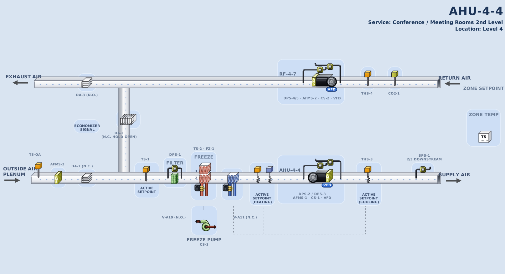
Every piece of equipment on the station is a vector I drew in SVG: the air handler with its supply and return fans, outside-air, return-air and exhaust dampers, filter bank, preheat and chilled-water coils, the VAV box with its reheat coil and primary-air damper, and the cooling tower.

They are drawn for binding, not decoration. The board is two 1613 by 878 SVG schematics written as templates, one shared by AHU-4-3, 4-6 and 4-4 and one for AHU-23-1, with every component its own group and every live value a template slot. The front end fills them from the point registry: fans spin only when their status point reads on, damper blades rotate to the commanded position, coils tint as their valve opens, and a component in alarm takes a red ring. The schematic is the data, rendered.

Values sit where an operator's eye expects them, beside the component they measure, in the same density a real workstation uses. A friendlier, sparser diagram would have been easier to read and worse at preparing students for the software they will actually sit in front of.

The AHU-4-4 equipment graphic: supply and return fans with VFDs, outside, return and exhaust dampers, preheat and cooling coils with valves, freeze pump, filter and sensors
AHU-4-4, built as an SVG schematic with every component its own group and every live value a template slot.
Five close-ups from the AHU-4-4 board: supply fan with VFD, preheat coils with freeze section, cooling coil with valve, economizer dampers, and return fan with VFD
Component close-ups. Each part binds to a point in the registry, so its state on screen is its value in the model.
06

Data model and backend

Before building anything I wrote the backend requirements as testable statements, then built it, front end and Supabase backend, with Claude Code against that spec. The data model is where most of the product decisions actually live.

Point registry

Every value is a point with an address, a type (analog input, analog output, binary input, binary output, analog value), engineering units, a valid range, a change-of-value increment and a writable flag. The whole UI routes on those addresses.

Simulation clock

A clock that runs paused, live, or up to 1000× speed, interpolating between hourly rows of real exported building history and TMY3 weather, so values move continuously instead of stepping once an hour.

Command priority

Writes resolve through Auto and Manual states. A point in Manual stops following interpolation and holds its value, which is the mechanic every override exercise depends on.

Fault engine

Rules evaluated against live point values on every tick, per piece of equipment, so a student can cause a fault by overriding the wrong point and the system catches it.

Change-of-value filtering

Analog points notify subscribers only when a change exceeds their increment. Without it a fast-forwarded clock repaints every value every frame.

Exercise schema

A starting timestamp, the set of changed points, a success criterion derived from a point and its setpoint with a tolerance, the ASHRAE standard behind it, and an assignment list.

Roles and access

Six privilege levels from view-only to manager. Students write setpoints and acknowledge alarms; instructors author exercises, edit schedules and unlock the capstone.

Supabase backend

I built the backend on Supabase: Postgres tables for profiles, exercises, assignments and attempts, email accounts with password reset, and row-level security so a student can only read exercises assigned to them (an is_assigned_to_me() policy). The schema lives in a re-runnable SQL file.

Sync and offline

A write-through cache: every screen keeps reading synchronously from local storage, and changes push to Supabase in the background. If the network drops mid-class the app keeps working, and an instructor can upload local exercises to the server later.

Assignment and progress

Exercises assign to the whole class, a group or individual students, all flattened to one seat list so nothing downstream changed. Student progress saves continuously and restores on resume, so a multi-hour exercise survives signing out.

Verification

251 automated tests, including an integration suite that loads every real exercise against the real registry and asserts each one changes the building. Deployed on Railway, with Supabase for auth and data.

07

Point detail modal

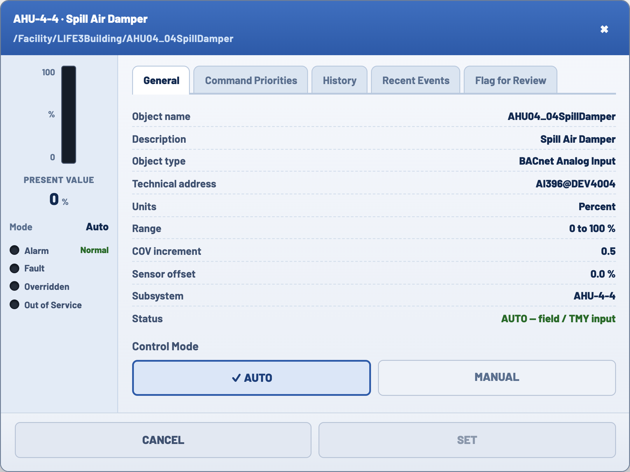
Clicking any value on the schematic opens that point's detail modal. It is the most used interaction in the product, and every field in it maps to the registry.

Value rail

A fixed left rail with a bar gauge filled against the point’s real range, the present value, an Auto or Manual badge, and four status dots: alarm, fault, override, out of service. Health is readable before you open a tab.

General

Point name, address, type, engineering units and range. The address is what connects the picture to the equipment in the mechanical room.

Command Priorities

The Auto and Manual states, with the override control. The tab says plainly that the product models two states rather than the full priority array real controllers use.

Alarms

Every fault rule that references this point, with condition, priority, timestamp and acknowledgement state. Unacknowledged entries pulse.

History

The point’s real exported readings, extended live as the session runs. With no history, the empty state explains that trending is a paid per-point subscription on real systems.

Recent Events

Value transitions, newest first, recorded only on actual change so it reads as a log rather than a wall of ticks.

The point detail modal for AHU-4-4 spill air damper, showing the value rail with gauge and status dots, and the General, Command Priorities, Alarms, History and Recent Events tabs
The point detail modal, captured from the running app.
08

Spec-driven build

I drew the equipment graphics in SVG, every air handler, damper, valve, coil and sensor as its own labelled vector, then designed and built the product with Claude. The workflow is worth describing, because it is the reason a single designer could ship a product this large without the result being a set of screens that only look complete.

The input was not a prompt. It was a set of real source material and three documents I wrote before any code existed: a requirements spec, a design doc, and a task plan. Claude worked against those rather than against a conversation.

Start from real source material

Training slides from the subject matter expert, a fourteen-chapter reference guide, twenty-seven spreadsheet exports of real system history, an EPW weather file, and the building’s filed energy data. The simulator had to be accurate before it could be good, so the data layer came first and everything else was built on top of it.

Write requirements as testable statements

A numbered spec of roughly 366 lines, written in the form WHEN this happens, THE system SHALL do that, with a glossary fixing every term so point, override, security level and scenario each mean exactly one thing. That reads like engineering hygiene and it is mostly interaction design: deciding that six privilege levels stack in ascending order, or that an overridden value stops following the data, is a product decision written in a format somebody can check.

Sequence the build by dependency

A task plan of about 404 items in strict order: data conversion, then the simulation engine, then interface chrome, then point detail, then alarms and schedules, then the teaching modes, then integration. Every task carries the requirement numbers it satisfies, so nothing gets built that no requirement asked for and nothing in the spec quietly goes missing.

Keep the reference in context

A steering document holds the domain reference so it is present in every session rather than re-explained each time. The design equivalent is that decisions live in a file, not in my memory of a conversation three weeks ago.

Then read all of it

This is the step most teams skip. A spec makes the result checkable, and checking it is what surfaced the defects in the next section. Generated code that passes its own tests can still be wrong about the system it lives in.

What the tool changed is throughput, not judgment. It did not decide that an alarm should distinguish seen from fixed, that a magenta value means someone has taken manual control, or that authoring belongs on the same screen students use. It made implementing those decisions possible at a scale one designer could not otherwise reach, and it made being wrong cheap enough that rewriting a fault rule was easier than defending it.

09

Technical audit

A version had already been generated with an AI development tool, and it looked finished. Every screen was there and it passed its own tests. I read it properly before trusting it with a classroom.

The simulation clock was never connected to the data. The timestamp advanced in the status bar, which is where your eye goes, but no value ever moved. The building looked live and was static.

Underneath that, all fifteen exercises silently did nothing. Each referenced points by an address format that did not exist, and writing to an unknown address fails quietly. Loading an exercise jumped the clock and staged none of the conditions. Three of the six fault rules pointed at sensors that were not in the data model at all, so they could never fire.

The tests passed because each piece was tested against its own assumptions rather than against the system. Everything was correct in isolation and wrong together.

Had this reached a classroom, students would have been asked to diagnose a building that never changed. I fixed the data layer, corrected every address, rewrote the three impossible rules, and added a test that loads the real exercises and checks each one actually changes something. Then I reintroduced the original bug to confirm the test caught it.

10

Design principles

Three established principles governed the work, and every screen decision traces back to one of them.

Visibility of system status

Nielsen’s first heuristic, and the one this product lives or dies on. A teaching tool that looks correct while being wrong is worse than one that is obviously broken. The clock names its own state, overridden points are color-coded, and any value that has stopped reflecting the building says so. The audit finding below is exactly this heuristic being violated: a running timestamp over a frozen dataset.

Learning by doing, with productive failure

Kolb’s experiential learning cycle, and Kapur’s work on productive failure: learners retain more when they struggle against a real problem before being told the answer. So the platform never says incorrect. The building behaves badly and the student discovers their hypothesis does not explain the readings. Feedback is whether conditions have improved, which is the only feedback the job itself gives.

Design for the adopter, not only the end user

In enterprise and edtech the person who adopts a product is rarely the person who uses it most. Instructors are the adoption gate here, so authoring, loading and reviewing were treated as primary workflows rather than admin screens. Getting this backwards on an earlier project nearly cost us a pilot.

11

Student experience

The core interaction is reading a screen full of values and deciding which one matters. Most of the design work went into making that decision possible for someone doing it for the first time.

State is visible at a glance

Five states, printed at the top of the sidebar rather than left for students to work out. A white box is an editable setpoint, gray is calculated, a dark pill is a measured value, a red ring means in alarm, and magenta means someone has overridden it. A beginner can see the condition of the plant before reading a single number.

Overridden values announce themselves

When a value is overridden it stops following the building and holds where it was left. That is the most dangerous state to misread, so it gets the loudest treatment, and a report screen exists purely to find every value somebody left in manual.

The clock always names its state

A pill in the header reads LIVE when the building is following real weather, FROZEN when it is paused, and AUTHORING while an exercise is being built. A student should never have to guess whether they are watching the building behave or looking at someone’s setup.

Alarms distinguish seen from fixed

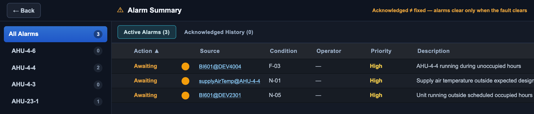
Acknowledging an alarm and clearing it are different acts, and the summary screen says so directly in its subhead. Unacknowledged alarms blink, acknowledged ones go solid, and the acknowledgement survives the condition going away. Students consistently conflate the two, and the interface is doing the teaching here rather than the instructor.

Everything is inspectable

Any value on the schematic opens its detail view. Present value, mode, and four health flags sit in a fixed rail so they stay visible while you move between tabs, with identity, command priorities, history and a change log behind them. The order reflects what an operator checks first: is this healthy, then what has it been doing. A Flag for Review tab lets a student mark a point they cannot explain, so an instructor can see what confused the room without the student having to raise a hand in front of it.

Two details in the detail view I would defend in a review. Where the underlying export had lost its timestamps, entries are labeled by how long before the session they occurred rather than given an invented clock time. And where a value has no recorded history, the empty state explains that trending is a paid subscription on real systems, because a blank chart is a real thing operators run into.

The five-state value key, printed in the sidebar rather than learned
72.4
Editable
A setpoint you can write to. White means the system will accept a value here.
68.1
Calculated
Derived by the controller. Read-only, and greyed so nobody wastes a click on it.
71.8
Measured
A live sensor reading. The dark pill separates fact from instruction at a glance.
84.0
In alarm
Outside its limit. A red ring rather than a red fill, so the number itself stays legible.
55.0
Overridden
Someone has taken manual control. The loudest state, because an overridden value has stopped describing the building.
The point detail modal for AHU-4-4 Spill Air Damper, showing its technical path, a present value rail with alarm, fault, overridden and out of service flags, tabs for General, Command Priorities, History, Recent Events and Flag for Review, and an Auto or Manual control mode toggle
Fig. 2. The point detail modal. The rail answers is this healthy before any tab is opened, and the technical path in the header is the same address an operator would use on a real system.
12

Instructor experience

Four jobs, in the order an instructor does them. This is the half of the product that does not photograph well and it took the most design thinking.

Author an exercise on the teaching screen

An instructor breaks the building on the same screen students use to fix it. Change values on the schematic, then save that state as an exercise. No separate authoring tool to learn, and no gap between what you set up and what the class will see. The save step does the technical work for them, which is what makes this usable by an instructor who is an HVAC expert rather than a software one.

Run it without prep

Fifteen exercises ship ready to load. Companion mode pairs the building with a lesson panel and pauses the clock, so advancing a step moves the building to the moment being discussed rather than leaving the instructor to stage it live.

Open the assessment when the class is ready

The capstone stays locked until an instructor opens it from the dashboard. Access is checked by privilege level rather than by hiding the link, so a student who guesses the URL sees a clear message about their access level instead of a broken page.

See how the room is doing

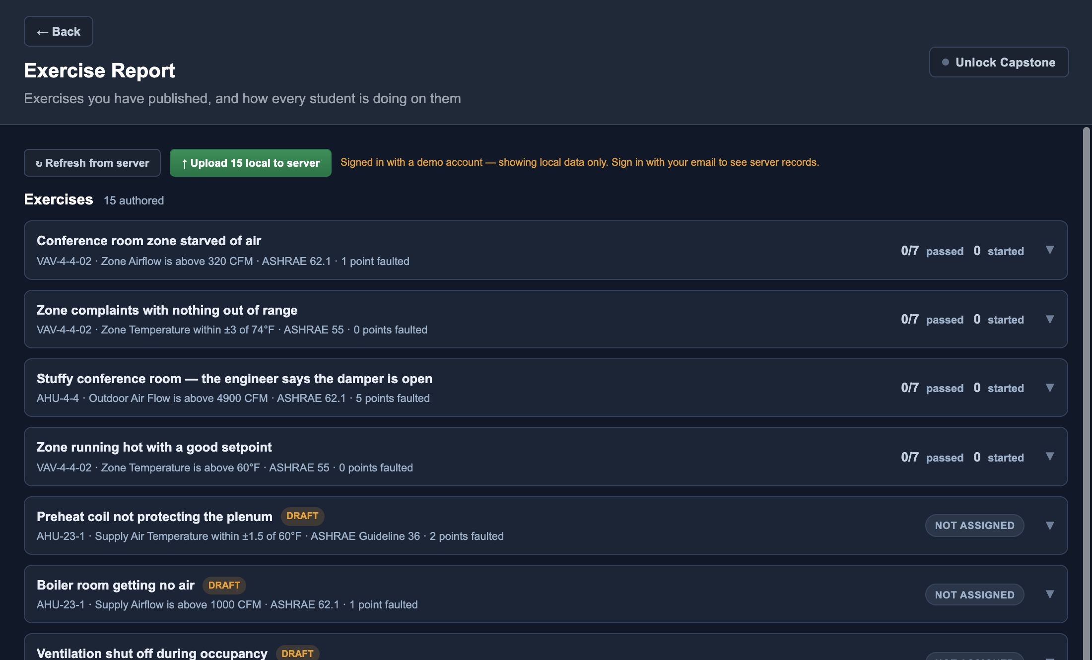
The Exercise Report lists every published exercise with its goal, its standard and a pass count. Expand one and it becomes a roster: every student by name, whether they have started, and whether anything has changed on their copy of the building. An instructor can see who is stuck while the class is still in the room. Afterwards it is too late to help.

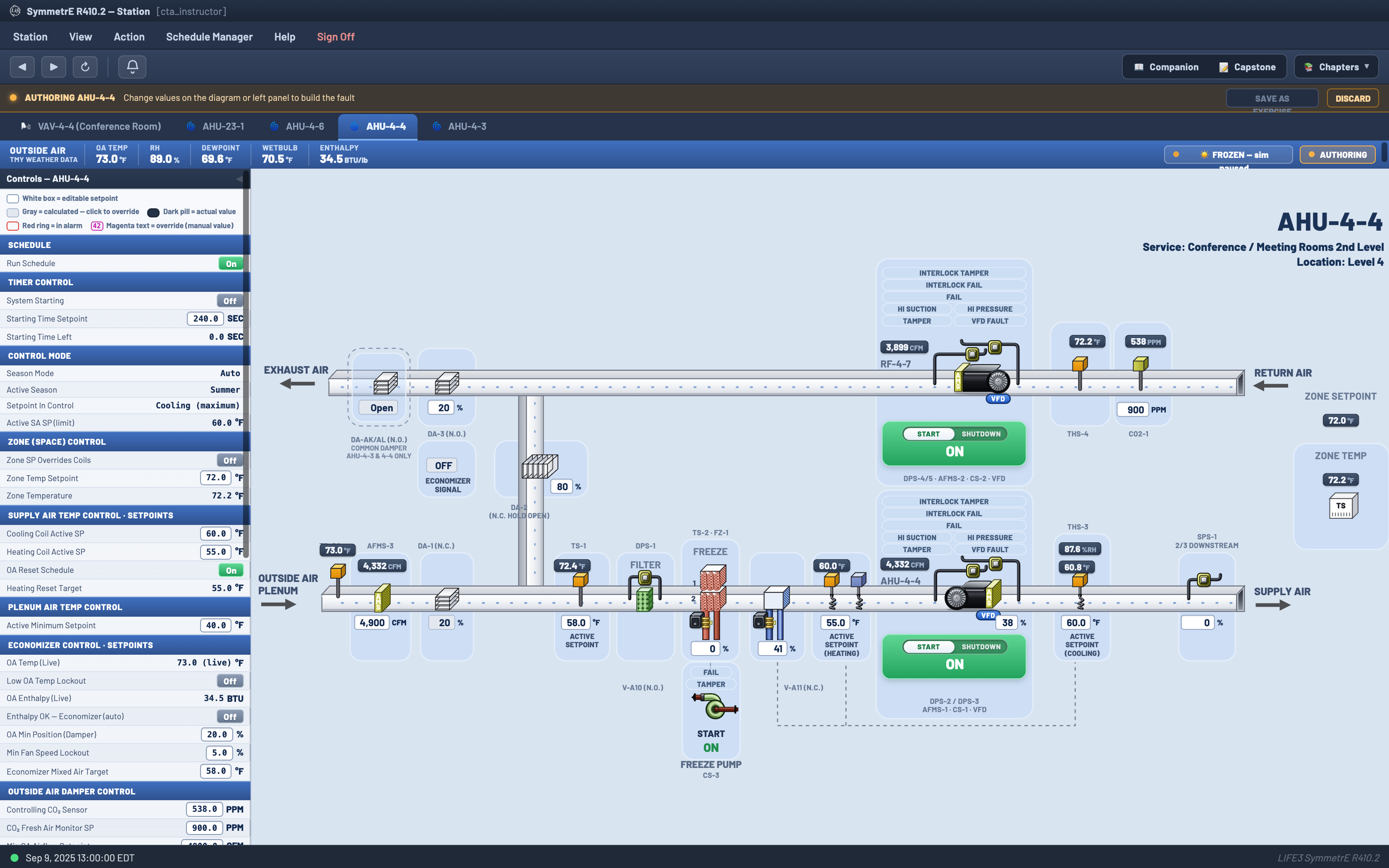
Authoring mode: a banner reading AUTHORING AHU-4-4, with instructions to change values on the diagram, and Save as Exercise and Discard controls
Fig. 3. Authoring. The instructor breaks the building on the same screen students will use to fix it, then saves that state as an exercise.
13

Exercise authoring

Authoring only works if an instructor can create a rigorous exercise without writing a specification. An HVAC expert knows exactly which fault they want to teach. Asking them to enumerate which data points changed, define a machine-checkable pass condition, and cite the governing standard would end the workflow immediately.

So the save dialog derives all three. The instructor writes a title and a brief in plain language. Everything technical underneath it is inferred from what they just did to the building.

It captures the starting state itself

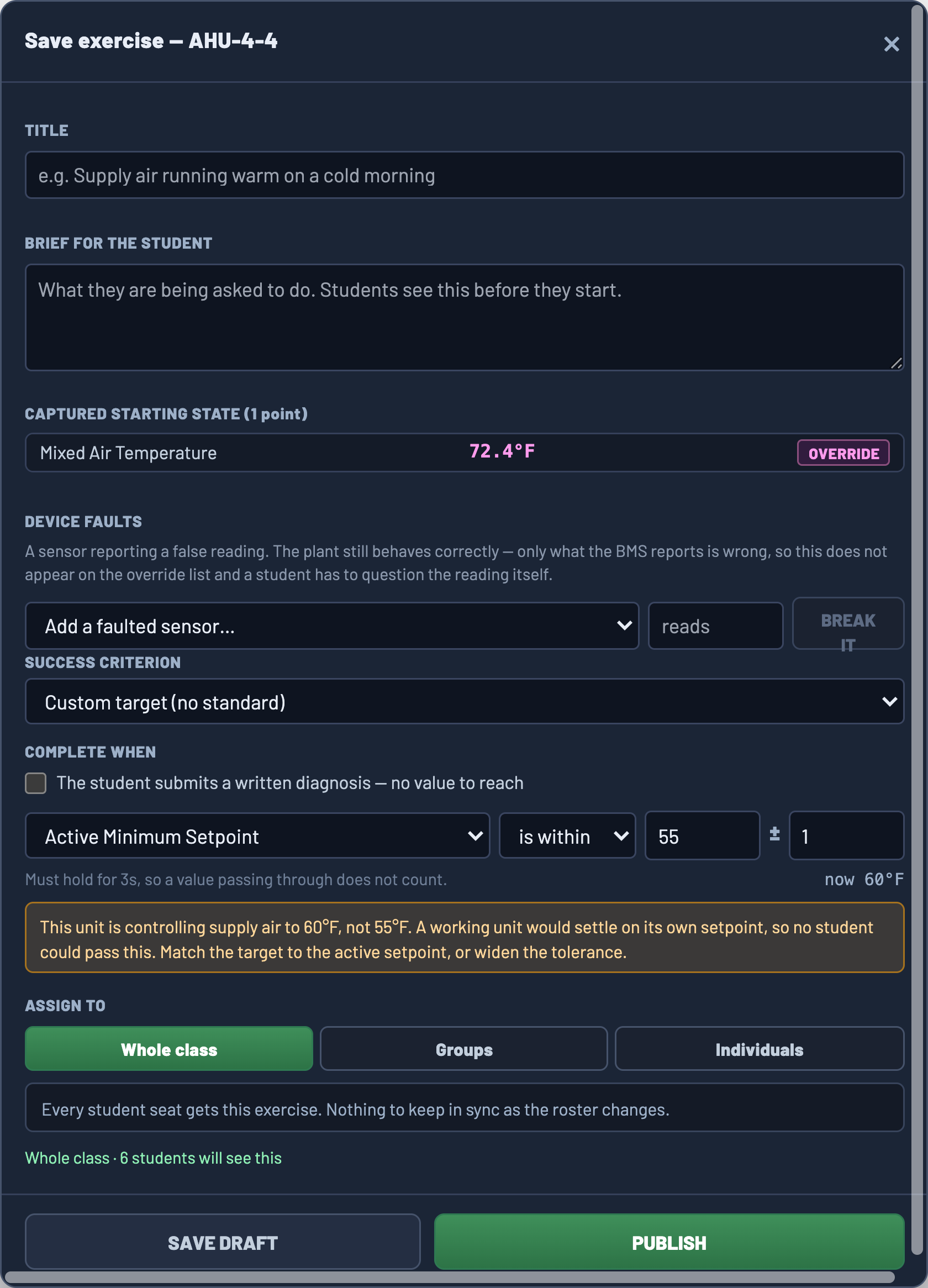
The dialog diffs the live building against its baseline and lists every point the instructor changed, tagged as an override. One point here, found automatically. No one types a list, and nothing gets forgotten, which is the failure that would otherwise ship a broken exercise into a classroom.

It separates an override from a lying sensor

A device fault is a different teaching problem and the product treats it as one. The plant still behaves correctly and only the reported reading is wrong, so a faulted sensor is deliberately excluded from the override list. The student cannot find it by checking what has been overridden. They have to distrust the number in front of them, which is a much harder and more realistic skill.

It reads the target from the equipment, not from a guess

Choosing a success criterion attaches the standard behind it, and the threshold is pulled from that unit’s own configured setpoint rather than a value typed in by hand. The same criterion applied to a different air handler produces a different number, because the two units are configured differently.

It shows the standard while you author

When a standard backs the goal, the requirement appears inline with its clause, and a custom target is offered for the cases where none applies and a plain reading of what it means. The instructor sees the pedagogical justification at the moment of authoring, and the student later sees the same badge, so the exercise and the curriculum cite the same source.

It validates the condition against the live building

The completion rule is a real comparison with a live readout beside it, so an instructor can see the current value while setting the target and immediately tell whether the exercise is achievable. A condition must hold for three seconds to count, so a value swinging briefly through the target does not pass someone who has not actually fixed anything.

It allows an exercise with no number at all

Some faults are diagnostic rather than corrective. A checkbox switches completion to a written diagnosis, so an exercise can ask what is wrong and why without demanding the student drive a value anywhere.

It scopes who gets the exercise

Whole class, groups, or named individuals, with a line under the control that states the consequence rather than the mechanism: every student seat gets this exercise, nothing to keep in sync as the roster changes. Differentiation is a normal part of teaching, and an instructor who wants to give three struggling students an easier version of the same fault should not have to author it twice.

The save exercise dialog with title and brief still empty, showing a captured starting state of one point, a success criterion reading Active Minimum Setpoint is within 55 plus or minus 1, a live value of 60 degrees, an amber validation warning, and an assign to control
Fig. 4. The save dialog before the instructor has typed a word. The title and brief are still empty, and the technical half of the exercise is already built: the changed point captured, the criterion written against the unit’s own setpoint, and the live value checked against it. The amber warning is the dialog refusing to let an impossible exercise ship.
The Exercise Report: published exercises with goals, standards and pass counts, one expanded into a per-student roster
Fig. 5. The Exercise Report. Every published exercise carries its equipment, its success criterion, the standard behind it and a pass count across the class.
14

Modes and states

Rather than build three products for three teaching situations, I made the layout and the clock the variables.

Companion
Leading a room

Building at 70%, lesson panel beside it, clock paused so nothing moves while the instructor is talking. A visible indicator says the clock is stopped, because a frozen building otherwise looks like a broken app.

Free Explore
Practicing alone

Full width, clock running fast so an hour of building behavior passes in a minute. Speed is adjustable, because watching an economizer swing over an afternoon needs a different pace than reading one alarm.

Capstone
Being assessed

A worksheet beside the live building, so students answer with the evidence still on screen rather than from memory. Autosaves locally, checks all sections have content before submitting, and confirms before it sends.

The alarm summary with a location filter tree, a sortable table, and a subhead reading acknowledged does not equal fixed
Fig. 6. The alarm summary. The subhead is doing real teaching: acknowledged is not fixed.
15

Design engineering

I designed this product and built a large part of it: the front end, the control logic, the fault behavior and the instructor tooling. That is unusual for a designer and it is worth being specific about, because several design decisions only survived because I could implement them.

Three examples where the design and the engineering were the same decision.

Faults are rules, not a script

The easy build plays a fault at a fixed time, and students learn the timing rather than the diagnosis. Instead the rules evaluate against live values continuously, which means a student can cause a fault themselves by overriding the wrong thing and the system will catch them doing it. Simultaneous heating and cooling, a supply air loop that is not holding, a fan running in an empty building, a shut outside air damper, a sleeping economizer, high carbon dioxide, and a zone reheating air the plant just cooled.

The building runs on real data

A thousand hours of real system history, interpolated so values move continuously instead of stepping once an hour, with real weather driving the outside air conditions and the building’s filed energy figures behind the carbon panel. Believability was a design requirement, and it needed a data layer to deliver it.

Screen updates are filtered

Values only refresh when a change is large enough to matter. Without that, a fast-forwarded clock repaints everything constantly and a beginner cannot tell signal from noise. It reads as a technical detail and it is really a legibility decision.

Outcomes

In classroom use for the building systems session and the capstone project.

7
screens: station, point detail, alarms, schedules, reports, capstone, instructor dashboard.
15
teaching exercises, plus authoring so instructors can add their own.
251
tests passing, up from 222, including the suite that would have caught the original bug.
0
network requests after load. It runs with the wifi switched off.
16

Validation

Worth being precise about, because the two are easy to blur.

Verified
That the simulation behaves correctly. Every exercise stages its conditions, every fault rule can fire, and the test suite proves it. That was the point of the audit.
Reviewed
Domain accuracy and teaching sequence, with the curriculum lead and a subject matter expert from the field. Both know this work far better than I do, and both are experts rather than beginners.
Not yet tested
Whether beginners can actually learn diagnosis with it. I have not watched a full class use the finished product, so claims about how students behave in it are design intent, not findings.
17

Next steps

Watch a class. Everything I know about how this teaches comes from two experts. The people it is for are the people I have not sat with, and that is the first gap I would close.

Log the path, not just the outcome. The Exercise Report says who passed, not how. Two students can reach the same answer by very different routes, and the one who guessed learned nothing. Recording which screen they opened first and what they changed would turn the report from a scoreboard into something an instructor can teach from.

Read generated code earlier. The audit found real defects, but late enough that they could have reached a classroom. I now read the data layer before I look at a single screen.

Next case studyLIFE3 Website Redesign →
← All work
BraneStorme logo
BraneStorme · Shipped to the App Store, 2021 · 13 min read

BraneStorme

A founder came to me with a concept, a diagnosis of his own, and no product. I ran the research, the strategy, the brand and the interface, and handed a full-stack developer something buildable.

My role
Product manager and UX/UI designer. Hired to design the full application.
Team
Founder, one full-stack developer, me
Dates
Winter 2021
Contribution
Product management Survey research Competitive analysis Personas User flows Brand identity UX/UI design Usability testing Developer handoff
Tools used
Figma FigJam Adobe Illustrator Trello Google Forms
Abstract

A founder came to me with a conviction, a diagnosis of his own, and no product. I ran a survey of sixty-three people, tore down five competitors including one that had already shut down, built the personas and seven user flows, designed the brand and the interface, and handed a single developer something buildable. Two findings decided the product. Music came back more often than therapy or friends when people described how they cope, which moved it from an accessory to the center. And a three-person team with no clinicians was proposing to host disclosures from minors, which made moderation capacity a design constraint rather than a policy document.

In short
Stage
0 to 1 from a conviction. No product, brand, research or flows existed at the start. Shipped to the App Store.
Problem
A founder with a conviction, a diagnosis of his own, and no product, brand or flows.
Users
People managing anxiety and depression who want community rather than clinical treatment.
Research
A sixty-three person survey and a teardown of five competitors, including one that had already shut down.
Findings
Music beat therapy and friends as a coping method, and a team with no clinicians was planning to host disclosures from minors.
Design
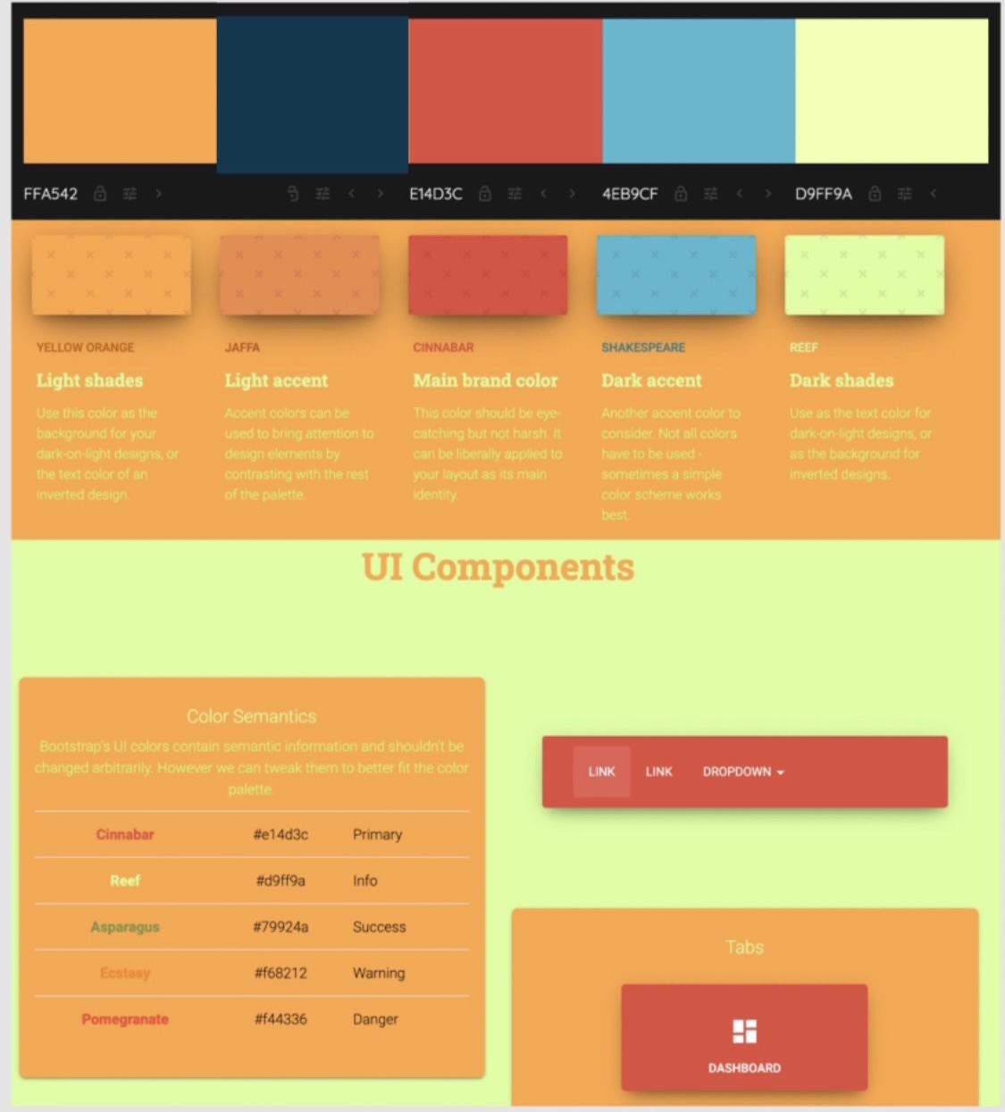
Brand from nothing, two personas, seven user flows, and the interface a single developer built from.
Shipped
Released on the App Store in 2021.
Decision record
Iterations
Six usability scenarios on the prototype, each producing a shipped change, including the pinned Helpful Resources card a tester asked for.
Rejected
Rooms as the entry point, in favor of music, which the survey put ahead of therapy and friends as a coping method, and a generic quote card, in favor of the founder's own voice.
Trade-off
Openness against moderation capacity. A three-person team with no clinicians meant age banding and reporting were designed in, not added later.
Edge cases
Minors, self-harm content, account retrieval, reporting another user, and a crisis resource one tap away.
Platform
iOS conventions for navigation, sheets and controls.
Status
Shipped to the App Store in 2021.
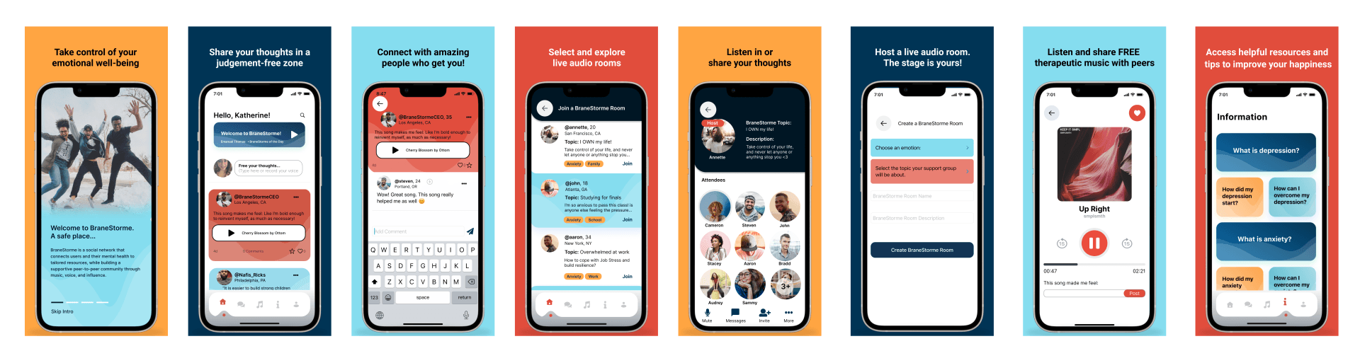
Eight BraneStorme screens with their value propositions: the intro, the feed, comments on a voice post, the room list, inside a live audio room, creating a room, the therapeutic music player, and the Information section
Fig. 1. What shipped, with the value proposition each screen carries. Intro, feed, comments on a voice post, the room list, inside a live audio room, room creation, the music player, and the Information section with its pinned resources.
01

Brief

A founder with an anxiety disorder, a brief, and a conviction that the category had nothing built for people like him. That was the starting material. The founder has an anxiety disorder himself, and his read on the market was specific: there is a stigma around mental health, it is heavier for people of color, and almost nothing in the category is built as a community. He described what he wanted as a Clubhouse for mental health, interactive, voice-first, peer to peer.

His target was people of color on lower incomes, roughly fifteen to forty. His objective was an alpha, tested with real users, then iterate. His own instinct was that slow is fast and the product should arrive in phases rather than in bulk.

What did not exist yet: users, personas, a competitive picture, an information architecture, a name treatment, a color system, a single flow, or a screen. That was my scope.

02

Research plan

A survey, 63 responses

Age, condition, triggers, coping behavior, and what they would want from a support app. Ages ran from twelve to fifty-four. Anxiety and depression each came up in around half the responses, and a further group named something they could not put a word to.

Competitive teardown, 33 slides

A SWOT on each of five competitors, with pricing, launch dates and business model. Including a post-mortem on one that had already shut down, which turned out to be the most useful slide in the deck.

The five competitor apps analyzed: TalkLife, Huddle, Youper, Wysa and Talkspace
Market sizing

Around ten thousand apps already built for mental health and wellness. Most charging between fifty and two hundred dollars a month. The WHO ratio of mental health professionals to population as low as two per hundred thousand. A crowded market with a real gap underneath it.

Personas and user flows

Personas built from the survey data, then seven end-to-end flows: onboarding and account retrieval, home, music, information, the BraneStorme Room, profile, and settings. Every branch, every failure path.

Usability testing

Six scenario tasks against the prototype: create an account, start a room about a relationship you are anxious about, play music, learn about anxiety, listen to the BraneStorme of the Day, invite people. Run per participant with written notes.

03

Research methods

I was the product manager as well as the designer, so the backlog was mine. I ran the project in Trello: research, branding, wireframes, prototype, and the founder's own suggestions as cards the three of us could argue about in writing rather than lose in email.

It is also where several of the good ideas came from. Points started as a card the founder wrote asking what I thought the notifications section should do. Working in the open like that is a large part of why a three-person team with one developer shipped at all.

The BraneStorme Trello board used to run research, design and build
Fig. 2. The board I ran the project from.
Onboarding, account creation and retrieval flow, including sign-up, social auth, terms, initial questions, age band and zip code
Fig. 3. Onboarding, account creation and retrieval. The age band and zip code are captured here because everything downstream depends on them, and the annotation carries the rule for the developer: a user sees their own band, one below, and above.
BraneStorme Room flow: join or create a room, initial questions, description, inside the room, messages, comment options, report, block, mute, guest list, invite by contacts, email or social
Fig. 4. The BraneStorme Room. Report, block, mute and the guest list are drawn as first-class branches off the room, not bolted on later, because moderation had to exist in the flow before the room shipped.
Profile flow: favorite songs, people you follow, following, starred posts, posts and notifications, with flag, mute and block on every branch
Fig. 5. Profile. Flag, mute and block hang off every place a user can encounter another user, which is the only way that holds up once the community is real.
Settings flow: account, notifications, community guidelines, delete account with confirmation, blocked users, change zip code, passcode and email, tell a friend, terms of service
Fig. 6. Settings, including the delete-account path with its confirmation and its way back out. Community guidelines sit in the top level of settings rather than buried in a legal page.
All seven BraneStorme user flows shown together as one map
Fig. 7. All seven flows together: onboarding, home, music, information, the room, profile and settings. The four above are the detail; this is the shape of the whole product.
04

Personas

Two personas, built from the survey rather than from imagination. Every quote, pain point and coping strategy on these cards is a verbatim survey response, not a line written to sound plausible. Wade’s frustrations are literally five people’s words: the noise, the kids talking back, the arguments, the finances, other people’s issues.

Kristin is the teen end of the data: a high school freshman in New York who worries about grades, has social anxiety, and copes with music and video games. Wade is the other end: married, two children, in California, actively on medication and breathing techniques and looking for something realistic. Two personas because the survey showed two genuinely different users, and that split is what produced the age-tiered content model.

I kept the uncomfortable answers in. One respondent’s coping strategy was drugs and sleep, and it sits on Wade’s card with my own note attached rather than being quietly dropped. A persona that only contains the healthy answers is not describing the people who need the product most, and it would have hidden exactly the risk that made me draw a hard line around crisis content.

Kristin Watson
Kristin Watson
High School student · Single · New York City · High tech literacy
DepressedAnxious
What triggers my anxiety is when there is a lot of people since at times i have social anxiety.
Freshman in High School. Worries about her grades and suffers from social anxiety. Likes to listen to music and play video games.
Goals
Stop feeling uncomfortable around other people
Improve her mood
Solutions they use
Taking deep breaths
Eating and sleeping
Pain points and frustrations
Finds it difficult to specify emotions
Doesn’t like to be yelled at or get in trouble
Thinking too much about past mistakes or regrets
Wade Warren
Wade Warren
College · Married, 2 children · California · High tech literacy
AnxiousDepressed
I recently started cymbalta which is helping… also breathing techniques.
Likes trying new things and wants to find realistic ways to improve his mental health.
Goals
Learn better ways to get rid of stress
Make physical and mental health a priority
Solutions they use
Meditation, working out, self-care
Socializing, taking my mind off things
Eating, drinking
Drugs and sleep [p.s. drugs not healthy]
Pain points and frustrations
Too many different noises at once… my kids talking back…
Fear of the unknown
Arguing with spouse
Worrying about finances
Other people’s issues
Fig. 8. The two personas, rebuilt here from the source file.
05

Key insight

I asked how people cope, as free text, with no options to pick from. Music came back more than anything else, more than therapy, more than friends, more than exercise. Over and over, in almost the same words: I go to a quiet room and listen to music.

Music was not a feature request. It was what people already did instead of talking, and the app had to meet them there before it asked them to speak.

In the original concept, music was a secondary feature alongside the rooms. I argued it up to a first-class part of the product: playlists by category including a breathing playlist, the ability to add songs, and a heart so recommendations improve. You can also attach a song to a post, which gives someone a way to say something they have no words for.

The second finding cut the other way. Teens in the survey preferred listening to music over joining a room, and when a teen did open a room it read as a space for older people. Twenty- and thirty-somethings were the ones who actually wanted the rooms.

06

Key design decisions

Decision 1

Age tiers, so a fourteen-year-old is not in a room with a fifty-year-old's problems

The survey told me the room felt age-wrong to teens. So content is grouped into bands, 12 to 17, 18 to 24, 25 to 34, 35 to 44, 45+, set at onboarding. You see content from your own band and the bands above it, never below.

Upward-only was the deliberate part. A teenager can read how someone ten years older handled the same thing, which is most of the value of a support group. A middle-aged user is not served content from children. And onboarding asks for a zip code, so a room can show where someone is posting from without publishing an address.

Decision 2

Reward helping, not being followed

Room engagement needed an incentive, and there were two options on the table: follower counts, or a count of how many people you had actually replied to and helped. I took the second and designed it as Points, surfaced in notifications as a log of the people who gave you points for helping them.

Follower counts create an audience, and an audience creates performance. In a room built on honesty, performing is the thing that kills it. A reciprocity count rewards the behavior we actually wanted and cannot be farmed by posting more about yourself.

Decision 3

Voice and text, not video, because I read why the competitor died

Huddle launched in 2017 with peer support groups and closed in 2019. It was video-first, with a pixelated-face option for anonymity. Two things killed it: people who were uncomfortable with face-to-face talk had no other way in, and a pixelated face does nothing about a recognizable voice.

So BraneStorme posts are audio recording or text, and the person chooses which. Voice keeps the honesty the founder wanted, you cannot edit a thirty-second recording until you sound composed. Text is the door for everyone who would otherwise not post at all.

Decision 4

Draw the line at crisis, in the product and not just the legal copy

Triggers people wrote in the survey included loneliness, being alone at night, finances, and racial aggressions and micro-aggressions. Real weight, from a team of three with no clinicians and no 24-hour moderation.

BraneStorme is explicitly not a crisis service, and I made that a design constraint rather than a disclaimer nobody reads. An Information section answers the six questions people actually ask: what depression is, how it starts, and how to get through it, then the same three for anxiety. A Helpful Resources card sits pinned at the top with the SAMHSA helpline, which a tester asked for. Posts describing suicide methods are out of bounds in the community guidelines, which I helped write alongside the founder.

07

Brand identity

The founder arrived with a name, a conviction and nothing else. No mark, no palette, no typeface. I owned the identity as well as the product, which on a project like this is not a separate workstream: the brand is doing clinical work here, because a mental-health product that looks clinical is a product people close.

Four decisions carried it, and I would defend each one in a review.

Twenty-two BraneStorme logo directions: linear B monograms, lightbulb-and-brain combination marks, a head silhouette with a spiral, a standalone brain, wave forms, and four color variations of the final direction, with the chosen version boxed and labelled
Fig. 9. Twenty-two directions, presented across three types: pictographic, typographic and combination. The bottom row is the shortlist in four color treatments, and the boxed one is what the founder chose.
The BraneStorme logo: a hand-drawn lightbulb growing out of a brain with radiating light, above a two-tone wordmark reading BRANE in dark navy and STORME in light blue
Fig. 10. The mark as it shipped to the App Store.
The mark

I drew eighteen logo directions across all three types, pictographic, typographic and combination, and presented the set to the founder rather than a single recommendation. He chose this one: a lightbulb growing out of a brain, hand-drawn rather than vector-perfect. The name is a pun on brainstorm, so every direction had to carry the idea of a thought arriving without becoming a corporate ideation icon. The linework is deliberately imperfect: this is a space where people post unpolished audio about bad weeks, and a machined logo would promise a different room than the one they are walking into.

The wordmark

Set in one weight, letterspaced wide, and split two-tone: BRANE in the dark navy, STORME in the light blue. The split does the explaining. Without it people read the name as a typo; with it they read it as two words, which is the joke, and the joke is the founder’s whole reason for the name.

Why not blue

Every competitor in the teardown defaults to a calm clinical blue. The founder was open on color, so I put up alternatives and made the case for warmth over the category default. He signed off on Cinnabar as the primary: awake, closer to a support group than a waiting room. It is the most consequential brand decision on the project and the one that most separates it from the category.

One job each

Then every color got a semantic assignment: primary, info, success, warning, danger. The developer never had to ask which orange, and more importantly a warning state could not accidentally be drawn in the brand color, which in a product handling disclosures from minors is a safety problem rather than a style problem.

BraneStorme color system: Cinnabar primary, Yellow Orange, Jaffa, Shakespeare and Reef, with semantic color assignments and UI components
Fig. 11. The color system, with every value assigned a semantic role and drawn on the components that use it.
The system, as delivered
Cinnabar · primary, brand, active
Yellow Orange · warning
Jaffa · accent
Shakespeare · wordmark, range
Reef · info, success
Deep navy · dark surfaces, wordmark

Six values is a small palette for a social product, and that was the point. The developer was one person building on nights and weekends, so the brand had to be specifiable in a page, not a document nobody would read.

08

Usability testing

Six tasks, run one participant at a time. None of the findings were dramatic, which is what a good round looks like when the flows are right. All of them shipped.

Resources were below the fold in Information
Helpful Resources card pinned to the top
Favorite songs looked nothing like the playlist
One list pattern for both
You could only play one song at a time
Play the whole playlist, auto-advance
The information icon read as decoration
Made it tappable
Profile icon in settings was not a target
Made it tappable
No spec for how @mentioning behaves
Wireframed the mention flow
09

Feature: BraneStorme of the Day

Home opens on one short piece of audio, in the founder's own voice, refreshed daily. It came out of a conversation about motivational quotes during the SWOT work: a generic quote card carries no credibility, and a founder who tells you he has an anxiety disorder himself is the entire reason to trust the room.

It also solves a cold-start problem. On day one an empty community has nothing in it, and the daily audio means the app is never empty and always has a reason to be opened.

10

Retrospective

I designed the whole system when the team could build a third of it. Seven flows, rooms, a music library, points, profiles, an information section, all specced, all coherent, and more than one developer can ship while the concept is still being tested. The founder's own instinct was phases, and my deliverable did not enforce that.

What I would do now is ship one loop first: daily audio, music, one room. Everything else gets marked phase two in the handoff, and the alpha tells us whether the rooms are worth building before we build all of them.

I would also have pushed to test with the actual target audience rather than whoever the survey reached. The respondents skewed younger and broader than people of color on lower incomes in their twenties and thirties, and that is the group the product was for. It is the reason I now agree the recruitment criteria in writing before a study starts.

Next case studyResu-ME AI →
← All work
Resu-ME.ai · Cofounder and Head of Design · 14 min read

Resu-ME AI

Three products and a marketing site that share one context: the job you find becomes the resume you tailor, and that becomes the interview you rehearse. Built on the bet that hiring is a coordination problem, not a writing problem.

My role
Cofounder and Head of Design. Product strategy, all four surfaces, design system, research, copy.
Surfaces
Marketing site, Resume Studio (web), Interview Studio (iOS), Job Studio (web)
Dates
2025 to present
Contribution
Product strategy Design system UX/UI across web and iOS Content design Marketing site Analytics taxonomy
Tools used
Figma Claude Mixpanel Google Analytics Adobe Illustrator Lottie
Abstract

Most AI resume tools do the same thing: paste your resume into a prompt, get a rewritten resume back. The output reads well and says nothing new, because the input was already the problem. The company’s bet is larger than resumes, that matching people to work along the dimensions which actually determine fit is a solvable coordination problem, and that where a competency gap blocks the match you build the competency rather than filter the person out. As cofounder and head of design I argued for the product shape that follows from it, a structured interview that asks about your work before it writes anything, and designed the system around it: Resume Studio on web, Interview Studio on iOS, Job Studio for sourcing, and the marketing site that explains all three without selling three things. I also own the funnel: acquisition, the pricing architecture, onboarding, and the instrumentation that reads them, plus the investor deck that has to make the same argument to a harder audience. The decisions I would defend hardest are the ones about what we did not build.
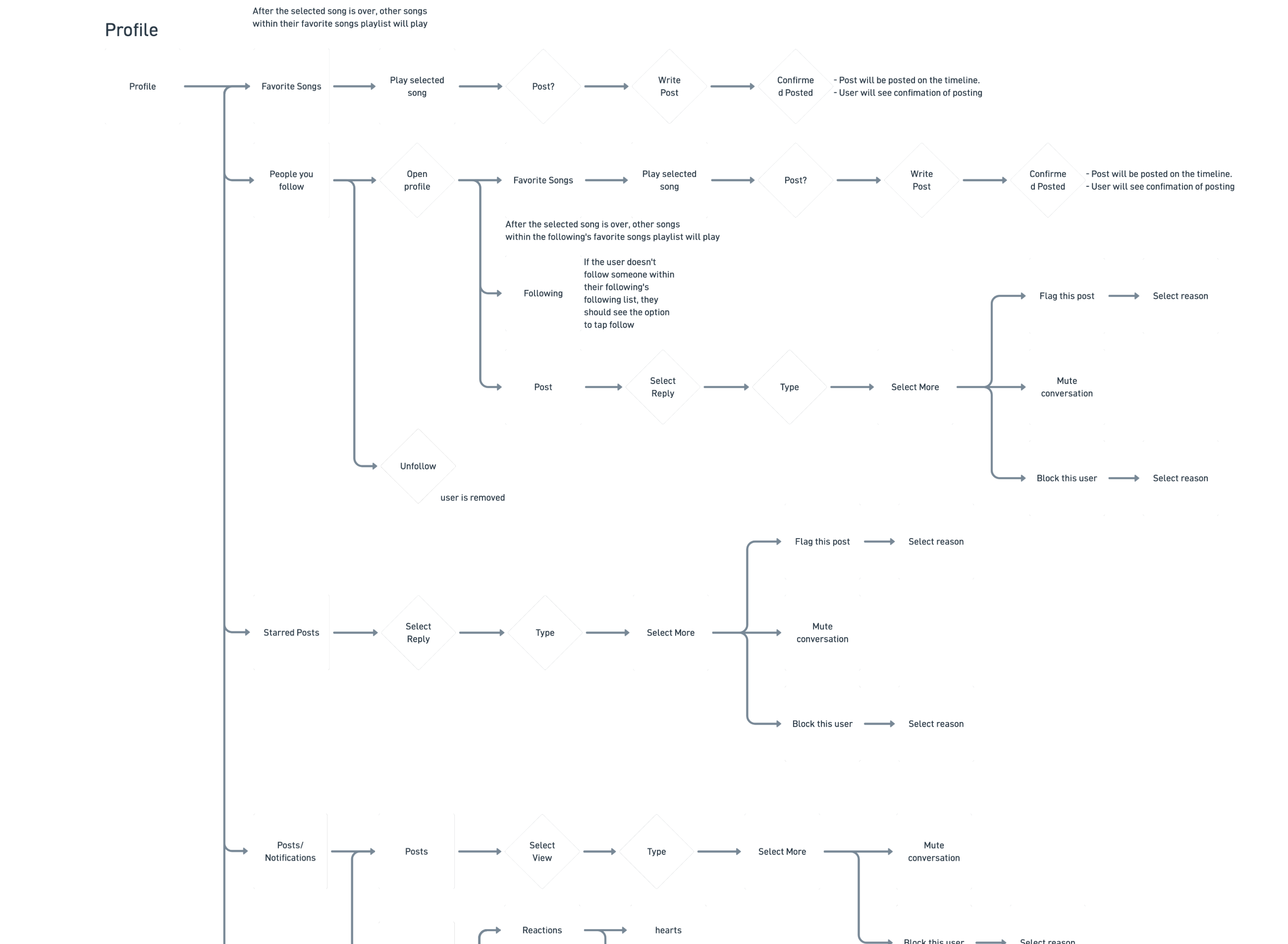
In short
Stage
0 to 1, three times. Resume Studio, then Interview Studio on iOS, then Job Studio, plus the marketing site and the design system under all of them.
Problem
A rewrite cannot add what the resume never contained.
Thesis
Interview the candidate first. One context, reused across every surface.
Scope
Four surfaces, two platforms, one design system and one analytics vocabulary.
Hard calls
Cut the match score from Job Studio. Refused a fourth pricing plan.
Shipped
Web and iOS live; Job Studio Phase 1 behind a flag.
Decision record
Iterations
Resume Studio shipped first, then Interview Studio on iOS, then Job Studio, each reusing the context the previous one produced.
Rejected
A match score in Job Studio, because it would anchor people on a number close to noise, and a fourth pricing plan, because it contradicted the shared-context thesis.
Edge cases
A skipped question, an answer that is too short, lost connection mid-conversation handled by autosave, and a job posting the user cannot apply to inside the product.
Platform
Web for resume work at a desk, native iOS for rehearsal, with light and dark themes on both.
Status
Live at resu-me.ai and on the App Store.
The studios section of the marketing site: Resume Studio with the AI enhancement conversation, Interview Studio on iPhone, and Job Studio with a filtered feed, above an Application Kit bundle banner
Fig. 1. The system, as the marketing site explains it. Three studios, one shared context, and a bundle that prices the whole journey rather than each piece.
01

Problem

Someone sits down to apply for a job they would be good at. Their resume says they led design initiatives and improved metrics. It is true, it is useless, and no amount of rewriting fixes it, because the interesting part was never on the page.

Every AI resume product on the market takes that page as input. Paste it in, get a polished version out. The polish is real and the content is identical, because a model cannot infer the 35% engagement lift from a sentence that does not mention it.

The category had converged on a rewriting tool. I argued the actual product was an interviewing tool that happens to produce a resume.

02

Research and product thesis

Two things in the research decided the product shape, and both cut against what the category builds.

The first came out of my cofounder’s own hiring process. Running product designer interviews, he switched from real-time conversations to async commenting in a shared doc: highlight a phrase, ask a targeted question, let the candidate answer when they were ready. The responses were consistently richer than anything a live interview produced. One candidate said so directly, that she could think and respond thoughtfully because it was not real time.

That reframed the problem. Candidates do not fail for lack of qualifications. They fail because a one-page resume is a forced amnesia event: years of work compressed to four hundred words, skimmed in thirty seconds, then defended live while cognitive load peaks. The competency that is missing is recall and articulation under pressure, and that is learnable rather than fixed. So the product teaches it the way test prep does: low-pressure repetition against a scoring framework. It is also why Interview Studio measures delivery instead of describing it.

The asymmetry is structural

The employer side runs parsing systems, AI screening, calibrated rubrics and recruiting teams paying $750 to $900 per seat per month for sourcing tools alone. The candidate side hand-customizes every resume: two to four hours each, fifty to two hundred applications per search. One hundred to eight hundred hours of unpaid labor before anyone calls back.

And the labor does work

A senior data scientist who reviewed our proof of concept put numbers on both ends: roughly 1% response rate on cold applications, and a 75% lift for candidates spending 45 to 60 minutes tailoring. So tailoring is worth doing and nobody can sustain it. That gap is the product.

Which is why tailoring is one tap

Job Studio already holds the job description, so the expensive step collapses. That is the only feature in Phase 1 that no competitor can copy without building the same shared context first.

03

Pitch deck

I designed the investor deck as well as the product, and I would argue that is the right split rather than a startup compromise. The deck has to make the same argument the marketing site makes, to a more skeptical reader, in ten slides. If the person who designed the funnel is not the person framing the market, the two drift.

The problem slide is the one that had to work hardest. 92,272 tech layoffs year to date, a 40% year-over-year increase, 22 weeks on average to find a role, and 88% of executives admitting their ATS filters out qualified candidates. Four numbers that establish the market is large, worsening, and structurally broken rather than merely annoying. Everything after it is a response to those four.

Deck slide: The Sophistication Gap, with 92,272 tech layoffs year to date, a 40% year-over-year increase, 22 weeks average to find a role, and 88% of executives admitting ATS filters out qualified candidates, beside a vision panel on the compounding career corpus
Fig. 2. The problem slide. The job search stack failed from both sides of the table.
04

Jobs to be done

Framing the problem as a journey rather than a feature set is what produced three products instead of one. A job search has three distinct jobs to be done, and each one currently sends people to a different tool that knows nothing about the others.

Find the role. Tailor for it. Be ready for the conversation. The insight worth building on is that each stage produces the context the next stage needs, and nobody was carrying it forward.

Job Studio

Find the role. Produces the job description, which is the input the tailoring step would otherwise ask you to copy and paste.

Resume Studio

Tailor for it. Produces a structured account of your experience, which is the input the rehearsal step would otherwise ask you to invent.

Interview Studio

Be ready for it. Pulls role-specific questions from the posting and the resume you just built, rather than from a generic question bank.

That chain is the product strategy, and it is also the only honest reason to build three things instead of one. If the studios did not share context, they would be three unrelated tools sharing a brand.

We did not build them in that order. The journey runs Job Studio to Resume Studio to Interview Studio, but Resume Studio shipped first because it generates the context the other two consume. Interview Studio came second and was cheap once that existed, since it reuses both the resume and the job description. Job Studio came last and deliberately scoped to Phase 1: it benefits most from shared context and contributes least of it.

05

Resume Studio: guided conversation

The bet only pays off if people answer the questions. An open-ended chat with an AI is a commitment nobody can size, and abandonment mid-conversation costs more than never starting, because now we have half a context and no resume.

Five decisions, each aimed at the drop-off point it addresses.

Goal-gradient effect

A bounded counter and a segmented progress bar, so you can always see how many questions are left and how far in you are. People work harder as a goal gets visibly closer, and an unbounded conversation removes that entirely. Bounding it turns an open chat into a task with an end.

Recognition over recall

Questions quote your own material back: "you mentioned conducting user research with 200+ participants, what methods did you use and what changed as a result?" Recognizing a detail you already wrote is far easier than recalling your career unprompted.

Progressive disclosure

A hint is available on every question but never shown by default. Offering the hint up front replaces the person’s own answer with ours, which defeats the entire mechanism. Offering it on request rescues the people who would otherwise abandon.

Multimodal input

Voice or type, chosen per answer. People describe their work far better out loud than in a text field, and this is also where the iOS product’s voice pipeline earns its second use.

Autosave with visible state

"Auto-saved 2 min ago" sits in the header, and an explicit rule tells you each question takes one response. The first removes the fear of losing work; the second sets the expectation before you hit send rather than after.

Resume Studio: the AI enhancement conversation with progress bar, hint and voice controls; the scored version comparison with a competency matrix and three options at 7.4, 8.1 and 9.2; and the layout, color and font design step
Fig. 3. Resume Studio, all three steps. Context, then scored options, then export.
06

Scoring and feedback

"Better" is not a claim a resume tool can make credibly, so the product shows its reasoning instead of asserting a result.

A bullet comes back as three scored options, not one rewrite: concise at 7.4, balanced at 8.1, quantified at 9.2, with the original struck through above them. The person chooses. That is a deliberate reversal of the category default, which hands you one answer and asks you to trust it.

Above the options sits a competency matrix, six dimensions scored against the job description, updating live as bullets change. It does the thing a score has to do to be worth showing: it says which dimension moved and by how much, so the number is diagnostic rather than decorative.

07

Interview Studio (iOS)

Rehearsal is a phone problem. People practice in the car, on the walk in, the night before, which is why this one is a native iOS app rather than a page in the web product.

It scores against the STAR method, the format interviewers are actually trained on, rather than a rubric we invented. Around that sit the two measures that make delivery coachable instead of vague.

Measure the behavior, not the vibe

Words per minute against a 120 to 150 target, and filler-word ratio as a percentage. "You sounded nervous" is not actionable. "138 words per minute, 2.4% filler" is something a person can practice against tomorrow.

Score the structure separately

An average STAR score sits beside the delivery metrics, so a well-structured answer delivered badly and a fluent answer with no substance do not collapse into the same number.

A readiness score, not a streak

The home screen leads with readiness and recent sessions. Practice products default to streaks, which punish the person who takes three days off before an interview, exactly when they need the tool most.

Light and dark, both first-class

Practice happens at night and in a parked car. Dark mode is not a preference toggle here, it is the condition half the sessions run under.

Interview Studio on iPhone: a feedback screen scoring an answer 87 out of 100 with average STAR score, words per minute and filler word ratio; a practice screen with behavioral, technical and case tabs; and a home screen with a readiness score and session history
Fig. 4. Interview Studio, iOS. Scored against STAR, with delivery measured rather than described.
08

Job Studio: scoping Phase 1

Job Studio crawls live openings from company career pages, classifies every posting by role family, and shows you only yours. Filter by work mode, location, salary floor and recency. Save what fits, dismiss what does not, and dismissing takes a reason so the feed learns.

The obvious feature for a product like this is a match score. Every competitor has one. I cut it from Phase 1 and it was the most contested decision on the project.

A percentage next to a job is a claim about someone’s chances, and ours would have been computed from a role-family label and a keyword overlap. It would have looked authoritative and been close to noise. Worse, it is the number people would have anchored on: a 42% next to a role you are qualified for talks you out of applying, and we would have no way to know we had caused it.

So Phase 1 ships without a score, without relevance sort, and without application tracking. What it ships with is the thing only we can do: we already hold the job description, so tailoring a resume for a posting takes one tap and no copy-paste. That is the feature worth having, and the score would have distracted from it.

Apply deliberately links out to the company’s own posting rather than capturing the application. Pretending to own a step we do not own is how job boards lose trust.

Job Studio: a filter panel showing role family, work mode, location, salary floor and sort with 412 matching openings; a saved jobs list with dismiss reasons; and a posting detail with tailor and apply actions
Fig. 5. Job Studio, Phase 1. No match score anywhere on the screen, by decision rather than by omission.
09

Marketing site and pricing

The site has a harder job than most: explain three products without making the company look like it sells three products. The structure follows the journey, so the studios section reads as one system with three entry points rather than a feature comparison.

Adding Job Studio was the test of that. The default move is a new SKU.

Job Studio is included, not sold

Two studios at $30 a month each, both together at $50 as the Application Kit. Job Studio joins every plan as a feature line rather than becoming a fourth price. A separate SKU would have contradicted the shared-context thesis on the same page that argues for it.

The free tier is the sourcing tier

Browse, filter, save, dismiss and apply are all free. Tailoring meters against the existing monthly analysis. The paywall sits where the expensive work happens, not in front of the part that builds the habit.

Analytics vocabulary is part of the design

Every CTA carries a location and plan attribute, and both new values had to be registered in the event router before launch or the allowlist would silently drop them. Shipping a section whose clicks do not appear in any funnel is shipping a section you cannot learn from.

Gate the nav on the flag

I held the navigation link until the feed was enabled in production. A nav item pointing at a surface users cannot reach is worse than no nav item, and the launch checklist says so explicitly.

The Resu-ME AI marketing homepage with its navigation bar, the headline Land the interview. Then ace it., a subhead reading your experience holds more than 1-2 pages can capture, and a Start For Free call to action noting one free resume enhancement and no credit card required
Fig. 6. The homepage. One sentence for the whole journey, then the three studios underneath it.
10

Funnel results

Resume Studio went live on 1 May with Interview Studio on the App Store the same day. These are the numbers sixteen days later, and I am reporting them at that scale deliberately: this is a launch, not a track record. What matters at this stage is whether each stage of the funnel is instrumented and moving, not whether the absolute figures are impressive.

Before launch the work was validation rather than acquisition: over fifty customer interviews, ten recruiters and hiring managers interviewed on the other side of the filter, and three SAFEs closed with three investors at $30K.

Acquisition

149 unique visitors, 602 page views and 256 sessions on the marketing site, against 9,499 views and 1,848 interactions on Meta across five activated social channels plus email outreach to roughly fifty people on the waitlist. The ratio is the useful part: paid and social reach is an order of magnitude above site traffic, which tells me the click-through, not the awareness, is the constraint.

Conversion

Six users converted across Resume Studio and Interview Studio, and six are still active. From 149 unique visitors that is a visitor-to-signup rate around 4%, which for a paid product at $30 a month in its third week is a signal rather than a result. The design decision it validates is the free first enhancement: no credit card in front of the conversation.

Onboarding

The guided conversation is the onboarding, so activation and first-value are the same event. That is why the flow is bounded, autosaves visibly, and offers voice as well as typing: every one of those exists to get a first resume out of the door rather than to look thorough.

Retention

Six active of six converted at day sixteen, which is a number I will not read too much into. Retention is the metric the pilot with The Knowledge House was designed to measure properly, across eight cohorts of five participants, with activation, completion and repeat-use defined with engineering before it ran.

Pricing as a growth lever

Competitor analysis showed premium AI tools converged on a $0 / $20 / $60-100 / $200 ladder. Resume Studio and Interview Studio sit at $30 each with both bundled at $50, which places us in the validated mid-band rather than inventing a price point, and makes the bundle the obvious choice rather than a discount. The $199 Workspaces tier exists to define the ceiling, not to be the volume seller.

And the instrumentation to read it

Every CTA carries a location and plan attribute in Mixpanel and Google Analytics, registered in the event router before launch. Without that the sixteen-day numbers would be a page-view count instead of a funnel.

Deck traction slide: pre-launch validation of 50 customer interviews and 3 SAFEs, launch day shipping Resume Studio and iOS Interview Studio, then day one to sixteen showing 149 unique visitors, 602 page views, 256 sessions, 9,499 Meta views, 1,848 interactions and 6 converted users
Fig. 7. The funnel as reported to investors at day sixteen. Each column is a stage, not a highlight reel.
Deck business model slide: Resume Studio and Interview Studio at $30 a month each, a $199 Workspaces hero tier, and a note that premium AI converged on a $0 to $200 ladder where $30/$30/$50 sits in the validated mid-band
Fig. 8. Pricing architecture. The mid-band position is the research result, not a guess.
11

Ownership

Four surfaces across two platforms, held together by one system rather than four sets of decisions.

Product strategy

The interview-first thesis, the three-studio structure, the scope line on Job Studio Phase 1, and the pricing architecture that keeps it one product.

Design system

One design token set, component library and motion vocabulary spanning a marketing site, a web app and a native iOS app, with light and dark as parallel themes rather than an inverted afterthought.

Content design

Every question the AI asks, every empty state, every paywall line, and the site copy. On a product whose core interaction is a conversation, the copy is the interface.

Measurement

The analytics vocabulary, the CTA taxonomy, and the discipline of registering new values before launch rather than discovering the gap in the first funnel review.

12

Next steps

Instrument the conversation. I know how many people finish and how many skip, but not which question loses them. Per-question drop-off would tell me whether the sixth question is one too many or whether one specific prompt is badly written, and those need opposite fixes.

Earn the match score. Cutting it was right for Phase 1. It becomes defensible once the analysis engine, not a keyword overlap, computes it, and once we can show what drove the number rather than just the number.

Close the loop. Phase 2 tracks applications through to outcome. That is the first point at which we can say whether any of this works, rather than whether people enjoy using it.

Next case studyThe Custom Wizard →
← All work
The Custom Wizard via The Knowledge House · Direct-to-consumer startup · Passcode protected · 11 min read

The Custom Wizard

A personalization tool for people who know they want their name on something, and have no idea what it should look like.

My role
Lead Designer. Sole owner of brand identity, visual direction, UI style guides, the component library, and every screen.
Team
Design lead reporting to the founder. Mentored a junior designer through the checkout flow.
Dates
Spring to Summer 2024
Scope
Mobile, tablet and desktop. 40+ screens, three breakpoints.
Contribution
Brand identity Logo design Component library Responsive UX/UI Guided personalization Design mentorship
Tools used
Figma Adobe Illustrator
Abstract

Custom product sites hand you a font dropdown, a color picker and a blank preview, then treat the resulting abandonment as a conversion problem. It is a design brief handed to someone who was never given one. I designed a personalization flow that removes the decision entirely: type your name, tap a crystal ball, and get a complete font and color pairing. As lead designer I owned everything visual: the brand from nothing, the aesthetic direction, the UI style guides, and the component library a build would run on, carried from low fidelity through three breakpoints.

In short
Stage
0 to 1 including the brand. No logo, palette, component library or flow existed before this.
Problem
Custom product sites hand the shopper a font dropdown and a blank preview, then treat the abandonment as a conversion problem.
Users
Shoppers buying a personalized gift who have no vocabulary for type or color.
Design
A three-step flow that removes the decision: type a name, tap the crystal ball, get a complete pairing.
Brand
Eight logo routes to one lockup, twelve palettes, and a usage rule for every color.
Delivered
Low fidelity through three breakpoints, plus the component library a build would run on.
Mentorship
Mentored a junior designer through the checkout flow across four structured critiques.
Decision record
Constraints
Three breakpoints, a shopper with no vocabulary for type or color, and a checkout built by a junior designer I was mentoring.
Iterations
Eight logo routes to one lockup, twelve palettes to one system, and the flow from low fidelity through high fidelity at mobile, tablet and desktop.
Rejected
A font dropdown and blank preview, the category default, because it hands the design decision to the customer.
Edge cases
Very long names, special characters, an empty name field, and reviewing the personalized product before purchase.
Status
Designed, not launched. Brand, flows and component library delivered.
Four Custom Wizard mobile screens: typing a name, the crystal ball preview, the product grid with the generated style applied, and the order summary
Fig. 1. The whole flow in four screens. Name, crystal ball, the catalog already wearing the result, then product detail and checkout.
01

Problem

Someone wants a keychain with their daughter's name on it. They land on a customizer, and the page asks them to choose a typeface from a list of forty, then a color, then a size, then look at a preview and decide whether it is good. Most people cannot answer that. They are not designers, and the page has just made them one.

The founder's brief was a personalization tool for a small custom-goods line: keychains to start, then apparel and phone cases. The obvious build is the customizer everyone else ships. That is the version I argued against.

A font picker is not a feature, it is an unresolved design decision delegated to the customer. The design question was not how to arrange the controls. It was how to get someone a result they like without asking them to make a single typographic decision.

02

Core interaction

The answer was to replace the entire control panel with one object. You type your name. You tap a crystal ball. It gives you a complete, designed pairing: a typeface and a color that actually work together. Tap again for another. Repeat until a result meets their intent.

Every combination in the deck was curated. The customer is not browsing a font menu, they are being served from a curated set, so the solution space contains no failure state. The worst result is one they do not personally like, not one that looks broken.

The wizard framing is doing real work, not just theming. A slot machine invites you to try again in a way a dropdown never does. Tapping costs nothing, carries no wrong answer, and converts the highest-friction step in the flow into the most engaging one. That reframing is why the interaction is a ball and not a "randomize" button.

It also solves a second problem quietly. Because the pairing is generated rather than assembled, the same result can be applied instantly across every product in the catalog. Your name in your style appears on the cloud keychain, the star, the heart, the t-shirt and the phone case at once, so choosing a product and choosing a style stop competing for attention.

03

User flow

The flow is short enough to label out loud, so I labeled it. Step 1, Step 2, Step 3, in badges on the page. Personalization flows typically obscure their length, which removes any sense of progress and increases mid-flow abandonment.

Step 1 · Type your name

One field, oversized, above everything else. The name is the only thing the customer definitely knows when they arrive, so the product asks for it first and gets an immediate commitment out of the way.

Step 2 · Tap the crystal ball

The style decision, compressed into one repeatable gesture. Subcopy states plainly what tapping does: cycle font and color combinations. No one has to guess what the ball is for.

Step 3 · Select products

The catalog appears below, every item already rendered with the chosen name and style. Add to cart sits on each card, so a customer who wants two keychains and a shirt never leaves the page.

Step 3 only reveals itself after a style exists. Showing an empty product grid to someone who has not typed a name yet is asking them to shop for a blank object.

04

Brand identity

There was no identity when I started. No logo, no palette, no typeface. The founders, Matt and Claudia, had one strong instinct: they wanted an 80s arcade feel, neon and gradients. That is a real brief and it is also a trap, so my first job was to calibrate it rather than execute it.

I said it plainly in the kickoff: we are not going full 80s, because the site will look dated on arrival. What we took from the reference was the lighting, meaning glow, saturation and a dark ground, on top of contemporary layout and type. Nostalgic in atmosphere, current in structure.

Then I worked through all three logo types, pictographic, typographic and combination, rather than jumping to the one I already liked. Eight complete routes went to the founders, each presented in situ on apparel, signage and product, so the decision was about the brand in use rather than a mark on a white page.

Eight numbered logo routes for The Custom Wizard, each shown as a mark and applied to apparel, signage or product: a gradient wordmark, two triangle-and-hat combination marks, a star-and-hat mark, a hat-and-wordmark stack, a neon crystal ball script, a circular hat emblem, and a retro sunset badge
Fig. 2. All eight routes as presented. Route 3 shipped: the inverted triangle, the hat, and the wordmark on one baseline.
Why 3 won

It is the only route that reads at 24px in a mobile header and still holds screen-printed on a shirt. The inverted triangle gives the mark a fixed silhouette, so the same lockup works in a nav bar, a favicon and a product tag without being redrawn each time. The glow satisfies the 80s brief; the geometry keeps it current.

Why not 6 or 8

Both are stronger as images and weaker as identities, and both are what going full 80s actually looks like. The neon script loses its wordmark below about 40px. The sunset badge fixes the brand to one decade, which a store whose entire proposition is that the customer chooses the look cannot afford.

What I showed

Every route rendered on a real substrate, because a mark that only works as a JPEG is a mark that fails at manufacture. Presenting apparel and signage alongside the digital lockup also let the founders judge the 80s question against the thing they sell, not against a slide.

05

Color system

The palette had a specific job, and it is harder than it looks. It has to make a keychain feel like a treat rather than a stationery order, and it has to survive being the background behind a hundred generated color pairings. That single requirement ruled out every light scheme: a white page fights whatever the crystal ball produces.

I explored twelve. Half were exercises in what not to do, kept in the deck on purpose so the founders could see the neon question resolved rather than asserted. The schemes with saturated greens and oranges are the ones that read as arcade rather than premium.

Twelve explored color schemes for The Custom Wizard, each shown as a five-swatch strip with hex values, ranging from violet and cyan combinations to saturated green and orange schemes
Fig. 3. Twelve schemes explored, all on dark grounds. The ones with saturated greens and oranges are the arcade routes I kept in the deck to rule out.

What shipped is five colors, and the discipline is not the choice of hues but that each one has exactly one job.

Ground
#1B1B23
Wizard purple
#8832A6
Signal cyan
#06A9E3
Rating gold
#FFC633
Hover
#BC372A

Dark ground so customer color always wins. Purple for the brand and the active state. Cyan reserved for the one nav link that matters. Gold only ever on ratings. Restricting cyan and gold to single jobs is what keeps a page this saturated readable, and it is also the part of the 80s brief I kept: the glow is intentional, and it is rationed.

06

Responsive wireframes

I sequenced this from low fidelity upward rather than starting in high fidelity, because the flow carried the risk, not the visual treatment.

Low fidelity first

Gray-box wireframes for mobile and desktop, covering the full commerce spine: cart, shipping, payment, confirmation, order history, plus an admin view for managing fonts, colors and inventory. Getting the argument about screen count out of the way before anyone could react to a color.

High fidelity across three widths

Mobile, tablet and desktop, drawn as real screens rather than scaled versions of each other. The crystal ball is the hero on mobile and sits beside the product grid on desktop, because a 1512px screen can afford to show cause and effect at the same time.

Error states as first-class screens

Sign in, incorrect passcode, forgot passcode, create new passcode, empty cart, favorites, remove from favorites, address, payment methods. The states people hit when something has gone wrong are the ones that decide whether they trust a small store with a card number.

A component library the developer could build from

Buttons with their hover value written on the artboard, radio groups, cart items, product cards, inputs with success and error variants, nav, footer, and a spacing guide. Documented in a UI styleguide page rather than left implicit in the screens.

Two high fidelity mobile screens: the Cloud Keychain product detail with the personalized name rendered on the product, a best seller tag, rating, text field and quantity stepper; and the payment method step with credit card and PayPal options and the card name fields
Fig. 4. High fidelity, mobile. Product detail with the generated style already applied to the product, then the payment step. The checkout screens were designed by the junior designer I mentored on this project.
07

Key design decisions

No font dropdown, at all

The most requested feature in this category and the one I refused to build. A dropdown returns the design problem to the customer and guarantees some percentage of orders look bad, which becomes a returns problem and a brand problem expressed as an interface decision.
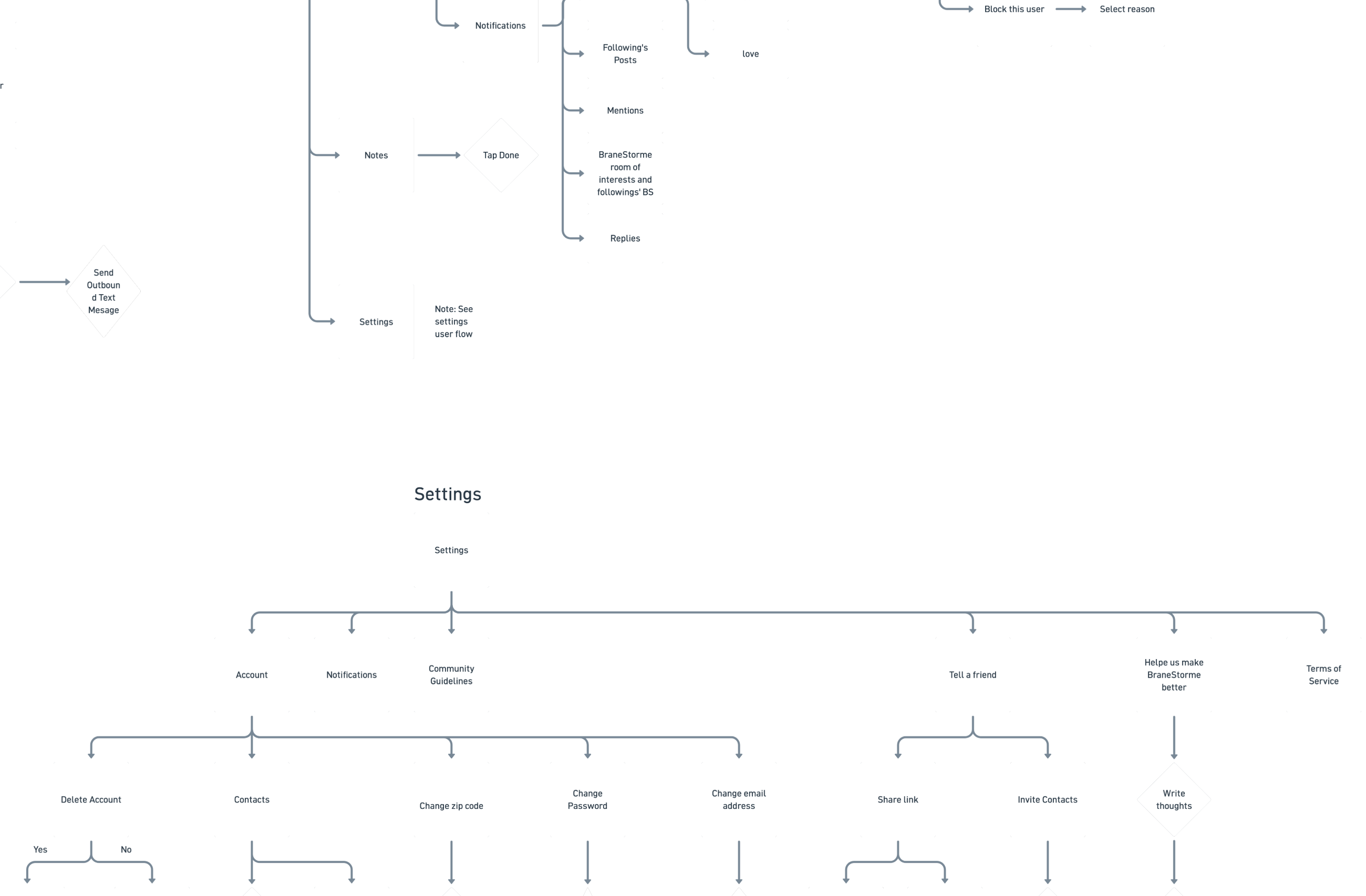
Ratings on every product card

Five stars and a price, visible before a customer opens anything. A new store has no reputation, so social proof has to be at the point of decision rather than buried on a details page nobody scrolls to.

Favorites, not just cart

A customer who generates a style they like at 11pm is not always ready to buy. Letting them save the result rather than only the product means the specific combination survives, which is the thing that took them effort to find.

Policies as designed screens

Terms, privacy and shipping got real layouts instead of a wall of text in a modal. Shipping policy in particular is the page that decides a purchase on a $25 item, and burying it costs more than designing it.

08

Mentorship: checkout flow

Partway through the project I took on a junior designer, Daniel, a recent graduate of The Knowledge House UX/UI program. I scoped him a consequential piece of the product rather than peripheral work: the entire checkout flow, across mobile, tablet and desktop, plus the admin screens behind it.

That is the most consequential surface in a customizer. Everything before it is fun; checkout is where people leave. Handing it to someone six weeks out of a bootcamp only works if the scaffolding around them is real, so most of my work was building that scaffolding.

I set the system before he started

He got the layout grid, the component library, the type and color specs and the naming conventions on day one, so his first decision was about the checkout and not about what a button should look like. I organized the Figma file and walked him through how I work before he opened it.

Critique against the system, not my taste

The feedback was specific and checkable: spacing between the personal information and payment blocks was inconsistent with the rest of the flow, the payment method buttons needed to match the shipping method pattern including their selected state, the header was showing the wizard as selected when it was not, and the full name field needed splitting into first and last to match what mobile already did. Every note pointed at a rule he could apply himself next time.

Consistency across breakpoints as the lesson

The recurring theme was that a tablet layout is not a resized desktop. Most of what I sent back was a mismatch between his tablet screen and a decision already made on mobile. By the last session he was catching those before I did, which is the actual goal.

Craft, taught directly

We also spent time on the mechanics: auto layout and hover states for components, installing and crediting a licensed font, and Illustrator shortcuts for manipulating shapes when he was drawing icons. Some of mentoring is just showing someone the faster way to do the thing they are already doing.

Room to propose, not just execute

He brought his own ideas, including a back-navigation pattern between checkout steps and a discount code flow, and I designed around them rather than over them. He shipped the checkout wireframes at all three breakpoints.

Five years of teaching is why this felt familiar, but the transferable part is narrower than it sounds. It is knowing the difference between a designer who needs the answer and one who needs the rule, and giving them the second one.

09

Next steps

Test the ball with people who are not me. The concept demos well because the interaction is novel, and novelty is not a usability result. The unknown is how many taps a user makes before committing or abandoning, and that number determines whether the combination set needs to be twenty or two hundred. Only a moderated session answers it.

Let people steer without giving them controls. A customer who taps fifteen times is telling you something specific, and right now the product ignores it. A light signal, warmer, bolder, simpler, would narrow the deck without reintroducing the font menu. That is the version of personalization I actually want to build.
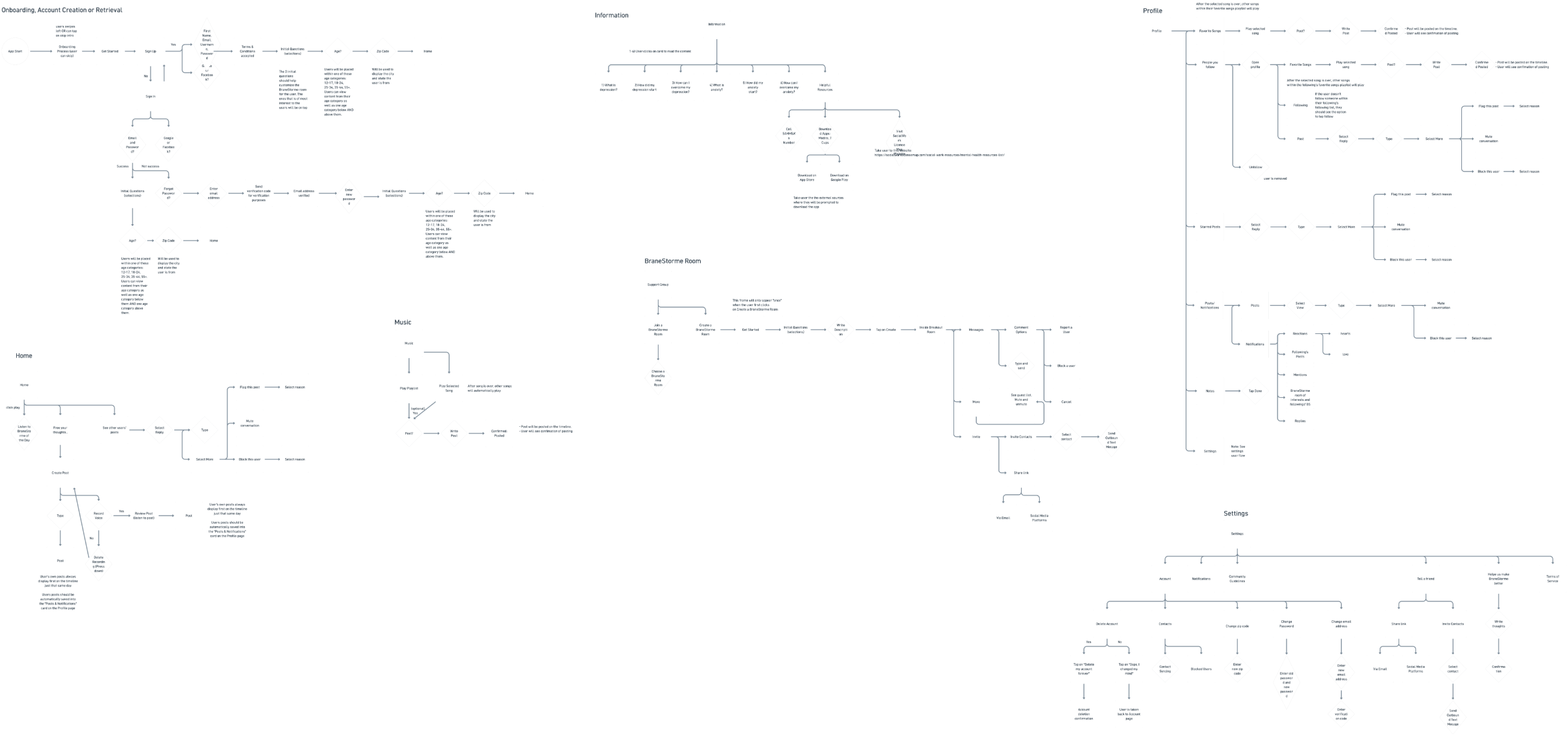
Design the admin side properly. The low fidelity wireframes include font upload, kerning and color management, and I never took that further. Whoever runs this store has to add combinations to the deck forever, and the quality of the whole product depends on that being easy.

Next case studyProductive Struggle →
← All work
The LIFE3 logo
Clean energy workforce technology · Lead product designer and advisor · 14 min read

LIFE3 Website Redesign

Designing for funders, workforce directors and prospective trainees at once, when most of the evidence is legally unpublishable and the most persuasive fact carries a liability the company cannot underwrite.

My role
Lead product designer and advisor. Research, IA, design system, copy, build.

Team
Founder and CEO, workforce product director, AI engineer, two data analysts
Dates
Summer 2026
Contribution
Research Information architecture Design system Content design Accessibility audit SEO Web design and build
Tools used
Figma Claude Google Analytics Hotjar HTML/CSS
Abstract

LIFE3 runs clean energy training, builds the systems workforce organizations operate those programs on, and embeds staff inside client teams. Three businesses, three audiences, and one site that had flattened all of it into a services list. I led research, information architecture, the design system and the build across eight pages. The hard part was not visual. The three audiences judge credibility by opposite standards, most of the evidence of the work is legally unpublishable, and the single most persuasive fact about the training carries a liability the company cannot underwrite.

In short
Problem
Three distinct businesses flattened into one services list, with no page written to prospective trainees at all.
Users
Funders, workforce directors and prospective trainees, who judge credibility by opposite standards.
Constraint
Most evidence of the work is legally unpublishable, and the most persuasive fact carries a liability.
Design
Eight pages, one design system, and a cost section that answers the question without over-promising.
Audit
Three invented figures removed, and 42 contrast failures corrected to meet WCAG AA.
Shipped
Live at life3.io. Two brand colors rewritten by the accessibility pass.
Decision record
Goals
Funders see delivered evidence, workforce directors see a partner rather than a vendor, and prospective trainees get the cost answer first.
Iterations
Section alignment was built three ways as full pages: mixed, left and centered. Left shipped.

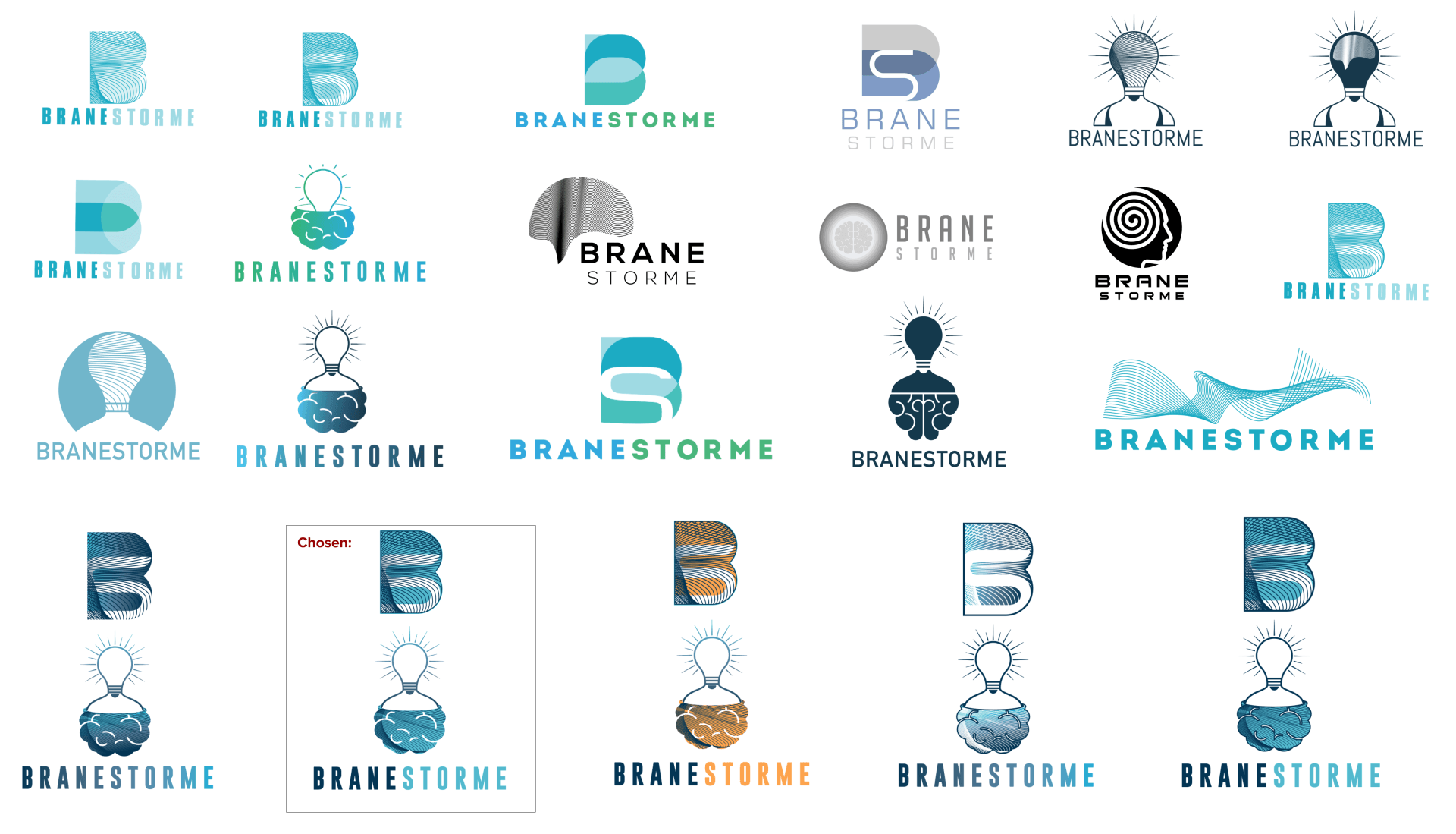
Rejected
The word free, the disclaimer that not every program is funded, and the fully centered layout.
Edge cases
Keyboard and screen reader use of the contact form, reduced motion, silent videos exposed as labelled images, and pages that must not publish participant data.
Measured
42 contrast failures corrected from 3.20:1 to 5.61:1, and titles and descriptions on every page. No post-launch conversion data has been shared with me.
Status
Live at life3.io.
The LIFE3 homepage: navigation bar, the headline Using Technology to Learn and Progress Together, funder logos under a trusted-by label, and the mission statement about bridging technology and workforce development
Fig. 1. The homepage as it shipped: navigation, hero, funder lockups and the mission statement.
01

Problem

A program officer opens the site before a renewal conversation and cannot work out what this company has actually delivered. LIFE3 does three things that sound like three companies. It trains people for clean energy jobs. It builds the systems workforce organizations run those programs on. And it does both with equity as the actual point rather than the footer copy.

Their existing web presence flattened all of that into a services list. Funders could not tell what LIFE3 had delivered. Workforce directors could not tell whether LIFE3 sold software or ran programs. And prospective trainees, the people the whole company exists for, had no page written to them at all.

The company also does not sell a product. Everything is built per program on tools they already operate. That sounds like a small distinction. It governed every page.

02

Audiences

I built three audience profiles from founder walkthroughs, the workforce product director’s client calls, and the reporting work the team already does. The problem is not that they want different things. It is that the thing that earns trust with one actively costs it with another. Funders are convinced by specific, sourced numbers, which is precisely the register that makes a twenty-four year old decide this is not for her. Workforce directors need to hear that LIFE3 does the work alongside them, which undercuts the product story a funder is evaluating. Every page had to hold at least two of those at once.

Audience 01
Dana, program officer at a state energy authority
Awards the contract. Reads the site before a renewal conversation.
Wants: evidence a grantee can report. Numbers with a source. Named funders and named programs.

Kills trust: a round figure with no denominator. She has reviewed hundreds of decks and identifies an unsourced metric immediately.
Audience 02
Marcus, director at a workforce nonprofit
Runs cohorts on forms and spreadsheets. Two staff, no engineer.
Wants: to know if this is software he has to learn or people who will do the work with him.

Kills trust: product language. If it reads like a SaaS launch he assumes a seat license and an implementation fee.
Audience 03
Nia, 24, looking for a way in
Heard about a training cohort from a community org. On her phone.
Wants: one answer first. What does it cost me.

Kills trust: anything that reads as a catch. Also anything that promises free and then asks for a card.
Fig. 2. Three audiences, one site. Nia is the reason the cost section exists and sits where it does.
03

Content strategy: cost and eligibility

Most LIFE3 training is fully underwritten and participants in funded cohorts pay nothing, which is the single most persuasive fact the company has. It is also the one it cannot promise. Funding is awarded per cohort, some engagements are deliberately paid, and the eligibility rules are set by whoever wrote the grant, not by LIFE3. So the word free was ruled out, and the alternative I first reached for was ruled out with it.

Print free once and you have set a permanent expectation across every future cohort. When a paid program arrives, the site has made the company look dishonest to exactly the audience with the least reason to extend it the benefit of the doubt.

The honest disclaimer fails the other way. "Not every program is funded" reads as a warning, and it lands hardest on the person with the least margin to absorb it, who then does not apply at all. Both the promise and the caveat cost the company the applicant.

The brief was to answer the cost question honestly, before it is asked, without making a promise the company cannot keep or a warning that filters out the applicant.

The answer was to make the mechanism visible rather than the price. A Cost and Eligibility section sits before the program pathways, not beneath them, so the question is answered before anyone has to look for it. The figure reads Covered rather than a dollar amount or a zero, because covered is a description of an arrangement and zero is a promise. Program cards carry the funder’s own lockup, which moves the claim from something LIFE3 asserts to something a named third party is accountable for.

Stating that funders underwrite the cohort and participants are selected by application and eligibility review does the disclaiming structurally. The reader understands the offer is conditional without being told they personally might not qualify.

04

Design system

Clean energy sites default to two looks: municipal blue, or startup gradient. I wanted neither. The type pairing carries the difference: Newsreader for headlines, with italics doing the emphasis, against Mulish for everything you read and IBM Plex Mono for eyebrows and labels.

A serif with real italics buys authority that a geometric sans cannot, and the mono labels come from the reporting side of the business, where everything is a field name. Deep navy grounds it, blue carries the energy work, and terracotta is the only warm thing on the page so it goes exactly where you should look.

Palette, as specced
Dark ground
#0a1622
Navy
#123b57
Primary
#2f99cd
CTA fill
#1c6e99
Accent text
#9c4a1c
Light section
#f2f3f5

Two of these six exist only because of a contrast audit. The accent and the CTA fill were originally the brighter blue and terracotta, and both failed. More on that below.

Fig. 3. The palette, after the accessibility pass rewrote two of its colors.
Type specimen, as specced
Using technology to learn
Newsreader 600
Headlines and section titles.
and progress together
Newsreader 400 italic
Emphasis inside headlines. The only italic in the system, and the reason a serif was chosen over a geometric sans.
Workforce programs run on systems that report.
Mulish 400 / 600 / 700
Body, navigation, buttons. 400 for prose, 600 for interface, 700 for emphasis.
COST & ELIGIBILITY
IBM Plex Mono 500
Eyebrows and labels. Borrowed from the reporting side of the business, where everything is a field name.
05

Evidence under confidentiality

The proof of what LIFE3 does lives in three places, and none of them can go on a website as-is. Client Monday boards full of participant names. Learning platforms behind credentialed logins. And engagements that are people embedded in an organization, with no interface at all. None of those interfaces are mine, which is the point: the design problem was not building them, it was finding an honest way to show work that lives inside somebody else’s software.

For the reporting work I rebuilt real screens from the product director's recordings. I cropped out the browser chrome and real URLs, blurred the name columns, and put them in our own frame with a neutral address. Real screens, no exposed data.

For the learning platforms I pulled screenshots from my own credentialed logins and picked on one rule: no participant PII, ever. The grader report and the submission screens are the most impressive views in the product and they carry names and email addresses, so they did not ship. Course structure, a certificate submission and an exam resources page carry the same argument with nothing to leak.

And for the embedded work I stopped trying. Those became process flows instead: meeting to transcript to structured notes to tracked actions. When the thing you delivered is a way of working, a flow diagram is the honest way to show it.

06

Design-to-build workflow

The site was designed in Figma and built with Claude, across about six weeks of client meetings. Figma held the source of truth for layout, type and color; Claude turned approved frames into shipped pages. The mechanism that made that handoff survive six weeks of revisions was a single file at the project root, read at the start of every session, holding every decision anyone had made.

Not notes written up afterwards. The log is the input. A nine-page site with a founder reviewing it weekly generates contradictions faster than anyone can hold in their head, and the failure mode is silent: a decision from week two survives on one page long after week five reversed it.

Figma first, then build

Pages were designed and reviewed as Figma frames before any of them got built. That order matters on client work: the founder approves something he can see, and the build becomes execution rather than negotiation. What Claude changed is how little that execution cost, which is why three complete alignment variants were worth building instead of arguing about.

Hard rules at the top

The founder’s non-negotiables, stated once and never re-litigated. Never present the training as free. No gray plates behind product mockups. No emoji, because it is not the brand. No em dashes in site copy. Rules like these are cheap to write down and expensive to rediscover on page seven.

The design system, locked

Every hex value as a named design token, the three typefaces and their roles, the navigation structure and its two collapse breakpoints. Tokens are why the next palette change is one edit rather than another forty-two, and locked means a later session cannot invent a fourth blue because it seemed to fit the section.

Dated decision records

One entry per meeting, attributed and dated, under the rule that the most recent decision wins. That single rule is what makes a six-week log usable rather than a pile of conflicting instructions. Section alignment alone reversed three times across three meetings, and the log is why the final answer is traceable instead of being whatever the last session happened to remember.

Open questions stay open

A contradiction between two participant figures is recorded as an open contradiction, with both numbers and their sources, flagged for the founder, and resolved in neither direction. A log that only holds settled decisions trains you to settle things you have no authority to settle.

Then audit against it

The payoff is a pass that reads every page against the accumulated log. That is what caught three invented figures on a page about to publish, a claim to be the operating system for workforce programs on a site whose founding constraint is that we do not sell a product, and one surviving em dash buried in an alt attribute.

The honest summary of the division of labor: Figma is where the design decisions were made and approved, and Claude is what made executing them cheap. Three complete alignment variants became worth building rather than debating, and a forty-two instance color correction became one pass instead of forty-two separate edits. It did not decide that covered is the right word instead of free, or that a warning aimed at the applicant is worse than no warning at all. Those needed a founder with a five-year view and a designer willing to write the constraint down rather than design around it.

07

Content audit

Auditing the site against everything the team had told me, one page failed badly. It carried three precise figures: active participants, completion rate, placements. All three were invented, and they were the most persuasive thing on the page.

They came out. What replaced them was the names of what the system actually does, Enroll, Track and Report, which is less impressive and true. The same page called itself the operating system for workforce programs, which contradicts the one rule behind this whole project: LIFE3 does not sell a product. That became the connected system behind a workforce program.

The audit also turned up a contradiction I could not resolve. The homepage said six thousand trainees. The founder's own writing and our funder proof points say seven hundred trained in New York State, more than half from priority populations. Those may both be true at different scopes.

I flagged it and changed neither. Quietly picking the bigger number would have been easy and would have put an unverifiable figure in front of the exact person most likely to check it. Quietly picking the smaller one would have cut their headline without their say. A designer editing a client's proof points without asking is not tidying, it is deciding.

08

Accessibility audit

Equity is the company's whole argument, so a site that fails WCAG AA contrast is not an oversight, it is a credibility problem. I audited it properly and the brand colors were the worst offenders.

Terracotta text on light
3.82:1, below the WCAG 2.1 AA threshold of 4.5:1 for body text. Darkened to 5.55:1 across 42 usages. Backgrounds and non-text rules kept the original, since AA applies to text.
White on the primary blue CTA
3.20:1, an AA failure on the highest-intent element on the page. Every solid fill moved to the deep blue, 5.61:1, sitewide including the nav.
Muted grays on dark
Lifted a step sitewide. The founder put it better than the audit did: dark gray sinks into the dark background.
The contact form
Built as styled divs, so it was unusable with a keyboard or a screen reader and it dragged the accessibility score to 78. Rebuilt as a real form with a label and an id on every field.
Structure
Skip link, one main landmark, focus-visible rings, a reduced-motion damper, decorative SVGs hidden, and silent videos exposed as images with labels.
SEO, while I was in there
Score was 82 because no page had a title or description. Every page got both, plus social tags.

Two of those fixes changed the brand palette. That is the part worth noticing: the audit was not a checklist at the end, it edited the design system.

09

Layout decision: three variants

Section headers had drifted. Some left, some centered, and the founder noticed. I centered every section header block sitewide. He reviewed it and asked for more centering, so the heroes went too. Then the call reversed: left align everything.

Rather than keep re-aligning a live site by hand, I built the three options as full pages you could scroll side by side: the drifted original, all left, all centered. Arguing about alignment without something to look at is how you get a third reversal.

Centered won. Seeing all three side by side is what settled it: on a page built from short section headers with a supporting line under each, centering reads as deliberate structure, while left alignment left the subheads floating against a lot of empty right-hand space. One detail came out of the exercise and stayed regardless of alignment: trailing "see all" links now sit under the header text rather than floated opposite it, which is a genuine improvement that only became visible once the three builds existed to compare.

Option B, left
The Proof of Work section with eyebrow, header, supporting line and trailing link all left aligned
Option C, centered · shipped
The same Proof of Work section with eyebrow, header, supporting line and trailing link centered
Fig. 4. The Proof of Work section in both builds, same content. C shipped: eyebrow, header, supporting line and the trailing All case studies link all centered on one axis.
The featured NYC Accelerator engagement card: an LMS new pilot eyebrow, challenge and solution copy, a three-step delivery roadmap, and enrolment figures of 200 enrolled, 100 active learners and 30 completed
Fig. 5. Technology Solutions. The featured engagement carries a delivery roadmap and real enrolment figures rather than a screenshot of somebody else’s software.

Outcomes

Eight pages, one system, and a set of decisions I can defend line by line.

8
pages on one design system, built and shipped.
42
accent-color usages corrected after the contrast audit.
3
invented figures removed from a page that was about to publish.
0
participant names or emails published, across three client platforms.
10

Retrospective

I should have written down the rules the day I learned them instead of a month in. The cost language, the no-product rule, the video attributions: each one got re-litigated at least once because it lived in a meeting rather than in a document. Once I kept a running decisions file, the churn mostly stopped, and the alignment reversal is the clearest evidence of what the earlier weeks cost.

Two pages still overlap Technology Solutions, are not in the navigation, and remain publicly indexable. I recommended folding them and the decision is not mine to make, but I should have raised it at the information architecture stage rather than after both existed.

And I would push harder on testing with the third audience. Funders and workforce directors reviewed this site constantly, because they are in the room. Nia never saw it. The cost section is the piece I am least sure of for exactly that reason, and it is the piece that matters most to the person with the least margin.

Next case studyBraneStorme →
← All work
Kingsborough Design Challenge · March 2020 · Self-directed, unpaid · 6 min read

Workout App Design Challenge

A weekend competition with a paid internship at the end of it. Research, persona, flows, mockups and a clickable prototype, in seventy-two hours, on my own.

My role
Everything: research, persona, flows, UI and the prototype
Team
Solo, start to finish
Dates
Fri 13 to Mon 16 March 2020
Deliverables
Survey, persona, user flow, mockups, clickable prototype
Contribution
Survey research Persona development User flows Wireframing High-fidelity prototype
Tools used
Figma
Abstract

Kingsborough ran a design challenge over one weekend with a paid internship as the prize. Teams of two picked a brief and had to produce research, a persona, user flows, mockups and a working prototype by Monday morning. I ended up doing mine alone, and took the workout app. In three days I fielded a survey, got nine responses at a mean age of thirty-four, and found that the feature everyone agreed on was not the interesting result. The interesting result was a single sentence in a free-text field about why tracking alone does not work.

In short
Stage
0 to 1 in seventy-two hours. Research, persona, flow, sixteen screens and a clickable prototype, from an empty brief.
Problem
Design a workout app in seventy-two hours, with research, persona, flows, mockups and a prototype.
Users
People who already want to work out and stop anyway, which is not a motivation problem.
Research
A survey fielded in three days, nine responses, mean age thirty-four.
Finding
One sentence in a free-text field about why tracking alone does not work, which set the whole direction.
Design
Persona, user flow, sixteen screens and a clickable prototype, solo after my partner withdrew.
Caveat
Convenience sample, no intent-to-adopt measure, and the gamification is still unvalidated.
Decision record
Constraints
Seventy-two hours, solo after my partner withdrew, and nine survey responses.
Iterations
Low fidelity flow first, then sixteen screens and a clickable prototype.
Rejected
Reminder-driven motivation, because the one detailed response said tracking alone does not keep people going.
Edge cases
A first run with no history, a missed day, and changing the goal after setup.
Status
Concept. A design challenge, not a shipped product.
01

Brief and constraints

The rules were specific. Teams of two. Four briefs to choose from, including an Instagram redesign and a wallet app. My partner dropped out, so I ran the whole thing myself. Five required deliverables: user research, at least one persona, user flows, wireframes or mockups, and a clickable prototype. Start Friday at nine in the morning, submit Monday at nine. Winning team gets a paid internship.

Seventy-two hours is not enough time to do all five well, and it is less time when you are on your own. So the real decision was where to spend it. I front-loaded research on day one despite it consuming a third of the timeline, because a persona assumed on Friday afternoon would have silently biased every screen after it.

02

User research

I wrote a survey and got it out the same morning. Seven questions covering age, what functions people want, what kind of training they do, their actual favorite activities, why they think a fitness app would help, and one open field at the end.

Nine responses, mean age thirty-four. A small sample, and I would say so in any room: nine people recruited over a weekend is enough to find a direction, not enough to prove one.

Activity recording, 9 of 9

Every single respondent wanted it. Unanimous agreement is usually a sign you have found table stakes rather than an opportunity, and that is how I treated it.

Convenience, 8 of 9

Access anywhere, anytime was the most cited reason a fitness app helps at all. Not better workouts. Availability.

Cost, 6 of 9

Cheaper than a gym came second. This is a price objection dressed as a feature request, and it set the tone for the whole product.

Everything else split

GPS and weight management at five each, heart rate at four, food advice at three. Training preferences fragmented across aerobic, classes, weight lifting and powerlifting, with favorite activities running from tennis and hiking to boxing, dancing and skateboarding. No two people wanted the same program.

Survey results: functions people want in a workout app, with activity recording cited by every respondent
Fig. 1. What people said they wanted. Activity recording was unanimous, which made it the least useful answer.
03

Key insight

The last question was an open field, and one response did more work than the rest of the survey combined.

I need incentives. My own progress isn’t enough, I need incentives. Maybe a game?

Nine out of nine had asked for activity recording. This person was saying that recording their activity was not working. They could see their own numbers and it still did not get them out the door.

Two other answers pointed the same way. One asked for competition with others as the reason apps help at all. Another wanted to share progress socially. Read together, the survey was not asking for a better tracker. It was asking for a reason to care about what the tracker says.

04

Persona

The persona came straight out of the responses rather than out of my head. Katie is thirty-two, works in business management in New York, earns eighty-five thousand, and finishes her day tired at a desk after three meetings and five phone calls.

Her goals are to exercise regularly, keep up tennis and volleyball, and find a cheaper alternative to a gym. Her frustrations are the three the survey kept returning: not enough time, needs cheaper options, hard to stay motivated. The gyms near her apartment are expensive and she is not sure the money is worth it.

The Katie persona: 32, business management, $85,000, with goals, frustrations and a quote about striving to be her best physically and mentally
Fig. 2. The persona, built from the survey rather than assumed. Her third frustration is the one the product had to solve.
05

Solution

If motivation is the problem, then the design question is what the app rewards. I put progress in front of the tracking rather than behind it.

Level, not just totals

The profile leads with a level number, workouts completed and followers. A raw count of workouts is a record. A level is a position you can lose, and that was the point.

Goals achieved as earned marks

Stars against named goals, 2000 steps, 300 pushups, 100 lifts, so achievement is discrete and nameable instead of a bar that never fills.

Two bars, not twelve

Steps and calories against a target, and nothing else on the home screen. Katie has minutes, not an evening. Every additional metric is a decision she has to make before she has done anything.

Add Motivation, in her own words

A field at the top of the profile where the user writes why they are doing this. It came directly out of that survey answer, and it is the cheapest possible version of the incentive she asked for.

Social as a light touch

Followers are visible, sharing exists, but there is no feed and no leaderboard. Two of nine wanted competition. Building the whole product around them would have alienated the other seven.

A palette that survives a dark screen

Dark gray ground, because most of this gets used early or late and a white screen at six in the morning is hostile. Teal for anything you can act on, yellow reserved strictly for progress, and nothing else competing.

Two colors with one job each meant a glance at the screen tells you where you are without reading a word, which matters when someone is checking their phone between sets.

#049595 · actions #FFB511 · progress #3D4045 · ground
The user flow: sign in through to logging a workout and viewing achievements
Fig. 3. The user flow, mapped before any screen was drawn.
Four app screens: profile with level and goals achieved, exercise, activity and achievements
Fig. 4. The mockups, built against that flow. Teal for actions, yellow for progress, everything else out of the way.
Sixteen screens from the workout app: splash, three onboarding slides, profile with level and followers, your activity with a weekly chart, workout history, goals achieved with a nearby classes map, then the onboarding questions for gender, experience level, fitness objective and body measurements, the custom plan confirmation, and sign in and sign up
Fig. 5. Every screen, in seventy-two hours. The top row is the running app: onboarding carousel, profile, activity, history and achievements. The bottom row is the setup a new user walks through once, four questions and a confirmation, which is where the survey findings about experience level and objective actually land.
06

Retrospective

Nine responses is a direction, not a finding. Mean age thirty-four, recruited by convenience sampling rather than against criteria, with no measure of intent to adopt. On a real project a survey at that scale is the screener that recruits your participants, not the evidence base itself.

The gamification is unvalidated. Levels and stars respond to a single stated preference, and stated preference is not observed behavior: wanting an incentive and responding to a specific incentive are different variables. Validating that assumption needs a two-week diary study measuring actual return rate, and until it runs I label the mechanic as a hypothesis rather than asserting it as a finding.

What holds up is the method. Synthesizing the open-ended responses rather than tallying the closed ones is what produced a defensible design rationale, and qualitative synthesis has led every project I have run since.

Next case studyGramercy Arts High School →
← All work
The Gramercy Arts High School crest
NYC Department of Education · Public arts high school · 8 min read

Gramercy Arts High School

A school website has to serve an eighth-grader deciding where to apply and a parent looking for one form at ten at night. I researched, designed and built it.

My role
Researcher, designer and WordPress developer. Sole designer.
Partners
School administration, teaching staff, and the students whose work is on it
Dates
Fall to Winter 2021
Abstract

I was teaching at Gramercy when I redesigned its website, which meant I already knew who was failing to find things and why. The old site was a DOE template that treated every visitor the same. I mapped a fifteen-page information architecture around five real audiences, sketched it, wireframed every page at desktop and mobile, built a small design system with the accessibility limits written into it, and shipped it on WordPress myself. The design decision I would defend hardest is that student work, not a stock photo of a hallway, is the first thing you see.

In short
Problem
One template, five audiences, and no way to tell an applicant from a parent.
Approach
Sketches, then a fifteen-page sitemap, then every page wireframed twice.
System
Four colors, three type levels, three buttons, and the contrast limits documented.
Shipped
Live on WordPress, built by me, still in use by the school.
Decision record
Goals
Parents and students find what they need without knowing the school's structure. The school gets a site its staff can update.
Constraints
WordPress, a school budget, and editors who are teachers rather than web staff.
Iterations
Sketches first, then every page wireframed at desktop and again at mobile, then the build.
Rejected
Organizing navigation by department, in favor of audience-first paths.
Edge cases
Deep menus on mobile, pages with no current events, and content staff will edit without breaking layout.
Status
Live at gramercyhs.org.
01
01

Problem

An eighth-grader in Queens is choosing twelve high schools to rank. She has heard Gramercy has a theatre program. She opens the site on her phone on the bus and needs to know two things: what you can study there, and when she can come see it.

The site she landed on was a DOE template. Announcements in reverse chronological order, a left rail of eleven links in no particular order, and no page written to an applicant at all. The two things she came for were the two things hardest to find.

I was teaching there at the time, which is the only reason I knew how many different people were failing on the same page. Parents called the front office for forms that were already online. Students could not find the bell schedule. And the most persuasive thing about the school, the work students actually make, existed nowhere on it.

02
02

Audiences

A school site is not one product. It is five, sharing a navigation bar, and the whole design problem is that they want opposite things at opposite times of day.

Prospective students

Arrive from the high school directory, on a phone, deciding whether to rank the school. They need the arts majors and the next open house, in that order, and they need to see student work before they believe any of it.

Their parents

Evaluating in parallel and asking a different question: is this a real school with real outcomes. College acceptances and partnerships answer that faster than any paragraph of mission copy.

Current students

Task traffic, all year. Bell schedule, calendar, clubs, and the resources page. They already know the school; they need one fact quickly and they are on a phone.

Current parents

Forms, news, and the family resources page, usually in the evening. This is the group the front office was fielding calls from, and every call was a findability bug.

Staff and the school itself

The site is also a recruiting and reputation tool. Staff pages and the history page exist for that audience, and they are the least visited pages on the site, which is correct.

03
03

Sketches

The contested decision was what the homepage leads with. A school will always ask for a welcome letter from the principal. I wanted student work above the fold and the open house date beside it.

That argument is cheaper to have over pencil than over a comp, because nobody defends a sketch. So the first artifact was a page of them: four homepage orders, drawn small enough that all four fit on one sheet and could be compared rather than admired.

A · Letter first
nav
welcome letter
announcements
gallery
footer
B · Work first
nav
student work hero
open house cta
majors
footer
C · Majors first
nav
four majors
work strip
open house
footer
D · Shipped
nav
work hero + cta
majors
acceptances
footer
Fig. 1. Four homepage orders, sketched before anything was designed. D shipped: student work carrying the open house call to action, majors underneath it, then the college acceptances that answer the parent question. The welcome letter moved to the mission page, where the people who want it go looking.
04
04

Information architecture

Fifteen numbered pages under five dropdowns, and the numbering is not decoration. It is how I kept the school, the staff writing content and myself referring to the same page by the same name for four months.

Two structural calls are worth naming. Courses and Open Houses appear twice, under About and under Students, because an applicant and an enrolled student look for them in different places and a site map is allowed to have two doors into one room. And the college acceptances and partnership logos each link out to the institution, so the proof is checkable rather than asserted.

Gramercy Arts High School
01 Home
logo
04 Mission & Values
05 History
06 Staff
About us
03 Courses
02 Open Houses
College acceptances
Partnerships
Calendar
dropdown
07 School Calendar 2021–2022
Events
13 Bell Schedule
Students
dropdown
03 Courses
08 Clubs
09 Student Gallery
10 Helpful Resources
Parents
dropdown
11 Family Resources
12 Parent News
14 Parent Forms
FAQ
15 Contact
FAQ
dropdown
Fig. 2. The sitemap, as delivered. Fifteen numbered pages, five dropdowns, and two pages deliberately reachable from two places.
05
05

Responsive wireframes

Forty-five wireframe frames: every one of the fifteen pages drawn at desktop and again at mobile, plus the shared pieces. Mobile was not a resize pass at the end. Most of this traffic is a student on a phone between classes, so the phone layout was drawn alongside the desktop one and in several cases first.

Drawing both early is what caught the things that only break small. A four-column major grid that has to become a single scroll. A bell schedule table that cannot be a table on a 375px screen. A footer carrying phone, email and Instagram that needs to stack without losing the tap targets.

Twelve desktop wireframes in a four by three grid: Home, History, Our Staff, Calendar, Clubs, Student Gallery, Helpful Resources, Family Resources, Parent News, Bell Schedule, Parent Forms and Contact, each showing its hero band and first content section
Fig. 3. Twelve of the fifteen pages at desktop. The purple band does the same job on every one, so a parent always knows where the title is.
The same twelve pages as mobile wireframes in two rows of six, each at phone width showing the collapsed header, stacked content and the persistent social footer
Fig. 4. The same twelve at 375px, drawn alongside the desktop rather than after it. The four-column grid becomes one scroll, the bell schedule stays a table because the data is genuinely tabular, and the footer stacks without shrinking a tap target.
06
06

Design system

Four colors, three type levels and three buttons. Small enough that a staff member adding a page could not get it wrong, which mattered because they were going to be maintaining it after I left.

Purple, and only purple

#552583 is the school color and the only accent in the system. It is the hover state on every button and link, so hover behavior is one rule rather than a per-component decision.

Lavender has one job

#F6EDFF exists solely to separate background sections. Writing that restriction into the branding page is what stopped it becoming a second accent, which is how a four-color palette turns into nine.

Contrast limits, stated

The branding page carries two notes I wrote as warnings rather than swatches: this combination is not accessible on black, and this one is not accessible on the brand red. A palette that does not say where it fails is a palette someone will misuse.

Type, three levels

Josefin Sans for the display scale, H1 at 100px down through H2 at 45 and H3 at 35, all semibold, against Helvetica Light at 20px for body. A geometric display face with a neutral body face, so a school site reads as designed rather than as a template.

Three buttons, fixed heights

Buttons 1 and 2 hold at 56px with width varying by label length. Button 3 is reserved for hero images and full-width call-to-action bands. Fixing the height is what keeps a site built by several people from drifting.

Palette, as specced
School purple
#552583
Ink
#000000
Section wash
#F6EDFF
Paper
#FFFFFF

Plus one reserved red, #BC372A, used for alerts only. The branding page flags it as a color the purple is not accessible against.

Type and buttons
Gramercy Arts
H1 · Josefin Sans SemiBold · 100px
Visual & Performing Arts
H2 45px · H3 35px, both semibold
Body copy sits in Helvetica Light at twenty pixels, which is larger than a typical site because a good share of the readers are parents on a phone.
Paragraph · Helvetica Light · 20px
Button 1
Hover · #552583
Button 3 · on imagery
Buttons 1 and 2 fixed at 56px tall. Button 3 for hero and full-width CTA only.
Fig. 5. The branding page, rebuilt here from the source file. The notes on it are the useful part: where each color may be used, and where it fails.
07
07

WordPress build

A public school has no engineering team and no budget line for one. So the deliverable could not be a Figma file, because a Figma file would have sat there. I built the site on WordPress myself and handed over something the school could actually keep running.

That changed the design in ways I would not have predicted from the wireframes. Anything a staff member would have to rebuild by hand every September got designed out. The calendar became one embedded source rather than a page of hand-typed dates. The student gallery became a structure someone could add to without touching a layout. Maintainability was a design constraint, not a handoff detail.

It is still live and still in use, which for a school site built by one person on a template platform is the outcome that matters.

08

Retrospective

I never tested it with an eighth-grader. The whole homepage argument rests on a claim about what an applicant looks for first, and I made that claim from being a teacher rather than from watching one use the site. Five sessions with students from feeder middle schools would have either confirmed it or embarrassed me, and both are useful.

I would also write the contrast rules as a checklist rather than as notes on a branding page. They are correct and they are prose, which means the next person adding a page has to read them to obey them.

And I would have measured something. There was no analytics on the old site and none on the new one, so the strongest claim I can make is that the front office stopped fielding calls about forms. That is real, and it is anecdote.

Next case studyThe Princeton Review LMS →
← All work
Tom's Sons International Pleating logo
Tom's Sons International Pleating · New York Garment District · 6 min read

Tom's Sons International Pleating

A hundred-year-old pleating house wanted to sell its own products instead of working behind other designers' labels. First we had to teach people what pleating is.

My role
UX researcher and prototyper
Team
Delano Asante and me, for a three-generation family pleating business
Dates
Nov 2019 to Mar 2020
Methods
Surveys, in-person interviews, competitive analysis, usability testing
Output
Sitemap, wireframes, clickable prototype, shipped site
Contribution
Survey research In-person interviews Competitive analysis Information architecture Moodboard Wireframing Visual design Usability testing
Tools used
Figma Adobe Illustrator Adobe Photoshop
Abstract

One of the last family pleating houses in the New York Garment District wanted to invert its revenue, from eighty percent white-label contract work to eighty percent its own label, inside a year. That is a brand problem disguised as a website problem: the craft is invisible because it ships under other designers’ names. I ran surveys, workshop interviews, a competitive analysis and usability testing. The blocker turned out to be language. Buyers could not search for, compare or specify a product they had no words for, so the site had to teach the vocabulary before it could sell anything.

In short
Problem
A pleating house wanted to invert its revenue from white-label contract work to its own label inside a year.
Users
Independent designers, wholesale buyers and retail shoppers, all wanting different things from one site.
Research
Surveys, workshop interviews, competitive analysis and usability testing on the prototype.
Finding
Buyers could not search for, compare or specify a product they had no words for.
Design
A sitemap that teaches the vocabulary before it sells, with Speak Pleat at top level beside the shop.
Shipped
Redesigned site delivered. Early work, and the research is stronger than the visual craft.
Decision record
Goals
User: specify a pleat without knowing the term. Business: shift revenue from white-label contract work toward the house's own label.
Constraints
A small family business, three audiences on one site, and a craft most buyers could not name.
Iterations
Three before and after pairs, revised after usability testing on the prototype.
Rejected
A shop-first structure, in favor of putting Speak Pleat at the top level beside the shop, so buyers learn the vocabulary before they buy.
Status
Redesign delivered in 2020. The client's current site may differ.
Tom's Sons International Pleating homepage on a laptop, showing a pleated gown
Fig. 1. The homepage that shipped. Finished garments in place of fabric swatches.
01

Problem

The owner spends part of every week explaining what pleating is. To buyers, to students, to designers who ought to know already. None of it is billable. Tom's Sons is one of the last family-owned pleating businesses left in New York's Garment District. Around 80% of their work was pleating fabric for high-end designers, which meant their craft went out into the world under someone else's name.

The owner wanted that number flipped. Within six months to a year he wanted 80% of revenue coming from Tom's Sons' own private label pleated products. That is a hard ask for a business with no online presence and no consumer brand.

Those unpaid explaining hours are the second problem hiding inside the first, and they turned out to be the more interesting one to design against.

02

Problem framing

01

How might we help Tom's Sons build a well-organized, intuitive site with content good enough to sell from?

02

How might we save Tom's Sons the time they spend convincing and educating people about pleating?

03

How might we make them the first place people look when they want a pleated product, rather than one of several suppliers?

The second question is the one that produced a section nobody asked for. An unpaid education habit is a business cost hiding inside a communication problem, and it is fixable with content rather than with more of the owner’s time.

03

Research

We ran surveys, in-person interviews at the workshop, a competitive analysis of other pleaters and small textile brands, and usability testing on the first prototype. The audience split into three groups, and they wanted different things from the same site.

Shoppers

Millennial and Gen X women who would buy a pleated piece. They needed to see finished garments, not fabric, and they needed a reason to care that this was pleated by hand in Manhattan.

Students and future workforce

Fashion students and people considering the trade. They arrived wanting to learn, and there was nowhere authoritative to send them.

Specialists and technicians

Existing employees and industry pros. They needed reference material and technical manuals, which is an onboarding problem dressed as a website problem.

The finding that shaped everything: people could not buy what they could not describe. Shoppers liked the garments and had no vocabulary for them, so they could not search, compare, or ask for anything specific.

04

Solution

1
Lead with finished products

The old site showed fabric. We replaced it with garments and put the new private label, Pierre la Beach, on the homepage, so the first thing a shopper sees is something they could own rather than a material they would have to commission something from.

2
A shop, built around what people actually chose

Survey respondents ranked products, and we used that ranking to decide what got prime placement rather than guessing.

3
Speak Pleat

We scoped it as an academy rather than a glossary, with three audiences in mind: future workforce and students, current employees onboarding against technical manuals, and working specialists. It gives shoppers the language to search and specify, gives students a real resource, and takes the unpaid education off George's calendar. This was the piece I pushed hardest for and it is the reason the site does more than sell.

4
History and legacy as a timeline

Three generations in one building is the strongest thing they have, and it was invisible. We planned an interactive timeline of company milestones, plus an Innovation and Technology section built around George and Leon Kalajian's own book, Pleating: Fundamentals for Fashion Design, and the technology they are using to change how pleating is made. A supplier with a published book is not a supplier, it is an authority, and nothing on the old site said so.

Research insights from the surveys, interviews, competitive analysis and usability testing
Fig. 2. What the surveys, interviews, competitive analysis and usability testing produced.
05

Process

Mood board first, to agree on what the brand should feel like before anyone argued about layout. Then a sitemap, because the argument we kept having was really about how many pages there should be. Then low fidelity wireframes to place images, copy, buttons and interactive elements. Then a clickable prototype in InVision for usability testing, and finally the built site.

Doing the sitemap early was what unstuck the project. Once Speak Pleat had a place in the structure, everyone could see it was a section rather than a paragraph on the About page.

The prototype is still live: view the clickable InVision prototype.

The sitemap: home, shop, history and legacy, Speak Pleat, innovation and technology, contact
Fig. 3. The sitemap. Speak Pleat sits at the top level, next to the shop, because it earns its place there.

Before and after

Homepage
Before
The original Tom's Sons homepage, leading with fabric swatches
After
The redesigned homepage, leading with a finished pleated garment
Fig. 4. Fabric out, finished garments in. The homepage now sells a product rather than a material.
Products
Before
The original products page, an undifferentiated grid of fabric
After
The redesigned products page with the private label line
Fig. 5. The shop, built around the products survey respondents ranked highest rather than around what was easiest to photograph.
About and history
Before
The original about page, a wall of text
After
The redesigned history and legacy section
Fig. 6. Three generations in one building was the strongest asset the company had, and it was invisible on the old site.
06

Retrospective

This was early work, and the part I would push harder on now is the transaction. I designed the browsing experience carefully and left checkout as somebody else's problem, which is not how a business gets to 80% direct revenue. If I ran it again I would design the purchase flow in the same pass as the shop.

What holds up is Speak Pleat. Finding the client's most expensive unpaid habit and turning it into a product feature is the same move I have made on every project since. At The Princeton Review it looked like reducing the time instructors spent explaining the same mistake to different students.

Next case studyWorkout App Design Challenge →

I’m a Senior Product Designer specializing in UX/UI.

I help teams make sense of complex problems, choose a clear direction, and create experiences people can use with confidence.

I care about both the decisions behind a product and the details people interact with. My approach combines research, product thinking, and visual design, with attention to how everything fits together, from the overall experience to its typography, hierarchy, and interactions. I enjoy questioning assumptions, working through tradeoffs, and bringing different perspectives together to strengthen the work.

Teaching visual arts and digital design shaped how I listen, explain ideas, and mentor others. It taught me to notice where understanding breaks down and adapt my approach. I carry that habit into research, design critiques, and collaboration.

Katherine Fernandez sitting on red sandstone at Garden of the Gods, with the Front Range behind her
Garden of the Gods, Colorado Springs. I climbed it in sandals, which I do not recommend.

Experience

Resu-ME AI
Cofounder and Head of Design
Oct 2025 to present
New York City

Cofounder and design lead on an AI career platform. Argued for the product’s central bet, that a structured interview about your work beats rewriting a thin resume, and designed three products around it: Resume Studio on web shipped first because it generates the context the others consume, then Interview Studio on native iOS, then Job Studio for sourcing. Grounded that thesis in research: candidates spend an estimated 100 to 800 unpaid hours per search cycle hand-tailoring applications, while 45 to 60 minutes of tailoring lifts response rates roughly 75%. Own product design across all four surfaces including the marketing site, the design system spanning web and iOS, and research with job seekers as well as the recruiters and HR directors on the other side of the filter.

Product strategy · web and iOS · design system · pricing · read the case study

The Princeton Review
UX/UI Designer
Jan 2023 to May 2026
Remote

Design lead for educational products serving over a million students a year. Audited 30 dashboard configurations across six exams and five course formats, ran 19 moderated student sessions, and rebuilt the end to end learning experience on one shell and the design system behind 20+ programs. Also defined the four product metrics reported monthly with data partners, including a three-signal disengagement model that surfaced mid-program drop-off at the halfway point rather than after a course ended. Ease of use held at 4.36 out of 5 through a full navigation replacement, and free-to-paid conversion rose from 1.22% to 1.83% year over year.

Adaptive study plans · score report redesign · free trial experience · flexible attendance · productive struggle discovery · product metrics · design system

LIFE3
Lead Product Designer and Advisor
via KAT Designs
2026
New York City

Design lead on the company website and the design system behind it. Eight pages, research and information architecture through build, plus the accessibility and SEO audits that rewrote two of the brand colors and corrected 42 contrast failures from 3.20:1 to 5.61:1. I also advise on product design for the workforce platforms the team builds for clean energy programs.

Read the case study →

Intelligent Graffiti
Design Lead and Mentor
via KAT Designs
Jul to Sep 2024
New York City

Design lead on The Custom Wizard, a print-on-demand customization tool. Ran research and information architecture, built the brand and the component library, and designed the wizard across three breakpoints. Mentored a junior designer, a recent graduate of The Knowledge House UX/UI program, through the full checkout flow and the admin screens: set up the layout grid and component system before he started, ran weekly critique against that system, and taught the Figma and Illustrator craft alongside it. He shipped the checkout wireframes at mobile, tablet and desktop.

Mentorship · design system · brand identity · responsive wireframes · read the case study

LIFE3
Product Designer, UX/UI
Mar 2020 to Jan 2023
New York City

Designed digital products from concept to launch for education and technology clients. Turned a fragmented learning management system into one platform by redesigning student and instructor workflows, and raised task success above 90% by simplifying complex processes. Also designed and built the BMS training simulator now used in Climate Tech Academy classrooms, including its control logic, fault engine and simulation clock, covered by 251 automated tests.

NYC Public Schools
Art Teacher
Aug 2019 to Jan 2023
New York City

Gramercy Arts High School, 2021 to 2023. AP Drawing, Digital Art, Advanced Graphic Design and Animation, grades 10 to 12. I also redesigned and maintained the school website and supported student exhibitions and portfolio showcases.

Bronx Early College Academy, 2019 to 2021. Visual arts across middle and high school, and co-taught the IB Diploma Program Film course.

PressPlay Talent
Product Designer
Jul 2018 to Aug 2020
New York City

My first product design role, overlapping my last teaching years. Built personas and user flows from qualitative and quantitative research for a digital talent platform, translated stakeholder goals into interfaces, and iterated prototypes against usability findings. It is where I learned that a stakeholder asking for a feature is usually describing a problem, and that the two are not the same brief.

Earlier
2016 to 2018
Georgia

Art teacher at Rome Middle School, student teaching at Cartersville Elementary, and graphic designer and screen printer at Gable Sporting Goods, where I learned that a design has to survive a physical production process. Which is the same lesson as handing work to engineers.

Craft foundations

The fundamentals underneath the case studies, and where each one is evidenced rather than claimed.

A persona figure beside four attribute bars, the constraint bar longest and highlighted
Personas and scenarios

Built from survey data rather than assumption. A sixty-three response survey produced the BraneStorme personas and the age-banding decision behind its rooms; nine survey responses produced Katie, the workout persona, whose real constraint (thirty minutes, low motivation on weeknights) set the whole information hierarchy. See BraneStorme and the workout challenge.

Four linked flow nodes with a branch dropping to a failure path that rejoins downstream
Journey and flow mapping

Seven end-to-end user flows for BraneStorme covering onboarding, account retrieval, rooms, music, profile and settings, every branch and failure path, delivered as the build spec for a single developer. On Resu-ME the journey framing is the product strategy: three studios, each producing the context the next one needs. See Resu-ME AI.

A sitemap tree, one second-level node highlighted with its child promoted
Information architecture

Thirty product combinations audited and consolidated onto one navigation model at Princeton Review, with a parity spreadsheet retired as a result. On Tom's Sons the sitemap was what unstuck the project: once Speak Pleat had a place in the structure, everyone could see it was a section rather than a paragraph. See the LMS.

A type pairing specimen: serif display, sans body and mono label on one baseline
Typography

Deliberate pairings with a reason, not a default. Newsreader for headlines against Mulish for body and IBM Plex Mono for labels on LIFE3, chosen because a serif with real italics buys authority a geometric sans cannot, and the mono labels come from the reporting side of that business. See LIFE3.

Four colour swatches with measured contrast ratios, two failing and two passing the threshold line
Color and contrast

Palettes with semantic roles assigned, so a warning state cannot accidentally be drawn in the brand color. On LIFE3 a contrast audit rewrote two brand colors: terracotta text failed at 3.82:1 and moved to 5.55:1 across forty-two usages; the primary CTA fill failed at 3.20:1 and moved to 5.61:1 sitewide. See LIFE3.

Four distinct shapes each with a label bar, showing state carried by shape rather than hue alone
Iconography and visual language

On the BMS Simulator, state is carried by shape and label as well as hue, because shop-floor lighting is bad and around one in twelve men in that trade has a color-vision deficiency. The Custom Wizard has a full mark and logo system built from nothing. See BMS Simulator and The Custom Wizard.

A five-state control model with one state and one transition highlighted
Interaction design

Patterns defined at the system level rather than per screen. The BMS Simulator's five-state control model, override behavior and change-of-value filtering are one vocabulary reused across every piece of equipment, so a student learns it once. See BMS Simulator.

A task rubric grid of passes with three marked failures
Usability testing

Run by me, against written task rubrics. Nineteen students across six exams at Princeton Review; six scenario tasks on BraneStorme that produced six shipped changes; moderated sessions on Tom's Sons. Findings get compared, not remembered. See the LMS.

Four scope bars against a risk column, one struck through as cut
Business alignment

Design decisions argued in business terms. Cutting the guarantee-progress widget was a liability argument that legal and operations signed off on. Cutting the match score from Job Studio Phase 1 protected trust in a number we could not yet compute honestly. Refusing a fourth pricing plan kept one product from reading as three. See Resu-ME AI.

How I work

01 Moderated usability testing

Nineteen students across six different exams in the last cycle, run one at a time against a written task rubric so findings could be compared rather than remembered. I recruit, moderate and synthesize myself rather than reading someone else's summary. The research deck is a byproduct; the value is that when a design decision gets challenged six weeks later, I can say which participant said what and why it changed the direction.

02 Mixed-methods triangulation

Interviews tell you why something happens, product data tells you how often. I check both before committing to a direction. Counting the questions available per topic showed a planned intervention could never have triggered for most students. Auditing a prototype's data layer showed a simulated building had never actually changed. Neither was visible in the interface, and both would have shipped.

03 Content design

I write the real words in the mock rather than bracketing them for later, because the copy is usually the interaction. Renaming one status label from a verdict about the student to a description of the work fixed comprehension of four features downstream at no build cost. A lot of what gets reported as a usability problem is a naming problem, and naming is cheap to fix and expensive to ignore.

04 Design systems and governance

Twenty-plus programs running on one component library: navigation, progress, cards, drill states, score reports, empty states, light and dark mode. The part that makes it hold is the governance, the audit and naming conventions that keep six product teams from re-solving the same component. That maintenance work is nobody's favorite and it is the reason anything ships consistently.

05 Design engineering

React, Redux, HTML, CSS and WordPress, and increasingly AI-assisted delivery with Claude. I work from a requirements spec and a dependency-ordered task plan written before any code, then audit the result rather than trusting it: that discipline has caught a simulation clock that was never wired to its data and three invented figures on a page about to publish. A decision log read at the start of every session is the control that makes it repeatable. The tool changes throughput, not judgment, and the judgment is knowing what to check.

06 Critique and mentorship

I mentored a junior designer through his first real component, four sessions of structured critique that moved him from a layout that looked finished to one that handled the states a build actually needs. Running critique that separates the decision from the person, and defending a rationale to a room that can disagree with me, is what five years of teaching was practice for. It is a tougher audience than any design review.

Leading without managing

I was the only designer on test prep for most of three years

Which meant sequencing was mine to defend. I learned to document the tradeoff in writing, with dates, rather than absorb it silently and ship at lower quality. Saying what will not happen this quarter is the part of seniority nobody tells you about.

The design system was governance, not a component library

Twenty plus programs on one set of components only holds if people agree to use it. Most of that work was the audit, the naming, and the conversations about why a team could not have its own version of a card.

I present to rooms that can say no

Feature Review, cross functional working groups, and client sessions with founders and funders. The version of a decision that survives is the one you can explain to someone whose incentives differ from yours.

Five years of critique before I ever ran a design critique

Teaching teenagers to take feedback on their own work, daily, is the best training I have had for giving it. The goal is the same in both rooms: say the thing that makes the next version better, in a way the person can actually act on.

Tools

Design
FigmaFigJamAdobe Creative SuiteInVisionMiroFramer
Research and data
Moderated studiesUnmoderated studiesSurveysUsability testingSnowflake reportsGoogle Analytics
Build
ReactReduxHTMLCSSWordPressGit
Working
JiraTrelloMondayConfluenceTeams

Let's talk.

I'm glad to walk through the passcode protected work on a call, which is usually a better conversation than reading it.